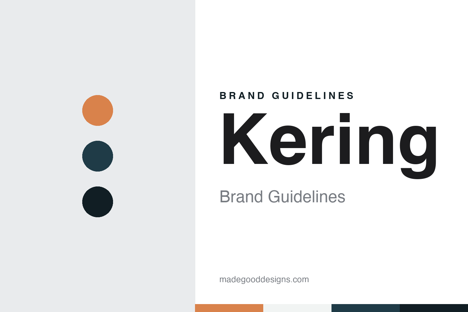
Kering Brand Guidelines
A timber yard in Brittany, a Breton word for home and an owl in flight.
Aa
Two constants: a sunset, azure and night palette and a Geometric sans register. Abstract homage — not a Kering asset or mark; no logo, icon or wordmark is reproduced.
From timber to a new name
Brittany, the early 1960s.
Kering began as a timber business in the west of France. English Wikipedia says François Pinault opened the Établissements Pinault in Brittany in 1962, specialising in timber trading. When the group announced its present name, an AFP report carried by The Peninsula on 23 March 2013 described the company as one created in 1963 by the wood trader François Pinault. Both dates point to the same beginning: a family timber firm in Brittany, which the group would later remember in its name.
The business changed trade more than once before it changed its name. Wikipedia says Pinault S.A. was listed on the Paris stock exchange in 1988 and then grew in retailing, merging with the distribution group CFAO in 1990, acquiring the department stores Printemps in 1992, which brought control of the mail-order company La Redoute, and buying the bookseller and electronics retailer Fnac in 1994. That same year the group was renamed Pinault-Printemps-Redoute, a name that, like the timber firm before it, simply listed what the company owned.
The long name was soon shortened to its initials, PPR. It was a practical label for a holding company, but it tied the group’s identity to department stores and catalogues. Wikipedia says the group took a controlling stake in the Gucci group in 1999 and bought Yves Saint Laurent the same year, and that through Gucci it added Boucheron in 2000 and Bottega Veneta and Balenciaga in 2001. It also sold its retail businesses over the following years, beginning with Printemps in 2006, a sale the AFP report also recorded.
Wikipedia says the group sold Conforama in 2011, CFAO and Fnac in 2012 and La Redoute in 2013, while it added houses such as Brioni in 2011 and Pomellato in 2012. In 2005, Wikipedia says, François-Henri Pinault, the founder’s son, had become chairman and chief executive, and it was under him that the group set out to choose a new name.
Colour
A Breton word that sounds like caring.
The new name was announced in March 2013. Design Week, in a report by Emily Gosling on 22 March 2013, said the group’s identity had been reworked by Dragon Rouge and Havas Lifestyle, and that PPR would become Kering, pronounced like the English word “caring”. Dragon Rouge was responsible for the brand strategy and the new signature, the magazine said, while Havas Lifestyle created the name and the visual identity and would build the new website. The name was to take effect in June 2013, after approval at the annual general meeting; the AFP report gave the meeting date as 18 June.
The word was built from two parts. According to Design Week, the company said the name was derived from “ker”, meaning home in Breton, reflecting the group’s origins in Brittany, while the English suffix “-ing” expressed the idea of movement. The AFP report gave the same account: Ker means home in Brittany, with the English ending added to invoke action. The company also said the name expressed a culture of taking care of its brands, people, stakeholders and the environment, a reading made possible by the English pun.
François-Henri Pinault, quoted by Design Week, called the change of identity “the logical and necessary outcome” of the group’s transformation. The new name dropped the family surname and the retail businesses that had made up the old one, and joined a Breton stem to an English ending.
A new strapline arrived with the name. Design Week said the signature “Empowering Imagination” would be introduced, and quoted Christian de Bergh, managing director of Dragon Rouge, saying the phrase emerged quite quickly after interviews conducted inside and outside the group. The magazine also reported a colour palette for the identity based on shades within colour sets that the company described as “sunsets, azures, jades and fiery”.
Typography
A name, an owl and a home.
A group identity works differently from a product brand. The name on the stock ticker, the annual report and the head-office lobby is often one that shoppers rarely see on a shelf. Beneath it sit consumer names with their own colours, mascots and lettering, and the parent’s job is usually to stay out of their way. That is why so many corporate wordmarks are plain: a simple sans or a restrained serif, one or two colours, a symbol that reads at small sizes in a footer or on the back of a pack.
Where the parent name does speak, it speaks to a different audience. Investors, employees, suppliers and journalists meet it in annual reports, careers pages, press releases and the signage of headquarters buildings. Those surfaces become the group’s real brand canvas, and they deserve the same attention as any pack design. A merger, a demerger or a rename tends to arrive with a new mark and new typography, so the group logo can also read like a timeline of how the business has been put together and taken apart. Studying these quieter identities shows how a parent name carries authority without competing with the brands it owns.
Aa
A geometric sans — after a group identity set in sans-serif type beside an owl. (Specimen set in Jost, a sans STAND-IN; NOT the Kering logo or any Kering typeface.)
Kering
An owl, and a hospital turned head office.
The emblem is an owl. Design Week reported that the new visual identity used sans-serif typography and an owl emblem which, according to PPR, represents vision and wisdom. The company’s own description, quoted by the magazine, said the owl was positioned so that its open wings appear to be lifting into the boundless realms of imagination, and that it was drawn with a single line, thick and thin, with perfect symmetry. The bird’s smiling eyes were meant to denote foresight, wisdom and intelligence, and its face was framed by a heart, to represent attention, caring and respect. The AFP report of 23 March 2013 also noted that the group would take an owl as its logo.
Wikipedia names the group’s houses today as including Gucci, Yves Saint Laurent, Balenciaga, Bottega Veneta and Alexander McQueen, each trading under its own name. In the company’s description quoted by Design Week, the heart around the owl’s face carries the same idea as the pun in the name: care for the brands and people of the group.
The group’s head office is a historic building. Wikipedia says Kering’s headquarters are in the former Hôpital Laennec in the 7th arrondissement of Paris. The French trade site Journal du Luxe reported on 13 December 2016 that Kering had opened its head office in the old Laennec hospital on the rue de Sèvres to the public for the European Heritage Days on 17 and 18 September 2016, and would do so again that December, with works from the Pinault Collection shown in the chapel. The magazine said the site dated from 1634, when it was built to house the “Incurables”, and that it now serves as head office for both Kering and the house of Balenciaga.
Wikipedia says Luca de Meo became chief executive in September 2025, while François-Henri Pinault remained president of the group, whose parent holding company is Groupe Artémis.
For a design guide, Kering shows how a renamed group can carry its origins in a single regional word and a drawn emblem, while its houses keep their own marks. Compare Gucci, the Florentine house in which the group took a controlling stake in 1999, and LVMH, a Paris group whose name is built from the initials of its founding houses. For this guide we use sunset, azure and night with a sans, an unofficial interpretation; no product or logo is reproduced.
Explore & save
Keep Kering’s identity on hand — save it to a board in the Made Good inspiration library.
Kering identity set
Pin the Kering sunset, azure and night palette and the Geometric sans register to your own board.


