Pernod Ricard Brand Guidelines
Two rival anise houses, two surnames and a sun.
Aa
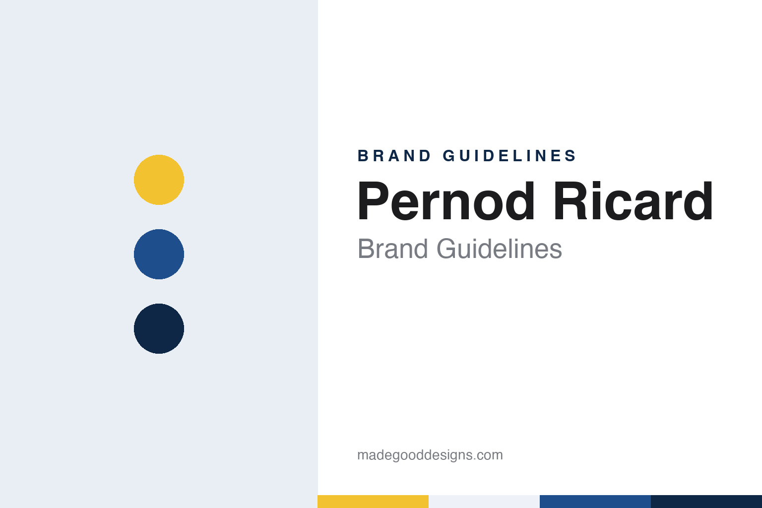
Two constants: a sun, Marseille blue and navy palette and a geometric sans register. Abstract homage — not a Pernod Ricard asset or mark; no logo, icon or wordmark is reproduced.
Two anise houses
Pontarlier, 1805; Marseille, 1932.
Pernod Ricard is two surnames from two rival businesses, set side by side. The older of the two belongs to the Pernod family. Wikipedia says the Swiss distiller Henri-Louis Pernod opened an absinthe distillery in Switzerland in 1797, and that Maison Pernod Fils was founded in Pontarlier, in Franche-Comté in eastern France, in 1805. A separate firm, Société Pernod Père & Fils, opened in Avignon in 1872, and in 1926, Wikipedia says, the distilleries merged to form Les Établissements Pernod. The company launched Pastis 51 in 1951 and in 1965 took over the producer of the gentian bitter Suze.
The younger name came from Marseille. The Boston Globe, in an article by Dennis Hevesi published in August 2012, said Paul Ricard concocted an anise-flavoured aperitif in 1932 in a small shop in Marseille, a mix of licorice and anise that he bottled under his own name as Ricard pastis. Wikipedia and the International Directory of Company Histories, in its 2005 entry, give the same year for the launch of Ricard’s aperitif.
Ricard built the name through publicity as much as through the drink. The Boston Globe said the company used slogans such as “Un Ricard sinon rien”, “A Ricard or nothing”, on yellow-and-blue signs, table mats, drinking glasses and ashtrays. The directory says Paul Ricard set up foundations to sponsor art and cultural activities, backed a yacht race and built a motor-racing track, and that the Circuit Paul Ricard was named in his honour. The surname moved from the label to the café table and on to the racetrack.
Paul Ricard retired in 1968, according to both Wikipedia and the directory. The directory says his son Patrick Ricard had been named general manager in 1967, and the Boston Globe said Patrick was managing director of the Ricard company when it merged with its longtime competitor. By the mid-1970s, the two houses that had sold anise drinks against each other for decades were ready to share a single name.
Colour
Two rivals, one group.
The merger joined the two names in the order of their founding. Wikipedia, in English and in French, dates it to 1975, and the French article places it in December 1975; the Boston Globe also gave 1975 in 2012. The International Directory of Company Histories gives 1974, and it noted that the two firms both supplied aniseed drinks in France; Wikipedia calls them competitors.
The new group kept both surnames whole. There is no ampersand and no initial: Pernod, the name from Pontarlier, comes ahead of Ricard, the name from Marseille. French Wikipedia says that at the time of the merger the Pernod company was based in Paris and the Ricard company in Marseille, and the group today has its head office in Paris. The two original brands kept their own labels, so the same two words appear once as a corporate name and again, separately, on two different bottles.
Leadership passed to the founder’s son. The Boston Globe said Patrick Ricard served as chief executive and chairman of Pernod Ricard until 2008, when he resigned as chief executive but stayed on as chairman. In a 1980 interview with Management Today, quoted by the directory, he said the company was following a policy of buying companies in prime markets because it would take too long to start from scratch and build its own distribution. That policy shaped what the name came to cover.
The directory also records the group’s early purchases outside France: Cusenier of Argentina in 1976, and the Scotch distiller Campbell, whose brands included Aberlour and Clan Campbell. The directory says it bought the maker of Orangina in 1983, and French Wikipedia says the group separated from its soft drinks, Orangina among them, after the Seagram purchase of 2001. The name of two anise houses was now the name of a group with whisky, liqueurs and soft drinks in it.
Typography
Houses, mergers and a sun.
A corporate identity has a different job from a product brand. A product name speaks to the person holding the bottle or the device; a parent name speaks to investors, employees, suppliers and regulators, and it often has to stretch across trades that look nothing alike. A group that sells spirits and beer, or a maker whose catalogue runs from printers to ceramics, needs a name that does not tie it to a single shelf.
That is why parent names tend to fall into a few patterns. Some are contractions of an older, longer name, keeping the sound of a founding place or material while dropping the literal description. Some are the joined surnames of founders or the shortened names of two merged companies. Others are coined from scratch, built from fragments of words in another language so that they carry a mood rather than a meaning, and so that they can be registered as trademarks in many countries at once.
The visual system follows the same logic. A group mark is usually quieter than the marks it owns: a wordmark, a simple symbol, a restrained colour, designed to sit on an annual report, a factory sign and a business card without competing with the product names underneath.
Aa
A geometric sans — after a group name made of two whole surnames. (Specimen set in Montserrat, a sans STAND-IN; NOT the Pernod Ricard logo or any Pernod Ricard typeface.)
Pernod Ricard
From pastis to a house of brands.
Later purchases brought names from Ireland, Scotland and Sweden under the group. Wikipedia says Pernod Ricard acquired Irish Distillers, makers of Jameson, in 1988. In 2001, the Boston Globe said, it bought assets of Seagram, including Chivas Regal and Martell cognac, and Wikipedia says that deal was made jointly with Diageo. In 2005 it bought Allied Domecq, bringing Ballantine’s, Beefeater and Kahlúa, and in 2008 it bought Vin & Sprit, the owner of Absolut, the Boston Globe reported.
Each of those brands came with its own label, colours and history, and the group name sits above them. On a Ricard bottle the surname is the brand; on a bottle of Jameson or Absolut the group name is the owner rather than the label.
The corporate identity has its own symbol. The London consultancy Radley Yeldar, which works under the name RY, says in a case study on its website that it started a refresh of Pernod Ricard’s corporate identity from the group’s sun logo. RY says the concept of conviviality had been central to the company for decades, under the line “Créateurs de convivialité”, or creators of conviviality, but was not coming through strongly in its corporate identity.
The agency says the shape and symbolism of the sun informed a new expression of the “glow” of conviviality, anchored in light and warmth, and that this idea guided a new visual system, including graphic elements, colour and photography. RY says the company now has a new set of guidelines across its communications.
For a design guide, Pernod Ricard shows how two rival family names can be joined without an ampersand, and how a single sun symbol can sit above a portfolio of very different labels. Compare Ricard, Paul Ricard’s blue-and-yellow pastis from Marseille, and Pernod, the older anise name from Pontarlier and Avignon. For this guide we use sun, Marseille blue and navy with a sans, an unofficial interpretation; no product or logo is reproduced.
Explore & save
Keep Pernod Ricard’s identity on hand — save it to a board in the Made Good inspiration library.
Pernod Ricard identity set
Pin the Pernod Ricard sun, Marseille blue and navy palette and the geometric sans register to your own board.