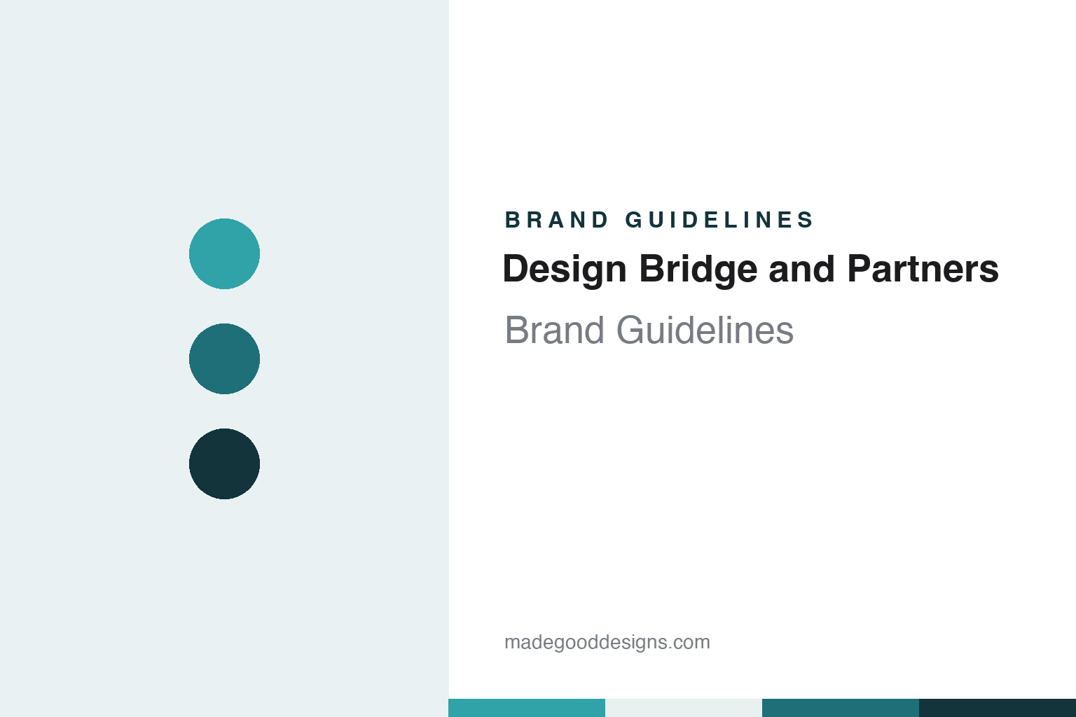
Design Bridge and Partners Brand Guidelines
A 1986 studio name, kept at the front of a 2023 merger.
Aa
Two constants: a harbour teal, lagoon and deep slate palette and a Geometric sans register. Abstract homage — not a Design Bridge and Partners asset or mark; no logo, icon or wordmark is reproduced.
A London studio, privately owned for three decades
London, 1986.
Design Bridge was set up in London in 1986. Design Week, reporting the sale of the consultancy to WPP on 23 August 2017, gave London and 1986 as its place and year of founding. An earlier Design Week item, dated 22 September 2000, named Philip Lawder as one of its co-founders: it reported that Lawder was leaving Design Bridge, the company he had co-founded in 1986, to become marketing director of the packaging and identity agency Brown ID.
For more than three decades the business stayed in private hands. When it agreed to join WPP, its group marketing director Birgitte Woehlk told Design Week that the move was a big change after being privately owned for so long, and that the founders and the managing team had been actively involved in the company’s growth until then. By 2017, the magazine reported, Design Bridge had added studios in Amsterdam, New York and Singapore to its London base, and it was planning an office in Shanghai.
The sale was the consultancy’s own idea. Design Week said Design Bridge had approached WPP directly, citing its ambition to expand into other markets, and Woehlk said the company needed a global partner that could provide extra resources, local knowledge and people. WPP announced the acquisition on 23 August 2017, alongside its half-year results. Under the arrangement described to the magazine, Design Bridge would operate as an autonomous company inside the group, keep the same management team and its London headquarters, and retain creative control over its clients and projects.
Inside WPP it joined a cluster of branding businesses that Design Week listed at the time: Brand Union, The Partners, Fitch, Coley Porter Bell, Landor and Lambie-Nairn. Within weeks, several of those neighbours learned that their names would go. Design Week reported on 15 September 2017 that WPP would merge Brand Union, The Partners, Lambie-Nairn, Addison Group and VBAT into a single new consultancy, and noted that the announcement came a month after the Design Bridge purchase. Design Bridge was not part of that merger. It kept trading under its own name, with its own studios and client list, until the next reorganisation in 2023.
Colour
Bottles, packs and a charity wordmark.
Much of the Design Bridge work reported in the trade press sits on shelves and bottles. In its 2017 acquisition report, Design Week listed Diageo, Unilever, Mondelēz and AkzoNobel, the owner of Dulux, among the consultancy’s clients. In 2022 a WPP spokesperson described Design Bridge’s expertise as lying in consumer goods brands.
A dated example is the rosé The Pale. Design Week reported on 17 May 2021 that Design Bridge had designed the identity and a bespoke bottle for the wine, a range from Sacha Lichine, the winemaker behind Whispering Angel, and that the studio had worked with Lichine on earlier collections from his Château d’Esclans portfolio. The design team described hand-illustrated party scenes inspired by the 1920s, with peacocks, playing cards and guests in period clothing; a bespoke typeface that modernised 1920s-style lettering; and a hot pink and off-white palette chosen to emphasise how pale the wine is. Luke Burley, the studio’s design director for 3D, said the squat, tapered bottle took its cue from traditional whisky decanters.
A year later the studio worked for a charity. Design Week reported on 24 May 2022 that Design Bridge had rebranded the Royal Horticultural Society pro bono, timed to the opening of the RHS Chelsea Flower Show, working with the WPP agency Wunderman Thompson, which concentrated on strategy and the campaign. The wordmark was rationalised so that it reads RHS rather than the society’s full name. Creative director Tim Vary said the team drew on the RHS Lindley Library, where the society’s original tree-root logo appears in mosaic tile and has been worked into the new logo, and on old botanical books whose plant annotations mix different hot-metal typefaces. A panel system, with plant imagery moving upwards through the panels, was introduced to bring consistency across touchpoints.
In both reports the designers traced the new work back to material from the client’s own history: 1920s parties in one case, a library mosaic and old botanical books in the other. In each case that material was turned into lettering, a palette and, for the RHS, a panel layout.
Typography
Founders, owners and a merged name.
A design studio’s name is one of its first design decisions. Some studios carry the surname of a founder, a choice that ties the business to a person and to that person’s reputation. Others pick an invented or borrowed word, which can travel more easily between countries, survive changes of leadership and leave room for the people who join later. Both routes have to work as a wordmark, a web address and a line in a client’s credits.
Because a studio sells the work it does for others, its own brand surfaces are unusual. The studio website is often the main shop window, and its case-study pages do much of the talking: each one sets client work inside the studio’s own grid, typefaces and tone of voice. Job advertisements, talks, social posts and short films about the studio’s process add to the picture.
Offices and partnership structures can also become part of the identity. A second or third office changes how a studio describes itself, and a group of partners or a new owner can change who signs the work. For a designer, the useful lesson is how a studio keeps a consistent voice while showcasing many other brands.
Aa
A geometric sans — after a consultancy whose name joins two parts with a single word. (Specimen set in Manrope, a sans STAND-IN; NOT the Design Bridge and Partners logo or any of its typefaces.)
Design Bridge and Partners
Two consultancies, one name.
The name changed after the merger with Superunion. Design Week reported on 7 July 2022 that WPP would combine Design Bridge with Superunion, the branding consultancy it had formed in 2018 from five of its design businesses, and that the merged company would be called Design Bridge and Partners from the following January. A WPP spokesperson said the aim was a simpler, future-facing offer for clients, pairing Design Bridge’s consumer goods work with Superunion’s enterprise-level branding and brand experience work. Wikipedia says the merger formally took effect in April 2023.
The reasoning behind the name was set out to the magazine in plain terms. The spokesperson said Design Bridge was kept in the new name because it had operated as an established company since 1986, while Superunion had existed for four years. The merger was to happen in every market where the two consultancies operated, and until the end of 2022 they continued as separate entities. John Morris, chief executive of Design Bridge, would carry on in the role at the merged company, and Superunion’s chief executive Jim Prior would become chair. WPP chief executive Mark Read said the union would create new growth opportunities for staff and clients.
Some of the people inside carry the longer history. Design Week interviewed Emma Follett, chief creative officer of Design Bridge and Partners, on 15 October 2026, noting that she had joined as a studio junior in 2000 and had recently been appointed to the board of trustees of D&AD. Asked which object in the studio summed up her taste, she described a version of Manet’s A Bar at the Folies-Bergère made up of Pantone chips, and compared it with the company: one bigger picture, built from many individuals.
For a design guide, Design Bridge and Partners shows how a merged consultancy can keep a founding date inside a new name: the 1986 London studio supplies the front half, and the second half signals the businesses that joined it in 2023. Compare it with the parent group in the WPP brand guidelines and with the 2018 merger told in the Superunion brand guidelines. For this guide we use harbour teal, lagoon and deep slate with a geometric sans, an unofficial interpretation; no product or logo is reproduced.
Explore & save
Keep Design Bridge and Partners’s identity on hand — save it to a board in the Made Good inspiration library.
Design Bridge and Partners identity set
Pin the Design Bridge and Partners harbour teal, lagoon and deep slate palette and the Geometric sans register to your own board.