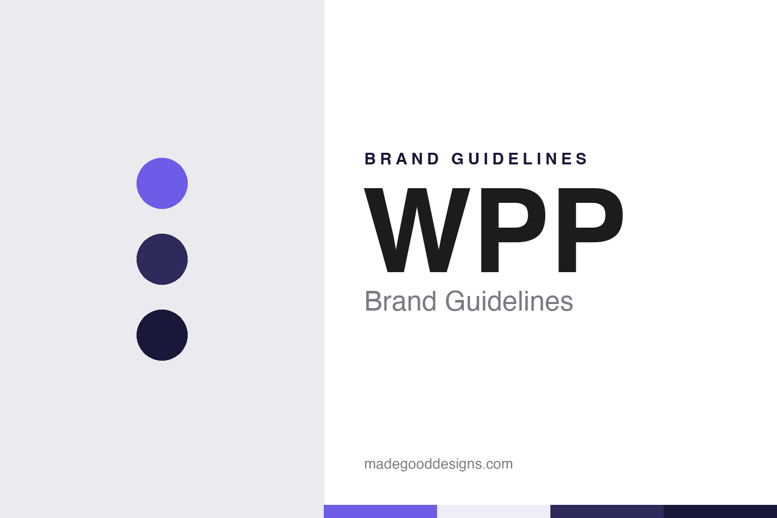
WPP Brand Guidelines
A basket maker’s initials, kept for a communications group.
Aa
Two constants: a violet, indigo and midnight palette and a Grotesque sans register. Abstract homage — not a WPP asset or mark; no logo, icon or wordmark is reproduced.
From wire baskets to a holding company
London, 1985.
The three letters of WPP began as an abbreviation for a manufacturer. Wikipedia says the company was founded as Wire and Plastic Products plc in 1971 and made wire shopping baskets. It was a small listed business with no connection to advertising, and its name described exactly what it produced.
That changed in 1985. Wikipedia says Martin Sorrell and Preston Rabl, looking for a listed company through which to build a worldwide marketing services business, bought a controlling stake in Wire and Plastic Products that year. The German trade weekly Horizont, reporting on 14 April 2018, described the same move from the other side: Sorrell, a former finance chief of Saatchi & Saatchi, created WPP in 1985 by taking over the listed shell of the basket and trolley maker. The company kept the initials of the shell, and the group that grew inside it has carried them ever since.
For a while the group still made things. Wikipedia says WPP became the parent of Picquotware, a maker of teapots and jugs based in Northampton, in 1986; after a fire destroyed the Northampton factory in November 1987, production moved to Burntwood in Staffordshire, and WPP closed that factory on 25 November 2004.
The agency business arrived through acquisitions. Wikipedia says WPP bought J. Walter Thompson, together with the public relations firm Hill & Knowlton, in 1987, and the Ogilvy Group in 1989. Horizont listed Ogilvy, JWT, Y&R and Grey among the international agency networks that Sorrell brought into the group, and said the media agency group GroupM was formed under him.
Sorrell stepped down as chief executive in April 2018, Horizont reported on 14 April 2018. Wikipedia says Mark Read, until then global chief executive of Wunderman, was named chief executive in September 2018, and that Read later sold the original Wire and Plastic Products company that Sorrell had bought. The manufacturer left the group, while its initials stayed on the door.
Colour
A name that sits above agency names.
WPP is a group name rather than an agency name, and much of its work reaches the public under other names. Wikipedia describes WPP plc as a British communications, advertising, public relations, technology and commerce holding company headquartered in London, with a primary listing on the London Stock Exchange. Among the networks and companies it owns, Wikipedia names AKQA, Burson, Hogarth, Landor, Ogilvy, VML and WPP Media, the media business formerly called GroupM. Each of those keeps its own name, its own logo and its own client list.
The parent name has to work in a different setting. It appears on annual reports, investor presentations, the group website and the careers pages, and in press releases announcing mergers and appointments. It is read by clients choosing a partner, by employees in many separate agencies and by shareholders, and less often by consumers.
The group set out a new identity for that audience in December 2018. The Drum reported on 11 December 2018 that WPP had issued a rebrand reflecting the restructuring of the business under Mark Read. The work was handled by Jim Prior, who led the branding agency Superunion, itself formed in 2018 from a merger of WPP branding agencies, and by Jane Geraghty, chief of Landor. Both agencies were part of the group, so the parent was rebranded by its own companies.
The Drum said the new look was designed to play in varying environments and colour palettes, to show how the network could adapt to clients and industry challenges. Prior said the ambition was to present WPP “with the same energy and creativity that we offer to our clients right across the company”. Geraghty said the group now had “an evolved brand and expression of purpose that better reflects who we are as a company”. A new website accompanied the identity, and WPP began describing itself as a “creative transformation” company, a phrase it set out at an investor event in London on 11 December 2018.
The choice of a changing palette rather than a single house colour suits a parent that sits above so many agency identities. The three capitals stay fixed while the colour around them moves.
Typography
Initials, agencies and a moving palette.
Advertising-agency identities are built from unusual raw material. Many agency names began as the surnames of their founders, set side by side or shortened to a run of initials, and over time those initials can become a wordmark that few people read as names at all. Above the agency brands sit holding-company names, which tend to be shorter, more abstract and designed to work on annual reports, stock listings and conference stages rather than on client work.
Because an agency sells ideas rather than packaged goods, its brand surfaces are unusual too. The lobby and reception area act as a shop window for visiting clients and job candidates. House symbols, small objects or colours associated with a founder, can turn up on desks, award shelves and merchandise. Pitch decks, credentials documents and case-study reels carry the identity into rooms the agency does not own, so the type, colour and layout rules have to survive being projected, printed and shared as files.
For a designer, the useful lesson is how a business-to-business identity balances heritage, signalled by founders’ names and dates, against the need to look current to the next client in the room.
Aa
A grotesque sans — after a group name set as three plain capitals. (Specimen set in Archivo, a sans STAND-IN; NOT the WPP logo or any WPP typeface.)
WPP
Mergers and new names.
Inside the group, agency names have been joined and retired as the business has been reorganised. Wikipedia says WPP merged Burson-Marsteller with Cohn & Wolfe to form BCW in February 2018. Under Mark Read, it says, J. Walter Thompson merged with Wunderman to create Wunderman Thompson, and Y&R merged with VML to create VMLY&R. Each merger produced a compound name built from the agencies it combined.
Those compound names did not last long. The Australian trade title Mediaweek reported on 18 October 2023 that WPP had announced the merger of Wunderman Thompson and VMLY&R into a single agency known as VML. It noted that both agencies had been launched in 2018. Jon Cook became VML’s global chief executive and Mel Edwards its global president. Mark Read said in the announcement that the move was another step for WPP “as we continue to reshape our offer for the future, simplify our business and unlock further benefits of scale”.
The VML merger shows how the group treats names. The J. Walter Thompson name, which reached WPP in 1987, passed into Wunderman Thompson in 2018 and then out of use in the agency’s title in 2023. The shorter VML, a name the group already owned, carried on. The holding company’s own name, by contrast, has not changed since it was taken from the basket maker in 1985.
The leadership of the group has also changed. Wikipedia says former BT Group chief Philip Jansen took over as chairman in September 2024, succeeding Roberto Quarta, and that Cindy Rose became chief executive on 1 September 2025, succeeding Mark Read. The three capitals carried on through both handovers.
For a design guide, WPP shows how a group can keep an inherited abbreviation for decades and let its colour do the changing, while the agencies beneath it carry their own names. Compare Ogilvy, the agency WPP has owned since 1989, and Publicis, a Paris-based communications group. For this guide we use violet, indigo and midnight with a sans, an unofficial interpretation; no product or logo is reproduced.
Explore & save
Keep WPP’s identity on hand — save it to a board in the Made Good inspiration library.
WPP identity set
Pin the WPP violet, indigo and midnight palette and the Grotesque sans register to your own board.


