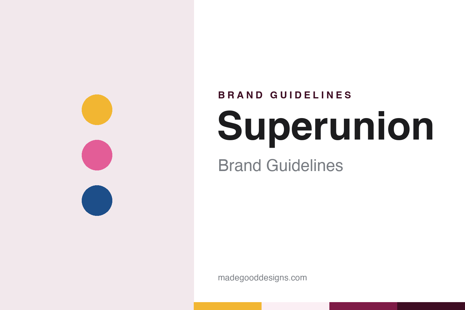
Superunion Brand Guidelines
Five consultancies joined in two halved letters.
Aa
Two constants: a berry, honey and ocean palette and a Lowercase serif register. Abstract homage — not a Superunion asset or mark; no logo, icon or wordmark is reproduced.
Five consultancies under one new name
London, January 2018.
Superunion was a merger before it was a brand. Design Week reported on 15 September 2017 that WPP would combine five of its design and brand consultancies — Brand Union, The Partners, Lambie-Nairn, Addison Group and VBAT — into a single business that had not yet been named. Jim Prior, then chief executive of Lambie-Nairn and The Partners, was to be global chief executive, and Brand Union’s chief executive Simon Bolton executive chairman. The name and branding were promised by the end of the year, with a launch in January 2018.
Each of the five brought a history of its own. Wikipedia traces Brand Union to Sampson Tyrrell, formed in May 1976 by the graphic designers Terry Tyrrell and Sam Sampson and bought by WPP in 1986; the business was relaunched as Enterprise IG in 1996 and took the name Brand Union in October 2007. Lambie-Nairn began as Robinson Lambie-Nairn, which Design Week said was founded in 1976 by Martin Lambie-Nairn and Colin Robinson. The Partners was a London consultancy whose co-founder was David Stuart; Design Week reported in July 2000 that it had been acquired by Young & Rubicam, the advertising group WPP was then taking over. VBAT was based in Amsterdam.
The new name arrived on 23 January 2018. Design Week reported that day that the five consultancies had come together under one brand called Superunion, led by Prior as global chief executive and Bolton as executive chairman, with Greg Quinton, formerly chief creative officer of The Partners, as global chief creative officer. Not every name disappeared: the magazine said four of the five former names would be dropped, while Vbat would continue to operate under its existing name from Amsterdam. The four UK-based teams were to share an office at Brewhouse Yard in London’s Clerkenwell, where Lambie-Nairn and Brand Union already worked.
Prior explained the decision in terms of identity. Four of the five companies, he told Design Week, had already been working closely together under his leadership for three years, and Lambie-Nairn and The Partners had collaborated on a rebrand for the broadcaster ARTE the year before. “A new name is a great way to signal the change we’re going through,” he said, adding that retaining the individual names would have been inconsistent.
Colour
A halved “u” and “n”, and colours in pairs.
Quinton led the branding of the new consultancy, and Design Week described its parts in detail in January 2018. The logo set the name in a lowercase serif, drawn as a bespoke typeface that Quinton described as human and approachable. In the word, the “u” and “n” were cut in half so that they look as if they belong to the same character — a device meant, Quinton said, to represent unity by bringing two things together in an unexpected way to make one, as the merger itself had done.
The colour system worked in pairs. Design Week reported a bright palette of optimistic, vibrant shades used together in twos, giving as examples “honey and bee yellow”, “berry and bubblegum pink” and “ocean and wave blue”. Photography and imagery repeated the idea of pairs: objects with similar shapes were set side by side, such as a puffer fish and a round bubble of bubblegum, to make something that Quinton called hyper-real. The scheme was intended to be flexible enough to work across the consultancy’s markets around the world.
Two further typefaces sat under the logo. According to the same report, the serif Cormorant was used for headings and the sans-serif National Two for body copy. The identity was to roll out across marketing and print materials, merchandise, online channels and the interiors of the offices during January 2018, with animated versions of the logo shown at launch.
The identity also had to explain a new business to its own staff. Quinton told Design Week that the merger was not an exercise in cost-cutting but a process of building, and that clients wanted creativity together with the ability to scale.
Typography
A merger, a logo and a retired name.
A design studio’s name is one of its first design decisions. Some studios carry the surname of a founder, a choice that ties the business to a person and to that person’s reputation. Others pick an invented or borrowed word, which can travel more easily between countries, survive changes of leadership and leave room for the people who join later. Both routes have to work as a wordmark, a web address and a line in a client’s credits.
Because a studio sells the work it does for others, its own brand surfaces are unusual. The studio website is often the main shop window, and its case-study pages do much of the talking: each one sets client work inside the studio’s own grid, typefaces and tone of voice. Job advertisements, talks, social posts and short films about the studio’s process add to the picture.
Offices and partnership structures can also become part of the identity. A second or third office changes how a studio describes itself, and a group of partners or a new owner can change who signs the work. For a designer, the useful lesson is how a studio keeps a consistent voice while showcasing many other brands.
un
A lowercase serif — after a consultancy logo set in bespoke lowercase serif letters. (Specimen set in Cormorant Garamond, a serif STAND-IN; NOT the Superunion logo or its bespoke typeface.)
Superunion
Idents, a parent group and a retired name.
Lambie-Nairn brought a long record in broadcast branding into the merger. Design Week, in a tribute published in January 2021, credited Robinson Lambie-Nairn with the Channel 4 “blocks” logo and identity at the channel’s launch in 1982, and said Martin Lambie-Nairn became consultant creative director for the BBC brand in 1990, a post he held for twelve years; the magazine had reported in November 2001 that BBC2 was unveiling a set of idents created by Lambie-Nairn. Under the Superunion name, Design Week reported on 10 September 2019 that BBC Two had added six idents made by Superunion and an in-house team, following a set launched in 2018, and on 3 February 2022 that BBC Three’s return as a broadcast channel used idents and hand-shaped characters named Captain, Spider and Pointer, designed by BBC Creative and Superunion.
Other dated projects reached beyond broadcasting. In December 2018, Design Week reported, Superunion and Landor, together with WPP’s in-house team, rebranded the parent group itself, with a logo made of many parts. In May 2021 the magazine reported a new identity for the housing charity Shelter by Superunion; design director Jonathan Brodie said the team kept the roof shape of the letter “h” from the previous mark, designed by Johnson Banks in 2004, as a symbol of the charity’s cause.
The name lasted a little over five years. Design Week reported on 7 July 2022 that WPP would merge Superunion with Design Bridge to become Design Bridge and Partners the following January, with Jim Prior as chair and Design Bridge’s John Morris as chief executive; a WPP spokesperson said Design Bridge was kept in the name because it had operated since 1986, while Superunion had existed for four years. Wikipedia says the merger formally took effect in April 2023. Since then the Superunion name has been retired, and its teams work as part of Design Bridge and Partners.
For a design guide, Superunion shows how a merged consultancy can turn its own merger into its identity, from two halved letters to colours that always arrive in pairs. Compare it with the parent group in the WPP brand guidelines and with the company it became in the Design Bridge and Partners brand guidelines. For this guide we use berry, honey and ocean with a serif, an unofficial interpretation; no product or logo is reproduced.
Explore & save
Keep Superunion’s identity on hand — save it to a board in the Made Good inspiration library.
Superunion identity set
Pin the Superunion berry, honey and ocean palette and the Lowercase serif register to your own board.