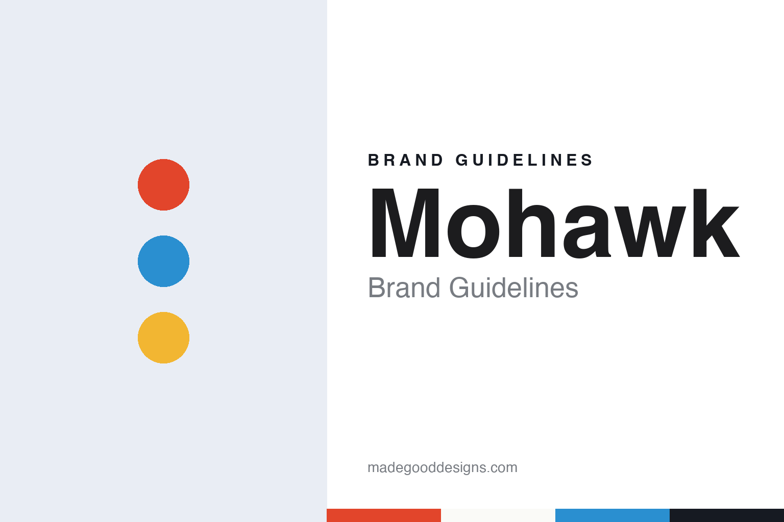
Mohawk Brand Guidelines
A paper maker that turned its initial into a toy.
Aa
Two constants: a multicolour red, blue and yellow palette and a friendly grotesque sans register. Abstract homage — not a Mohawk asset or mark; no logo, paper or wordmark is reproduced.
A mill on the Mohawk River
Cohoes, New York, from 1931.
Mohawk is a paper maker in upstate New York. The trade magazine PaperAge described the company on 23 February 2024 as Cohoes, New York-based Mohawk Fine Papers, with a paper mill and converting plant in Cohoes, a converting facility for envelopes in South Hadley, Massachusetts, and a converting plant in Ashtabula, Ohio, known as the Saybrook Converting Center.
The company’s age is fixed by its own announcements. A Mohawk release published by the design news site Dexigner on 18 April 2012 called it an 81-year-old company, which places its start in 1931. The same release described a business that was reinventing itself to work in a digital world.
Before 2012 the company’s name included its product. It traded as Mohawk Fine Papers, and the name still appears in that form in trade reporting. The 2012 release explained that when Mohawk was only a papermaker, its logo was seen mainly on four kinds of object: advertising, swatchbooks, brochures and ream wraps.
The company also owns other paper names. PaperAge reported in 2024 that Mohawk owned the Crane Stationery brand, which covers papers for personalised stationery, wedding invitations and holiday cards. The 2012 release named Superfine and Strathmore as signature Mohawk brands, each with an identity of its own, and Pentagram lists a refresh of the Strathmore Paper brand among its projects alongside its Mohawk work.
Mohawk’s identity has long been tied to one design office. The 2012 release said Pentagram had been Mohawk’s primary brand agency for more than twenty years, and that Pentagram had redesigned the Mohawk logo in 1991 and again in 2002. The partner on that relationship was Michael Bierut of Pentagram’s New York office.
Colour
The 2012 “M” and a new way to sample paper.
A larger change to the brand came in April 2012. According to the release carried by Dexigner on 18 April 2012, the company dropped “Fine Papers” and became simply Mohawk, and unveiled a new logo designed by Pentagram. Pentagram’s project page credits Michael Bierut as partner, with Katie Barcelona, Joe Marianek and Aron Fay on the team.
The new mark is based on the letter M. The release said it works as a monogram for the name Mohawk, and is also built to recall the papermaking and printing processes, both of which involve paper moving around cylinders. Bierut linked the mark to the idea of connection. “Whether it’s for a small book of photos featuring your niece and nephew or for a giant global corporation, it’s about communication,” he said, and he called the logo “toy-like”, saying the shape encourages experimentation.
Colour was central to the system. The release said the M would appear in different colours and configurations depending on who Mohawk was talking to, where and when. Bierut said the company wanted to show that a business with Mohawk’s history could still change the way it looked “the next time you see it, and the time after that”. Launch assets included colour variations of the core logo and several patterns built from the shape of the M, with more expected over time.
The system had to work online as well as on paper. Bierut said that in some cases, such as Mohawk’s Felt & Wire online venture, the logo acts as an “endorsing brand” rather than a headline, and that it needed to shrink to a button and sit beside a web address. The release also mentioned partnerships with Blurb.com and Moo.com, and a new website, MohawkConnects.com.
Mohawk’s communications head, Laura Shore, said in the release that the company also commissioned other studios for individual projects, naming VSA Partners, AdamsMorioka, CarboneSmolan, Volume Inc., Tomorrow Partners and Aurora Design, so the system had to give those designers room while setting a direction.
The same launch changed how Mohawk showed its papers. The release described a new product selector designed by Michael McGinn Design Office using the Pentagram brand: three accordion-fold charts holding oversize paper chips, sorting Mohawk papers into three groups by performance, character and value, with a booklet titled “The New Mohawk”. McGinn said the difference from earlier sampling was about 25 inches of shelf space.
Typography
A papermaker’s initial as a building block.
A colour system or a paper mill shows its identity in places a consumer brand rarely has to think about. The first is the swatch book or fan deck: a bound set of printed chips or strips, each carrying a reference code, that a designer can hold against a sample or pass to a printer. Its binding, typography and order of colours are often the most widely handled object a colour company makes.
The second surface is naming. A colour name or a paper name has to be distinct, easy to say and stable enough to sit in a specification, a print order and a design file for years. Numbers and codes do the precise work, while names give a range a voice.
Third come sample packs and promotional books. Paper makers have long sent designers printed demonstrations showing how a stock takes ink, foil or embossing, and these pieces work as both catalogue and portfolio.
Finally, the paper itself can carry a mark. Watermarks, ream wrappers, box labels and swatch covers put a name in front of printers and buyers every time a sheet is unpacked, so they form part of the brand as much as any logo.
Mm
A friendly grotesque sans — a nod to the open, modular M that Pentagram drew for Mohawk in 2012. (Specimen set in Work Sans, a sans STAND-IN; NOT the Mohawk logo or any Mohawk typeface.)
Mohawk
A changeable mark and a change of owner.
Mohawk’s identity since 2012 rests on one idea: a single letter that can change colour and pattern while staying recognisable. Pentagram says the logo was applied to advertising, swatchbooks, brochures and ream wraps, as a building block in a system with many colour variations and patterns. Bierut said the hardest part of the job was cutting down all the colours and combinations that worked to a practical number for the launch.
The mark sits alongside the company’s product names rather than replacing them. In the 2012 release Bierut described the M as an ingredient that could stand alone or sit next to the word Mohawk, and next to the identities of Superfine, Strathmore and Felt & Wire.
The business behind the mark changed hands in 2024. PaperAge reported on 23 February 2024 that the Italian specialty paper maker Fedrigoni had announced the acquisition of certain assets of Mohawk Fine Papers, through a new subsidiary set up for the purpose, in a sale process started by a financial institution. The magazine noted that the two companies had already entered a manufacturing partnership in September 2022. Fedrigoni’s chief executive, Marco Nespolo, said the deal would let the group make and distribute its own papers in North America and widen access to Mohawk papers internationally.
For a design guide, Mohawk shows how a paper maker can turn its initial into a flexible system of colours and patterns, and how sampling tools can carry a brand as strongly as a logo. It is worth comparing with Pentagram, the studio behind its marks since 1991, with Fedrigoni, which bought its assets in 2024, and with Pantone, whose swatch books do similar work for colour. For this guide we use press red, cylinder blue and ream yellow with a friendly grotesque sans, an unofficial interpretation; no product or logo is reproduced.
Explore & save
Keep Mohawk’s identity on hand — save it to a board in the Made Good inspiration library.
Mohawk identity set
Pin the Mohawk press red, cylinder blue and ream yellow palette and the grotesque sans register to your own board.