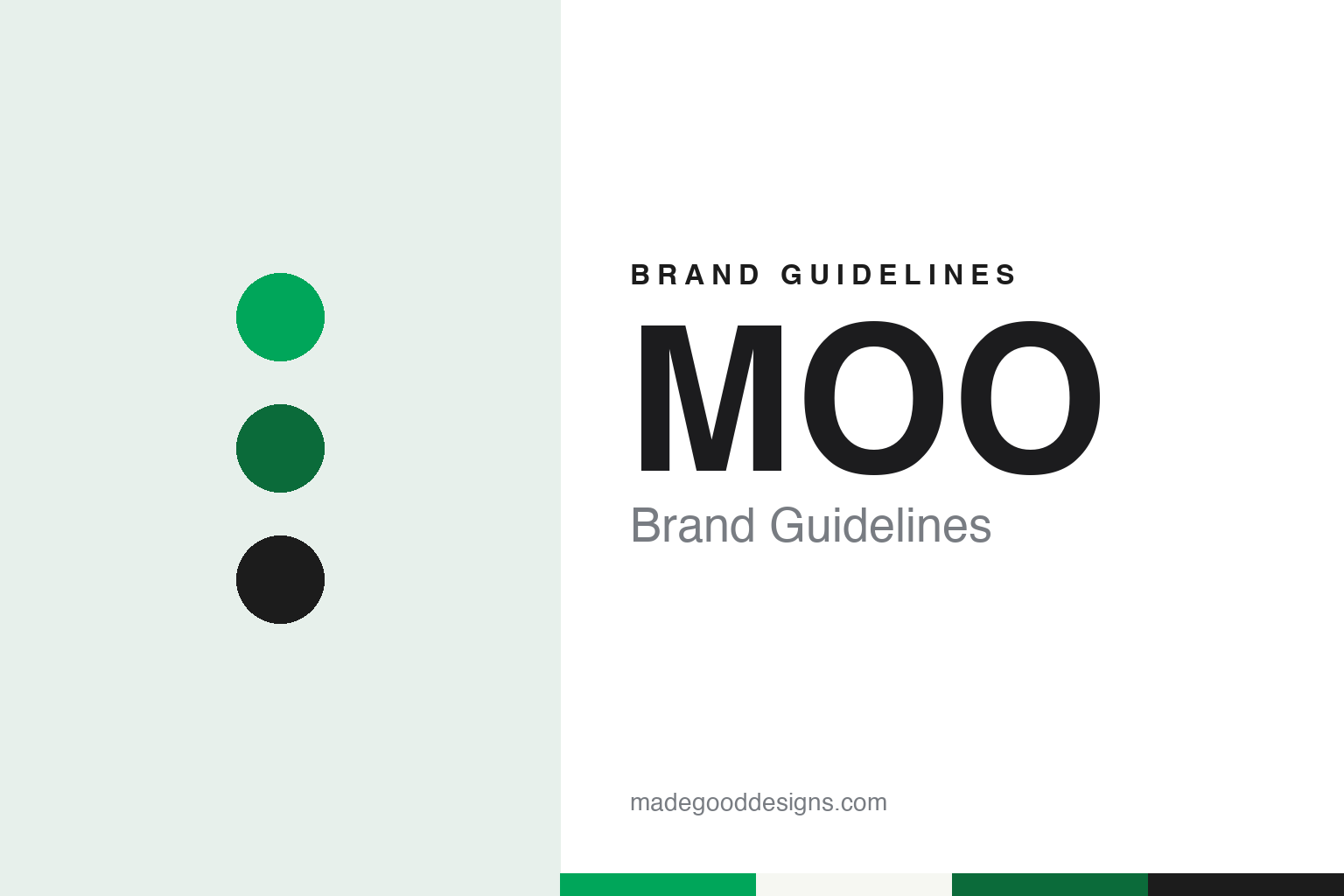
MOO Brand Guidelines
A business card that points to a person online.
Aa
Two constants: a card green, deep green and ink palette and a geometric rounded sans register. Abstract homage — not a MOO asset or mark; no logo, icon or wordmark is reproduced.
An idea at a design company
From Imagination to Moo.com, 2002 to 2006.
MOO began as one person’s idea about what a business card could do. In an interview with HuffPost UK published on 10 December 2012, the founder, Richard Moross, described the route that led him there. In 2000 he was working at the BBC in programme finance management. He left to join an internet business his brother had started, a site gathering local independent businesses, which closed in 2001. After a spell of consulting work he wanted a job closer to design, and in 2002 he joined Imagination, where he helped with business pitches and with research for design projects.
The idea for the company came to him there, Moross told HuffPost UK, during a night when he could not sleep. He showed it to Imagination’s chief executive, but it was not the firm’s focus, and in 2004 he left to pursue it on his own. He described the product as a consumer item that worked like a business card. Everyone knew how a business card worked, he said, but cards were still seen as formal things, and he wanted his to act more as a key that unlocked information about a person online. Printing, in his words, was the mechanism that delivered the product.
The original name did not last. Moross said the cards were initially called Pleasure Cards, which he called a bad idea in hindsight, and that some people assumed he was starting a club and handing out membership tokens. An angel investor backed the business in August 2004, and it launched in February 2005. As part of the launch, Moross said, he sent cards printed with people’s own names and contact details to people in the media, to businesses he found interesting and to people he admired.
The response taught him something about the brand. Moross told HuffPost UK that people did not like the Pleasure Cards name or the website, but they did like the idea of putting images and photographs on their cards. He concluded that the concept had a future if the brand changed, and he began to look for a way to relaunch it.
Colour
Moo.com, Flickr and a card for the web.
The relaunch came through a photo-sharing site. Moross told HuffPost UK in 2012 that it was only after he got in touch with Flickr that the company began to reimagine its brand, and that the Flickr tie-up drew interest from investors, including people in the United States. New investment followed, and the business launched as Moo.com in September 2006. TechCrunch, reporting on 20 September 2012, named the backers of 2006 as Atlas, Index and the Accelerator Group.
The name itself has no hidden meaning. Asked where it came from, Moross told HuffPost UK there was no reason beyond the name being short, memorable, inoffensive, available, friendly and funny. People often hoped for a story about a cow, he said, but there isn’t one. The name was not originally his either: the company bought it from a man in Seattle.
The product range widened from cards. TechCrunch wrote in 2012 that Moo.com had built its business on business cards designed online, and had since expanded into printed products such as postcards and stickers, along with partnerships with Flickr and Facebook. Moross told HuffPost UK that the company had started as a consumer business but had come to sell mainly to businesses, and that it opened an office in the United States in 2008.
In 2012 MOO made a move back towards the screen. TechCrunch reported on 20 September 2012 that Moo.com was buying all the assets of Flavors.me, a site where people built personal online profiles, from Hii Def Inc., including the brand, the site, its technology and its intellectual property. Hii Def kept its other business, Goodsie. Moross, described as chief executive and founder, said the company had been looking at a move into digital for some time. “Despite being a printer, the fundamentals of our business are around identity,” he told TechCrunch.
Typography
A short name for a small card.
For a print-service brand, the identity is not confined to a logo on a homepage. It is carried through a sequence of moments that a customer passes through, often without noticing that each one has been designed. The order flow is the first of these: the upload screen, the template picker, the preview window and the progress bar all speak in the brand’s type, colour and tone of voice, and they set expectations long before anything is printed.
The proof is the second moment. A digital proof, a soft-proof warning about low-resolution images or a printed sample sent ahead of a larger run is where the service shows how carefully it handles someone else’s work, and the language around it matters as much as the layout.
Paper samples and swatch packs make the brand tangible. Stock names, finish labels and the small card that explains weight and coating turn technical choices into something a customer can hold and compare.
Finally there is delivery. The shipping box, the tape, the protective sleeve, the packing slip and any insert card are often the only physical contact a customer has with an online printer, so they become the most direct expression of the identity. Designers studying the category should look at these surfaces together, as one continuous system rather than as separate pieces.
Aa
A geometric rounded sans — after the circular shapes MOO says connect its typeface Fellix to its logo. (Specimen set in Outfit, a sans STAND-IN; NOT the MOO logo or the Fellix typeface.)
MOO
Green, rounded type and a 2024 refresh.
MOO’s own description of its look comes from a post on its company blog dated 1 March 2024, titled “Readying the MOO brand for a new era”. The company says it had recently updated its brand identity, having not revisited its own brand for about eight years, and that it worked with the design agency Anagram on the new look. MOO says the work covered design, colour palette, tone of voice, illustration and photography, and that it would roll out across social channels, emails and banners at the outset, and over time on packaging and on moo.com.
The company describes what it was moving on from. MOO says it started out to shake up the staid world of print, with bold colours, friendly rounded typography and a personality unlike a typical business brand. Over time, it says, the bold, flat colour backdrops and plinths that helped make its name were taken up by competitors, and the look became less ownable.
Colour stays at the centre. MOO says that “in a corporate ocean of blue, green is still our thing”, and that it has gone a little bolder so the green stands out on the smallest screens. It says the aim is to use its core brand colour more consistently, with a supporting palette designed to sit alongside photography and new product colours.
The type and pictures changed too. MOO says it introduced a new typeface, Fellix, chosen because its circular shapes join neatly onto vertical stems in a way that sits with the MOO logo. Its photography, the company says, now turns outwards to show the people who use MOO, while product shots are more closely cropped with cleaner lines. It also lists new illustrations and icons and more emphasis on motion design.
For a design guide, MOO shows how a short name, chosen for being memorable, can carry a brand built on a colour and a rounded letterform, and how a printer can treat its own business card as the product. Compare Blurb, another print-on-demand service built around the web, and Vistaprint, which also began with printed cards ordered online. For this guide we use card green, deep green and ink with a sans, an unofficial interpretation; no product or logo is reproduced.
Explore & save
Keep MOO’s identity on hand — save it to a board in the Made Good inspiration library.
MOO identity set
Pin the MOO card green, deep green and ink palette and the geometric rounded sans register to your own board.