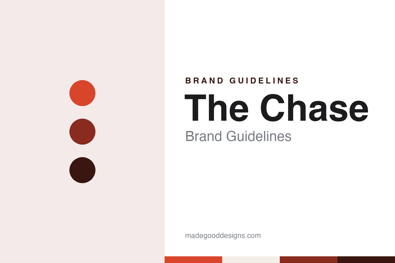
The Chase Brand Guidelines
A wooden elephant, a typesetter and a studio outside London.
Aa
Two constants: a card red, brick and oxblood palette and a Grotesque sans register. Abstract homage — not a The Chase asset or mark; no logo, icon or wordmark is reproduced.
A design group in Manchester
A typesetter, a teacher and a freelance partner, 1986.
The Chase began in Manchester in 1986. Design Week, in a studio profile dated 19 November 2012, said the consultancy was established in Manchester by Ben Casey in 1986, and named Lionel Hatch as co-founder and director. Casey gave his own account in an interview with designboom published on 15 May 2012. He said he was working in education at the time, and that a friend who ran a typesetting company called Quick Brown Fox had been trying to persuade him to set up a design group in Manchester.
Casey told designboom that many people in the business he discussed the plan with doubted that a design company could succeed outside London. He went ahead regardless and approached Hatch, a freelance designer whose work he admired, who agreed to join him. He also recruited two young designers he knew from his teaching days at Preston Polytechnic: Hugh Adams, then at Pentagram, and Jim Williams, who worked in advertising at Collett Dickenson Pearce. Casey said it was CDP’s advertising, rather than the work of a graphic design company, that shaped the studio’s thinking in those years.
The early structure did not last. Casey told designboom that the company got off to a quick start, but that after a couple of years its parent company, QBF, went into receivership. He and Hatch then bought The Chase from the receivers, in a recession, and Casey said the experience taught them how to run a tight ship. Design Week listed Hatch as co-founder and director in 2012, and described Casey as co-founder and director in 2014.
The studio’s opening piece of self-promotion set out its method. Casey said that with no portfolio or case studies, the founders needed something that showed their approach. Driving home one evening, he heard a radio story about a woodcarver in India who, asked how he made elephants from blocks of timber, said he simply cut away the wood that did not look like an elephant. The Chase sent out a mailer with a wooden elephant in 1986 to announce its Manchester office, and Casey called it the project that had guided the studio’s thinking ever since.
Casey’s link to the Preston area runs through the record. Design Week said on 14 July 2014 that he is from Preston, described him as The Chase’s co-founder and director, and said he was also head of the School of Graphic Design at the University of Central Lancashire.
Colour
Football, water, dogs and stamps.
The designboom interview of May 2012 walked through dated work from the studio’s archive. For Preston North End football club, The Chase produced stationery in 1991 that linked small illustrations to everyday correspondence and football phrases; a yellow card was added to invoices, followed by a red card when payment was overdue. In 1997, at the club’s Deepdale stadium, the seating of a stand was treated like pixels to form a large portrait of Alan Kelly, after whom the stand was named.
Other projects in the same archive include an identity and advertising for Yorkshire Water in 2002, a football bag the same year, an annual report for Manchester Dogs’ Home in 2003 that combined the report and accounts with fundraising information, and a 2006 diary for the same charity built around the Chinese year of the dog. In 2004 the studio designed a book on coastal erosion by the photographer Jason Orton, in which the last pages and the back cover were themselves made to look eroded.
Royal Mail appears several times. Casey’s interview showed in-store vinyl promotions for a Royal Mail year pack of stamps in 2008 and Royal Mail collectibles packaging in 2011, and a self-promotional Christmas card from 1993 whose stamps added up to the price of first-class post. Design Week listed Royal Mail, the BBC and D&AD among the studio’s clients in its 2012 profile.
Work for the design world itself features too. In 2010 The Chase produced 26&26, a week-by-week calendar showing 53 typefaces from FontShop, Fontworks and Atomic Type, each chosen by a different designer or typographer. In 2011 it made promotional material for the D&AD graduate scheme, and for the BBC Wildlife Fund it produced Almost Extinct, which asked people to cross off a different endangered species each day of the year. A timeline in the café at Lowther Castle followed in 2012.
Casey described the change in the business over that period. He told designboom that technology had transformed how the studio worked and opened new media channels, and that it had moved from being a team of graphic designers to a creative consultancy with a more proactive relationship with clients.
Typography
Founders, a buy-out and three offices.
British design studios often take their names from the people who started them. Two surnames joined by an ampersand, a single surname with “Studio” in front, or a founder’s name set entirely in lowercase all appear across the field. Each form signals something about the practice behind it: a pairing of surnames puts a partnership at the front, while a lowercase name can read as plain and unforced next to the capitals of corporate clients.
The ampersand itself is a recurring device. It can join two founders, stand in for a word inside a name, or become a small piece of lettering that a studio redraws for its own stationery and website. Because it is a character with many historical shapes, a studio can make it its own without inventing a symbol from scratch.
Beyond the name, studios build their identities through what they make for themselves. Self-initiated projects, printed books about the studio’s work, posters for talks and exhibitions, and short-run publications all act as brand surfaces. Alongside the case studies on a website, these pieces show how a practice thinks when no client is setting the brief.
Aa
A grotesque sans — after the studio’s plain, idea-first typography. (Specimen set in Archivo, a sans STAND-IN; NOT The Chase logo or any The Chase typeface.)
The Chase
Preston, a civic brand and the offices today.
The Chase expanded beyond Manchester while keeping it as its base. Casey told designboom in 2012 that the main office was in Manchester, that the company also had an office in London, and that in keeping with its original plan of taking design services out into the provinces it had opened an office in Preston. Design Week’s profile of November 2012 described the studio as working across branding, digital, exhibitions and environments, packaging and print from Manchester, London and Preston, and named Peter Richardson, Stephen Royle and Richard Scholey as creative directors.
Preston became the setting for civic work. Design Week reported on 14 July 2014 that Casey had led a rebrand of Preston City Council. It said that in 2013 he had designed the Preston Guild City place brand, intended to raise the profile of the city, and that he had then updated the council’s logo to bring it into line with that brand. The magazine said a gradual roll-out was under way across buildings, vehicles, clothing and stationery. It added that Casey had worked on many projects in the city, including Preston North End’s Deepdale stadium and the original National Football Museum.
Casey’s statements about the craft are consistent across the interviews. He told designboom that the key part of the process was getting agency and client to agree on a precise brief, because that takes much of the subjectivity out of judging the work, and that the part he enjoyed was cracking the concept. He said designers should keep observing, because concepts do not come out of an empty tank, and that enthusiasm was the one quality that could not be taught.
The company still trades under its own name. Its website, checked in October 2026, presents it as The Chase Creative Consultants and lists contacts in Manchester and in Soho, London. Casey and Hatch have owned The Chase since buying it from the receivers of QBF in its early years, as Casey described in 2012.
For a design guide, The Chase shows how a studio can make one early idea, cutting away what does not belong, the rule for decades of work in the north of England. Compare Mytton Williams and Studio Sutherl&, two other UK studios in this collection. For this guide we use card red, brick and oxblood with a sans, an unofficial interpretation; no product or logo is reproduced.
Explore & save
Keep The Chase’s identity on hand — save it to a board in the Made Good inspiration library.
The Chase identity set
Pin The Chase card red, brick and oxblood palette and the Grotesque sans register to your own board.