Studio Sutherl& Brand Guidelines
A surname that ends in an ampersand.
Aa
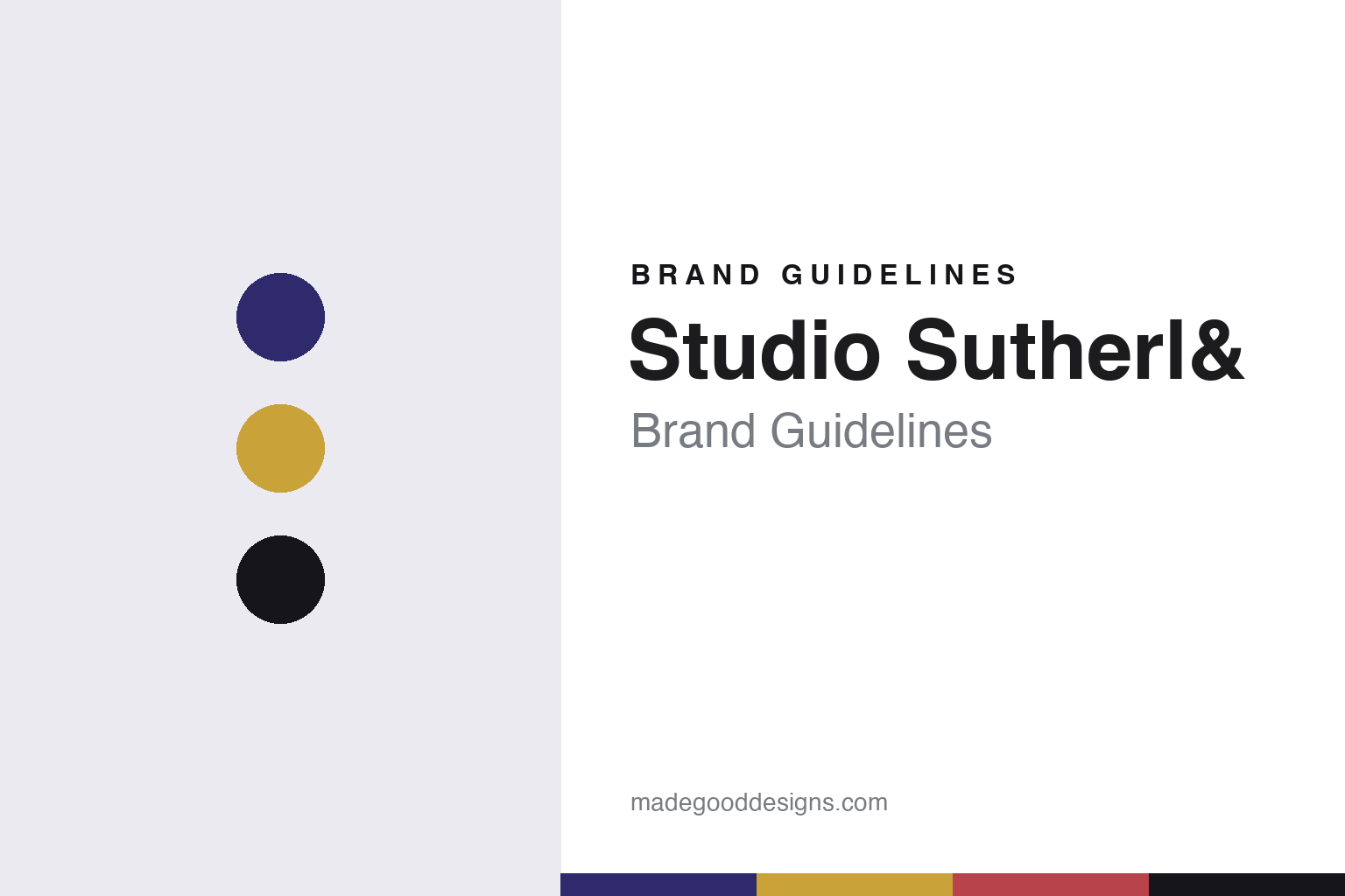
Two constants: an indigo, gold, red and black palette and a book serif register. Abstract homage — not a Studio Sutherl& asset or mark; no logo, icon or wordmark is reproduced.
From Hat-Trick to a studio of one
Jim Sutherland’s route to his own name, 2001 to 2014.
Studio Sutherl& is the studio of the British graphic designer Jim Sutherland, and its story starts at another London consultancy. Design Week reported on 7 April 2014 that Hat-Trick Design had been set up in 2001 by Sutherland, Gareth Howat and David Kimpton, and that Kimpton had left in 2009. The same report, by Angus Montgomery, said that Sutherland was leaving Hat-Trick at the end of that month, and that the consultancy would continue under Howat with its existing team, clients and projects.
The report set out what Sutherland planned to do next. He told Design Week that he would take a sabbatical of nine months to work on personal projects, and then set up his own consultancy to take on commercial work. He explained that he had been doing a lot of personal projects and enjoying them, and that when he gave talks or presented to students, around half of the work he showed was personal work. Looking back on Hat-Trick, he described the previous thirteen years as “incredibly full-on”. Howat told the magazine that the move was amicable and wished him well.
That interest in other designers’ thinking was on record well before the move. In June 2002, during his Hat-Trick years, Design Week printed a short piece by Sutherland on the work of Stefan Sagmeister. In it he described seeing Sagmeister’s poster for the American Institute of Graphic Artists at D&AD, hearing him lecture at the Design Museum, and reading his book Made You Look, which he said was not just a portfolio but had something to say about Sagmeister’s approach. He singled out the honest diary notes in the book and the idea that design can and should make a difference to society.
Colour
An ampersand in the surname, and a set of stamps.
The studio’s name is itself a piece of lettering. It takes the founder’s surname and replaces its last three letters, “and”, with an ampersand, so that “Sutherland” becomes “Sutherl&”. When Design Week reported the studio’s Royal Mail commission on 16 September 2016, it used that spelling throughout the headline and opening line, calling the studio Studio Sutherl& and even styling the founder as “Jim Sutherl&”. In later reports, in 2018, 2020 and 2021, the magazine spelled the name out as Studio Sutherland, so both forms appear in print.
The 2016 job was a set of six stamps for Royal Mail themed on the murder mysteries of Agatha Christie, each based on a separate novel. Design Week, in a report by Tom Banks, said the stamps combined visual illusions with print techniques to give hidden clues to the solutions. Sutherland told the magazine that heat-sensitive ink revealed a killer behind a curtain on a train, and that Poirot and Hastings investigating a poisonous crime scene formed a skull. One stamp needed a magnifying glass to read its micro text; another needed ultraviolet light.
The stamps also used positive and negative space to point towards the answers. Sutherland said there were lots of hidden clues to discover, with and without magnifying glasses. He worked closely with the illustrator Neil Webb, who told Design Week that the two of them sketched and selected compositions together to convey the drama “with a visual twist”, and that as a fan of noir and of the design of that era he saw the brief as a dream job. The set marked the anniversary of Christie’s birth on 15 September 1890.
Typography
Names, ampersands and self-initiated work.
British design studios often take their names from the people who started them. Two surnames joined by an ampersand, a single surname with “Studio” in front, or a founder’s name set entirely in lowercase all appear across the field. Each form signals something about the practice behind it: a pairing of surnames puts a partnership at the front, while a lowercase name can read as plain and unforced next to the capitals of corporate clients.
The ampersand itself is a recurring device. It can join two founders, stand in for a word inside a name, or become a small piece of lettering that a studio redraws for its own stationery and website. Because it is a character with many historical shapes, a studio can make it its own without inventing a symbol from scratch.
Beyond the name, studios build their identities through what they make for themselves. Self-initiated projects, printed books about the studio’s work, posters for talks and exhibitions, and short-run publications all act as brand surfaces. Alongside the case studies on a website, these pieces show how a practice thinks when no client is setting the brief.
&
A bookish serif with a generous ampersand — after a studio whose name ends in one. (Specimen set in Libre Caslon Text, a serif STAND-IN; NOT the Studio Sutherl& logo or any studio or client typeface.)
Studio Sutherl&
Museums, churches and a collective, dated.
Cultural clients follow in the dated record. Design Week reported on 23 August 2018 that Studio Sutherland had designed the branding, marketing and wayfinding for St Albans Museum + Gallery, which had opened in June that year in the city’s former town hall. Jane Wentworth Associates wrote the brand strategy, Mowat & Co worked on interiors and exhibition spaces, and John McAslan + Partners restored the building. The identity drew on the city’s crest, a blue shield with a yellow cross: four triangles leave a cross-shaped space at the centre of the logo, and the name is set at a 45-degree angle, turning the “+” in the name into an “x”. The serif used is Kingfisher by Jeremy Tankard, and the palette is indigo and gold. Sutherland said the triangles were used to highlight images, fold into caption stands and come out of the walls as wayfinding, and that the studio even designed bottles for a museum ale brewed by Farr.
In August 2020 Design Week reported a new identity for the Churches Conservation Trust, for which the studio had pitched the previous year. Sutherland said the old identity used a generic arch; the new one offers a set of arches, including Gothic, Trefoil, Multifoil and Ogee, so that a local church can pick the shape that suits it. Volunteers sent in photographs of church doors and windows, three-word lines such as “Saints, Sinners, Sleepovers” run on posters, and a children’s trail with the illustrator Rebecca Sutherland turned the arches into animals such as Belfry the Bat, produced as stickers, rubber stamps and notebooks.
On 2 February 2021 the magazine reported the studio’s identity for Perspectiva, an organisation that emerged in 2015 from conversations between Jonathan Rowson and Tomas Björkman. Multiple logotypes were made by setting the name in different directions on an isometric grid, alongside a headline typeface, book covers and a set of “perspective icons” that include question marks, ampersands and exclamation marks, in purple, blue, pink and grey.
For a design guide, Studio Sutherl& shows how a one-person studio can make its own name a typographic idea and then carry that kind of single, clever device into stamps, museums and churches. Compare the London studios johnson banks and Why Not Associates. For this guide we use indigo, old gold, stamp red and black with a book serif, an unofficial interpretation; no product or logo is reproduced.
Explore & save
Keep Studio Sutherl&’s identity on hand — save it to a board in the Made Good inspiration library.
Studio Sutherl& identity set
Pin the Studio Sutherl& indigo, gold, red and black palette and the book serif register to your own board.