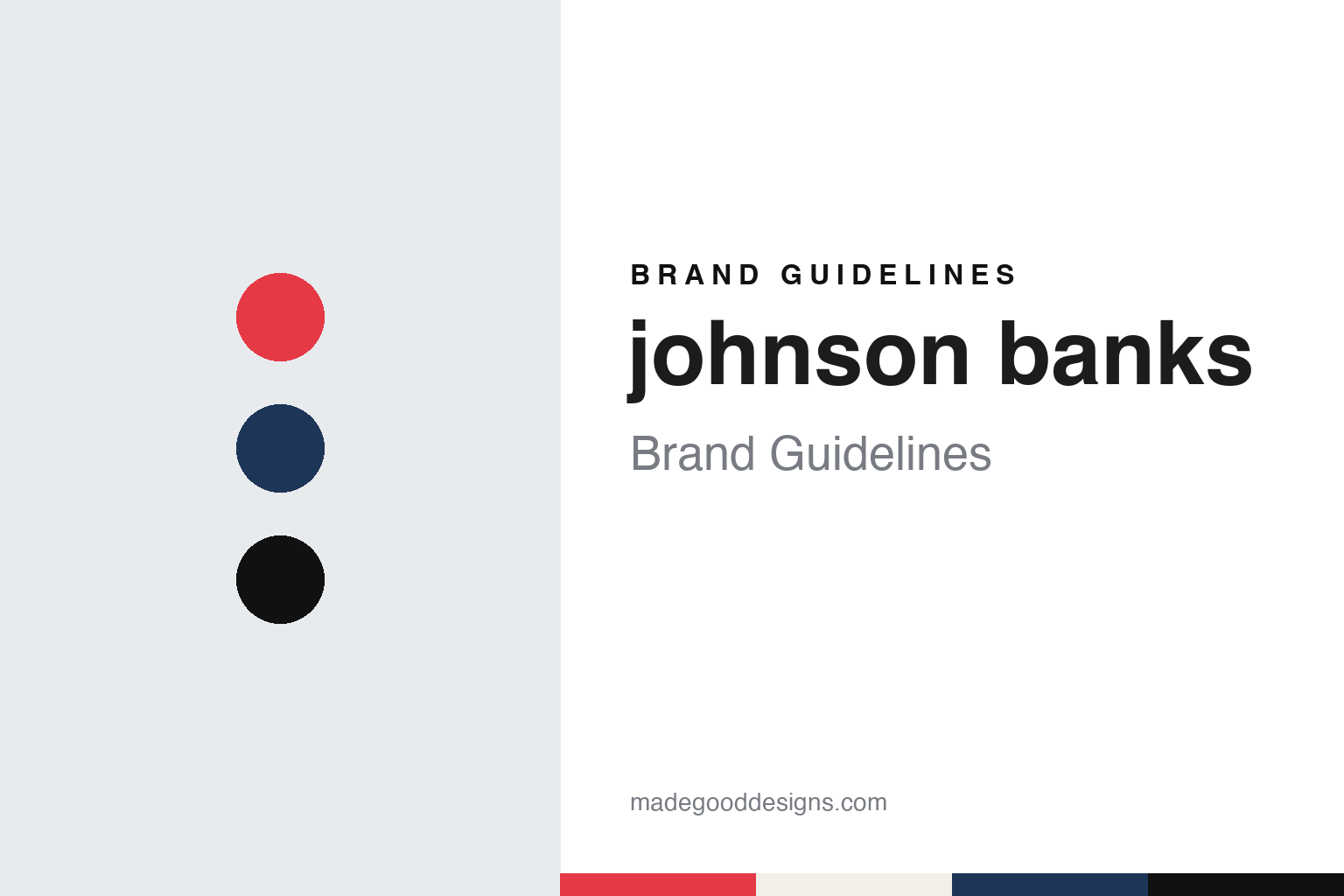
johnson banks Brand Guidelines
A lowercase name, a stacked word, a logo you can type.
Aa
Two constants: a red, navy and ink black palette and a grotesque sans register. Abstract homage — not a johnson banks asset or mark; no logo, icon or wordmark is reproduced.
A London consultancy, since 1992
One founder’s name, written in lower case.
johnson banks is a London design consultancy that writes its own name in lower case. Wikipedia says the company was founded in 1992 by Michael Johnson, and that it specialises in brand consultancy and visual identity systems, with much of its work for the cultural, government and charity sectors. Trade coverage follows the studio’s styling: Creative Review, writing in June 2010, set the name as “johnson banks” throughout, and its project credits listed the studio the same way.
The studio’s early commissions show the range Wikipedia records. It says the Yellow Pages hired johnson banks in 1999 to update the telephone directory, to cut the number of pages and to make room for the longer dialling codes introduced in the late 1990s. The answer was typographic: a condensed typeface with shortened ascenders and descenders, drawn to save space line by line. Wikipedia also lists identity work for the insurer More Than in 2001, for the housing charity Shelter in 2004 and for Christian Aid in 2005, followed by Virgin Atlantic in 2010.
Stamps form another strand. Wikipedia says the studio designed a Fruit and Vegetable collection for Royal Mail in 2003, which the consultancy said drew on the children’s toys Mr. Potato Head and Fuzzy-Felt. The set came with extra stickers, so that people could dress the stamps with moustaches, hats, legs, glasses and shoes. In 2007, Wikipedia adds, Royal Mail commissioned a Beatles set from the studio to mark fifty years since John Lennon and Paul McCartney met.
Alongside client work, the studio has run its own type experiments. Wikipedia mentions a bilingual typeface based on Japanese katakana and a set of pictographic symbols based on Mandarin characters. In January 2012, it says, johnson banks worked with Ravensbourne college on Arkitypo, an alphabet of letterforms made with 3D prototyping techniques. Wikipedia also credits the studio with the packaging for Pink Floyd’s The Later Years and with a King’s College London campaign, “World Questions, King’s answers”, dated 2010 to 2012.
Colour
The Science Museum identity of 2010.
A well-documented identity from this period is the Science Museum in London. Design Week reported on 23 June 2010 that johnson banks had been appointed in December 2009 after a pitch, which the museum’s head of creative direction, Tim Molloy, described as a long and vigorous process. Creative Review, two days later, said the studio had been asked to redesign the museum’s brand and identity at the end of 2009.
The brief came out of the museum’s wish to reach beyond families. Creative Review reported Johnson saying the museum wanted a more sophisticated identity that avoided the usual clichés of test tubes and professors in white lab coats, while cutting through more strongly on posters. Johnson traced the history the studio inherited: a simple wordmark and crest in the 1980s, the “Sci M” device from the late 1980s, and a plainer typographic mark adopted around 2000 that, he said, had struggled for recognition among cultural posters on the London Underground. Design Week quoted Molloy saying the museum “spoke with many voices” and that its identity had been used in so many ways that it was no longer recognisable.
The solution was a stacked word. Design Week described a square marque bearing the words “Science Museum”, with a ligature between the i and e of “science” that allowed it to be set as a four-character block. The magazine said the mark would appear across banners, signs and publications and could be animated. Johnson told Creative Review that the idea grew from research into codes, puzzles, patterns and basic digital typefaces, and from noticing that “science” and “museum” were fairly generic words, which led the team to experiment with slightly abstracted letterforms.
The typeface carried the system. Design Week said the studio had drawn a face called Grid, which Johnson described as “the identity” and which could work without the logo. On colour, he told the magazine that people tend to think of blue but that the studio was working on a broad palette. Creative Review said the team used the logo as large as possible and extended the letterforms into a headline typeface. Early applications included Underground posters in which visitors appear to touch the logo from behind the poster, and a campaign for the redesigned Who Am I? gallery. Creative Review credited Michael Johnson, Kath Tudball and Miho Aishima as designers, and said the banners on the front of the museum and the concourse elements had already been replaced.
Typography
A studio that shows its working.
British design studios often take their names from the people who started them. Two surnames joined by an ampersand, a single surname with “Studio” in front, or a founder’s name set entirely in lowercase all appear across the field. Each form signals something about the practice behind it: a pairing of surnames puts a partnership at the front, while a lowercase name can read as plain and unforced next to the capitals of corporate clients.
The ampersand itself is a recurring device. It can join two founders, stand in for a word inside a name, or become a small piece of lettering that a studio redraws for its own stationery and website. Because it is a character with many historical shapes, a studio can make it its own without inventing a symbol from scratch.
Beyond the name, studios build their identities through what they make for themselves. Self-initiated projects, printed books about the studio’s work, posters for talks and exhibitions, and short-run publications all act as brand surfaces. Alongside the case studies on a website, these pieces show how a practice thinks when no client is setting the brief.
Aa
A sturdy grotesque — after a studio that writes its name in lower case. (Specimen set in Archivo, a sans STAND-IN; NOT the johnson banks logo, the Science Museum Grid face, Zilla Slab or any studio typeface.)
johnson banks
Mozilla, rebranded in the open, 2016–2017.
The project that put the studio’s process on public view was Mozilla. Dezeen reported on 10 November 2016 that the rebrand had begun in June 2016, and that Mozilla, known above all for the Firefox browser, wanted to raise awareness of its other projects. Johnson told Dezeen that the client’s initial brief had included a short section on doing the rebrand “in the open”, and that by the time two studios were left in the running, Mozilla’s questions centred on that idea. He summed up the client’s reasoning: an open-source software company might as well run its rebrand the same way.
The process ran on an open design blog. According to Dezeen, Mozilla initially posted several possible concepts, gathered feedback from the blog and from a conference in London, and then asked johnson banks to narrow the themes. These became design routes with names such as The Eye, The Connector, Wireframe World, The Impossible M and The Protocol, which used a colon and two forward slashes. After further rounds of public comment, four routes remained: Protocol, plus reworked designs called Dino, Flame and Burst. Dezeen said blog comments, live crit sessions and Mozilla’s strategic goals all fed into the choice.
The final route was revealed in January 2017. Dezeen reported on 18 January 2017 that, after months of public scrutiny, the new logo spelled out the company name in a Courier-like face with the letters “il” replaced by a colon and two slashes, as they appear after “http” in a web address. It’s Nice That, writing the same day, named the route Protocol 2.0 and quoted Johnson saying that the “://” idea and the typographic dinosaur head had been clear favourites after the second round, but that an extinct creature did not send the clearest message, so the team rebooted the “://” idea and borrowed some of the energy of the other routes. Johnson said the coloured bars of the system alluded to browser bars and could hold type, messages or images, and that the studio had always liked the thought of a logo you could type, as in moz://a.
Type and imagery followed the same open logic. It’s Nice That said johnson banks worked with the Dutch foundry Typotheque to adapt an existing slab serif, because much coding is still done in typewriter-style faces with slab serifs. Dezeen said the resulting Zilla font was being made available free, and that Mozilla planned to invite artists and designers to contribute imagery to be shared under Creative Commons.
For a design guide, johnson banks shows how a studio can make its working visible: a lowercase name, a stacked museum word in 2010 and, in 2016–17, a rebrand argued out in public until the logo became something you could type. Compare Bibliothèque and The Chase, two more UK studios in this collection. For this guide we use red, navy and ink black with a sans, an unofficial interpretation; no product or logo is reproduced.
Explore & save
Keep johnson banks’s identity on hand — save it to a board in the Made Good inspiration library.
johnson banks identity set
Pin the johnson banks red, navy and ink black palette and the grotesque sans register to your own board.