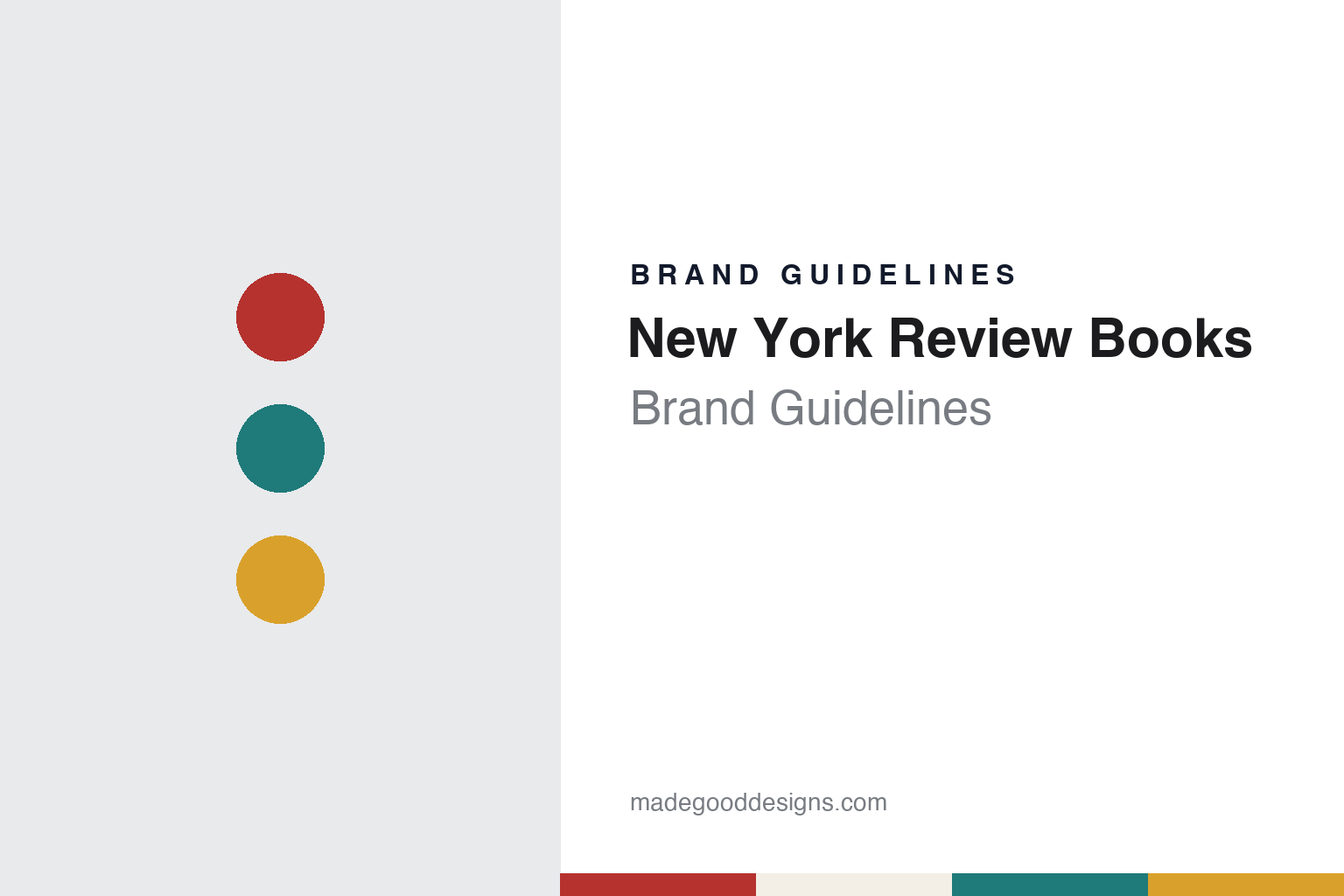
New York Review Books Brand Guidelines
A title box in the same place, a new colour every time.
Aa
Two constants: a spine red, teal and mustard palette and a humanist sans caps register. Abstract homage — not a New York Review Books asset or mark; no logo, cover or wordmark is reproduced.
A magazine that started publishing books
The book arm of a review founded during a newspaper strike.
New York Review Books is named after its parent. It is the book publishing division of The New York Review of Books, the literary and current-affairs magazine, and Publishers Weekly described the relationship plainly in a report by Gabe Habash dated 26 July 2012: the book publishing side is part of the same company as the magazine.
The magazine is the older of the two. The Guardian, in Geoffrey Wheatcroft’s obituary of the editor Robert Silvers published on 21 March 2017, recounted that the journal appeared on 1 February 1963, during the New York newspaper strike, when there was no New York Times to review new books. It was planned over supper by Elizabeth Hardwick, Robert Lowell, and Barbara and Jason Epstein, who asked Silvers to join them, and Silvers co-edited the Review with Barbara Epstein from the beginning. English Wikipedia says the founders sold the magazine in 1984 to the publisher Rea S. Hederman, who still owns it.
The book division followed in 1999. English Wikipedia says it was started in the autumn of that year and grew out of an earlier venture, the Reader’s Catalog, which sold books by mail. Its founder, Edwin Frank, and his colleagues found that many of the titles they wanted to offer were out of print, so they decided to republish them. Wikipedia names the series’ opening volume as a 1999 reissue of Richard Hughes’s 1929 novel A High Wind in Jamaica.
The New York Times described the result in a piece by Steven Kurutz dated 9 April 2018: an offshoot of the magazine, the NYRB Classics imprint reissues volumes that have fallen out of print or been neglected, such as J. R. Ackerley’s 1956 memoir My Dog Tulip and an English translation of Magda Szabó’s 1987 novel The Door. The same article said Frank founded the Classics imprint in 1999 and continued to edit the series with a colleague, Sara Kramer. Frank told the paper that fostering a sense of discovery was a central goal, and that “we don’t do books that are widely published elsewhere and available at cheap prices.”
The name on the books has two forms. The full name, New York Review Books, ties the list to the magazine; the short form, NYRB, is used for the series names, from NYRB Classics to NYRB Poets.
Colour
Classics, children’s books, poets, comics and an e-book list.
From the Classics series the division grew into a family of imprints, each carrying the New York Review name or its initials. English Wikipedia lists New York Review Books Classics, New York Review Books Collections, The New York Review Children’s Collection, New York Review Comics, New York Review Books Poets and NYRB Lit, and describes a further series of writing from and on China called Calligrams.
Each has a defined job. Wikipedia says the Collections series gathers essays by frequent contributors to the magazine, so the book list draws directly on the Review’s own pages. The Children’s Collection was founded in 2003 to bring back children’s books that had gone out of print, and in 2015 the publisher added NYRB Kids, paperback editions drawn from that collection which the publisher describes as designed to appeal to young readers.
The digital list was announced in 2012. Publishers Weekly reported on 26 July 2012 that NYRB Lit, a new e-book series devoted to contemporary literary fiction and narrative nonfiction, would release its opening title in September, The Water Theatre by Lindsay Clarke. Its series editor was Sue Halpern, a longtime contributor to the magazine, who told the magazine that the series would use the lower costs of digital publishing to take on books that larger houses considered too risky. The launch list continued with Beirut, I Love You by Zena El Khalil, 1948 by Yoram Kaniuk, Ravan and Eddie by Kiran Nagarkar and, in January 2013, On the Edge by Markus Werner.
The parent magazine has its own address story, and it involves a designer. The Real Deal reported on 9 October 2020, in a piece by Lois Weiss, that The New York Review of Books had bought a Kips Bay townhouse that had belonged to the graphic designer Milton Glaser. Glaser bought the former Tammany Hall clubhouse in 1965; it housed New York magazine, which he founded with Clay Felker in 1968, and it was where he designed the I ♥ NY logo. The building has a glass transom etched with the words “Art is Work”.
The magazine moved in three years later. The New York Review of Architecture reported on 19 November 2023 that the Review had moved into the building that autumn, that it was built in 1902 as a clubhouse for a branch of Tammany Hall to a design by the architect Robert Lyons, and that a drawing of the building appeared on a new tote bag and on the cover of the magazine’s sixtieth-anniversary issue.
Typography
A shared name across magazine and book list.
For a book publisher, the name has to work in several places at once: on the spine, where a reader scans a shelf, on the title page, where the house is named in full, and on the series that a house builds over decades. Some names describe where a press began. Graywolf Press was named for the Graywolf Ridge and Graywolf River near Port Townsend, Washington, where it started printing poetry chapbooks by letterpress in 1974, and it kept the name after moving to St. Paul in 1985 and to Minneapolis in 2009. Other names describe who a house belongs to. New York Review Books, started in 1999, takes its name from The New York Review of Books, the magazine that publishes it, and shortens it to the initials NYRB for series such as NYRB Classics and NYRB Poets.
Series design often does more of the identifying than the colophon itself. Writing in Eye in the winter of 2007, Rick Poynor described how Penguin’s classics covers of the 1960s, under Germano Facetti, held a series together with a consistent type style and title position, and how Katy Homans’ format for NYRB Classics keeps a title box in a fixed place while changing its colour from book to book, carrying that colour onto the spine and back cover, and leaving the small NYRB logo off the front. When reading a publisher’s identity, look at what stays fixed from title to title, where the house name or mark actually appears, and how far a series format, rather than a logo, tells a reader which list a book belongs to.
Aa
Humanist sans capitals — after a series whose title box is set in caps. (Specimen set in Fira Sans, a sans STAND-IN; NOT the NYRB logo, NOT FF Meta and NOT any New York Review Books typeface.)
NYRB Classics
Katy Homans’ cover format and the colour that wraps the book.
The design of NYRB Classics has been described in detail by the design press. In Eye no. 66, the Winter 2007 issue, the critic Rick Poynor wrote that the format was devised by Katy Homans, a New York designer with many years’ experience designing art books. Poynor set the series against the formula for classics covers associated with Germano Facetti at Penguin in the 1960s: a consistent type style and title position, with a detail from a painting, photograph, drawing or sculpture chosen to place the book in its moment.
Homans’ system has a fixed frame. Poynor described a title box based on Meta capitals that always sits in the same central position, about a third of the way down the cover; its depth depends on how many lines the title needs, and the boxes generally come in two basic sizes. Behind it sits a picture, usually a work of art. Where Penguin used one colour to hold a series together, he wrote, NYRB varies it: the background colour of the box reappears on the spine and back cover, and the colour used for the author’s name and title returns on the inside covers. He noted that the small, capsule-like NYRB logo, developed by the design firm Red Canoe, is left off the front cover.
The pictures are chosen in conversation. Poynor wrote that Edwin Frank, the series editor and a poet, usually suggests an image or a direction, and that twice a year Frank and Sara Kramer, who then handled production, visited Homans’ studio to look through her library of art books. Homans, he wrote, often uses the title box to hide part of the image or to frame it, as on Alberto Moravia’s Boredom, where the box partly conceals a picture frame hanging at an angle, and on Oakley Hall’s 1958 western Warlock, reissued with a painting by Sigmar Polke on a 2006 cover.
Eleven years later, The New York Times described the same format from the shop floor. Steven Kurutz wrote on 9 April 2018 that every title has a colourful spine and back cover and a matching colour-blocked text box, or cartouche, at the centre of the front, with a cover image that is often a painting or photograph, and that the uniform design makes the series recognisable in the way the old Penguin Classics were with their orange and black. Homans told the paper: “Simplicity is what I was thinking about. And also, I love color.” A Brooklyn bookseller quoted in the piece likened the imprint to a record label such as Blue Note.
For a design guide, New York Review Books shows how a series can hold together through a fixed position and a repeated device rather than a fixed colour, with the colour of each title box carried around the spine to the back. Compare Penguin Books, whose classics format Poynor used as the point of comparison, or McSweeney’s, another independent literary publisher. For this guide we use spine red, teal and mustard with a sans, an unofficial interpretation; no product or logo is reproduced.
Explore & save
Keep New York Review Books’s identity on hand — save it to a board in the Made Good inspiration library.
New York Review Books identity set
Pin the New York Review Books spine red, teal and mustard palette and the humanist sans caps register to your own board.