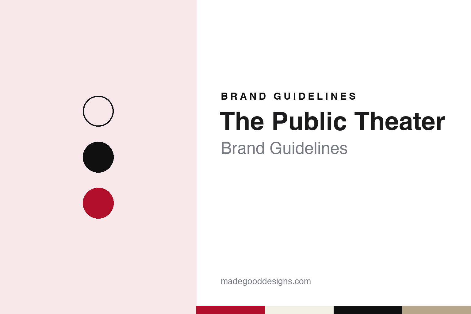
The Public Theater Brand Guidelines
A free Shakespeare festival that took over a library and spoke in poster type.
Aa
Two constants: a wood-type red, deep playbill red, newsprint, press black and Astor sandstone palette and a condensed poster sans register. Abstract homage — not a Public Theater asset or mark; no logo, poster, photograph or Public lettering is reproduced.
A workshop, a park and an amphitheatre
Joseph Papp’s Shakespeare Workshop and free Shakespeare in Central Park, 1954–1962.
The Public Theater started under another name. English Wikipedia says Joseph Papp, born Joseph Papirofsky in Brooklyn, founded it in 1954 as the Shakespeare Workshop, and that it grew into the New York Shakespeare Festival, with a mission to make Shakespeare’s plays available to anyone. Papp was then working as a stage manager at CBS television in New York. The early company toured the city’s boroughs on temporary stages; Wikipedia singles out a 1956 production of The Taming of the Shrew at the East River Amphitheatre on the Lower East Side, which The New York Times critic Brooks Atkinson wrote about in support of Papp’s plan, and says Papp was granted the use of Central Park for free productions in 1957.
A permanent stage in the park took four more years. Wikipedia says Papp began raising money for an outdoor amphitheatre in 1958 with the help of the actress Helen Hayes, against the opposition of the parks commissioner Robert Moses, and that the project moved forward after Newbold Morris took over the parks department in 1960. When public funds ran short before completion, Morris turned to his friend George T. Delacorte Jr., president of Dell Publishing, who paid for the rest; the theatre was named for him and his wife, Valerie. It stands on the site of an old Croton Aqueduct reservoir.
The Delacorte Theater opened in June 1962 with The Merchant of Venice, starring George C. Scott and James Earl Jones, according to Wikipedia. Since then the Public has staged its free summer season, Shakespeare in the Park, there, usually two or three productions a year, mostly Shakespeare in full or abridged form, with some musical adaptations and other classics. Tickets are given out free on the day of each performance.
The amphitheatre has since been rebuilt once. Wikipedia says the Public announced its renovation plans in 2018, hired Ennead Architects, which had earlier worked on the Astor Library building, and won approval from the city’s Landmarks Preservation Commission in January 2022. The Delacorte closed in September 2023, was rebuilt in a conical shape using wood recycled from New York City water towers, and reopened on 15 July 2025.
Colour
A Romanesque Revival library on Lafayette Street, rescued in 1965 and opened as a theatre in 1967.
Papp wanted a year-round home as well as a summer one, and he found it in a library. Wikipedia says the Public has occupied the Astor Library building on Lafayette Street since 1967. The Romanesque Revival structure went up in stages between 1853 and 1881: the German-born architect Alexander Saeltzer designed the original block, and two expansions toward Astor Place followed, by Griffith Thomas from 1856 to 1869 and Thomas Stent from 1879 to 1881.
The library collections later moved on, and in 1920 the Hebrew Immigrant Aid Society bought the building. By 1965, Wikipedia says, it was disused and faced demolition, and the New York Shakespeare Festival persuaded the city to buy it for use as a theatre. It was designated a New York City Landmark in 1965 and converted for performance by the architect Giorgio Cavaglieri. Wikipedia says Papp rented it from the city in 1967 and moved his staff into what he named the Public Theater, hoping to draw a newer audience for new playwrights. The building was extensively renovated again between 2010 and 2012.
The Astor Place stages shifted the company toward new work. Wikipedia says the Public’s production of the musical Hair opened there in 1967, and it lists A Chorus Line in 1975 and Hamilton in 2015 among the shows that later moved to Broadway. The building now holds five theatre spaces and Joe’s Pub, a cabaret room named in honour of Papp.
Leadership has passed through a handful of directors. Cooper Hewitt, Smithsonian Design Museum, notes that Papp died in 1991. Wikipedia says JoAnne Akalaitis led the theatre from 1991 to 1993 and George C. Wolfe from 1993 to 2004, and that Oskar Eustis is now artistic director, with Patrick Willingham as executive director. Programmes launched under the current leadership include the Mobile Unit, which since 2013 has toured free Shakespeare to community centres, shelters and prisons across the five boroughs, and Public Works, begun the same year, which brings community members onto the Delacorte stage alongside professional actors.
Typography
Nineteenth-century wood type in 1994, Akzidenz Grotesk in 2005 and Knockout in 2008.
Theatre owners and producers work with two kinds of name at once. A producer’s brand sits on contracts, credits and the small line at the foot of a poster, while each show it stages carries a title logo of its own, designed to travel from city to city and to work on a cast album, a tour poster and a souvenir mug. A theatre owner has the opposite problem: its buildings usually keep historic house names painted, carved or lit on the street, so the company that owns them has to sit quietly beside those names rather than replace them. The marquee, fascia board or canopy above the doors tends to carry the show’s title, and the house name, and only then, if at all, the group that runs the building. Many theatre groups act as umbrellas, holding a portfolio of houses whose names predate the company and whose façades are often protected.
The everyday brand work of such a group happens in smaller places. Ticketing websites, booking confirmations, membership and loyalty schemes, gift vouchers, front-of-house signage, ushers’ uniforms and bar menus are where a group name reaches audiences directly, often in a restrained typeface and palette that leave room for show artwork. Programmes and merchandise sit between the two: a programme usually belongs to the production but is printed to a house format, and merchandise stands sell show-branded goods inside a building with its own name. A producer that also licenses its catalogue adds another layer, since rights holders often supply approved title treatments to other companies staging the work.
Aa
Condensed poster sans — after nineteenth-century wood type and the Public’s later grotesques. (Specimen set in Anton, a sans STAND-IN; NOT The Public Theater logotype, Knockout, Akzidenz Grotesk or any Public lettering.)
The Public Theater
Paula Scher’s wood type in 1994, a shorter name in 2005 and a square full stop in 2008.
The Public’s graphic identity is documented in some detail. Cooper Hewitt, Smithsonian Design Museum, published an account by its former curator Gail Davidson on 5 April 2018, drawing on the designer’s own book Make It Bigger. It says that after Papp’s death the new director, George C. Wolfe, wanted to broaden the theatre’s image as a place for everyone, and that Paula Scher created the identity in 1994. Scher looked to the blunt horizontal bands of nineteenth-century English wood-type posters and to Rob Roy Kelly’s 1968 book American Wood Type. The resulting logotype made “PUBLIC” the dominant word, with “THE” in red running horizontally inside the upstroke of the P and “THEATER” in red filling the width below; the letters of “PUBLIC” get lighter in weight as they run down the page. The museum says the typography ran vertically down the side of letterheads, envelopes and posters, and it holds a 1994 envelope from the set, given by Scher in 1996.
It’s Nice That reported on 27 January 2020 that Scher, a partner at Pentagram, was publishing a book on her twenty-five years with the theatre through Princeton Architectural Press, with more than four hundred images and essays by Steven Heller and Ellen Lupton. It described her 1995 posters for Bring in ’da Noise, Bring in ’da Funk, with letters radiating from a photograph of a tap dancer, and traced two later revisions. In 2005, as Oskar Eustis took over and the theatre marked its fiftieth anniversary, the logo was redrawn in Akzidenz Grotesk; Cooper Hewitt says the red disappeared and the word “Theater” was dropped. In 2008, timed to a major renovation, the logo moved to Knockout, a typeface from Hoefler & Frere-Jones, with a heavy square full stop and, in It’s Nice That’s description, a De Stijl-inspired grid.
For a design guide, The Public Theater shows a company whose name became its typography, starting with a stacked wood-type block in red and black and slimming down over time to one condensed word and a square full stop. Compare the Shakespeare’s Globe and Roundabout Theatre Company guides. For this guide we use wood-type red, deep playbill red, newsprint, press black and Astor sandstone with a sans, an unofficial interpretation; no product or logo is reproduced.
Explore & save
Keep The Public Theater’s identity on hand — save it to a board in the Made Good inspiration library.
The Public Theater identity set
Pin The Public Theater wood-type red, newsprint, press black and Astor sandstone palette and the condensed poster sans register to your own board.