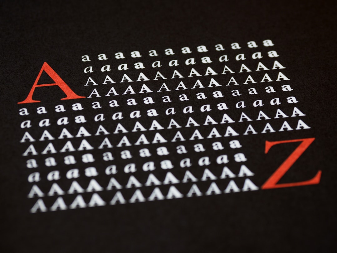
Best Minimalist Fonts (Free & Premium)
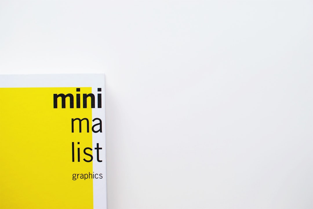
Minimalist typography is about clarity, neutrality and discipline. The best minimalist fonts are clean sans-serifs with even strokes, open shapes and little personality of their own, letting content and layout do the talking. The core principle is restraint: one well-chosen neutral family, a tight type scale and lots of whitespace beat any decorative approach for a modern, uncluttered result. Minimalism is often misread as “boring,” but the best minimalist work is highly intentional: every size, weight and margin is chosen deliberately, and the absence of clutter is what makes the remaining elements feel confident and premium.
What makes a good minimalist font?
Look for even stroke weight (monoline or near-monoline), open apertures, generous spacing and simple, unadorned letterforms. Geometric and humanist sans-serifs both qualify: geometric (Jost, Futura) feels precise and architectural, while humanist (Inter, Work Sans) feels warmer and more readable. A good minimalist font ships with many weights so you can build hierarchy without switching families. Avoid quirky details, heavy contrast or trendy flourishes.
Best minimalist fonts
This roundup leans heavily on free Google Fonts, with a couple of premium classics for teams that want the absolute reference neutral sans.
| Font | Best for | Price |
|---|---|---|
| Inter | UI & digital products | Free (OFL) |
| Work Sans | Web body & headings | Free (OFL) |
| Jost | Geometric Futura look | Free (OFL) |
| DM Sans | Compact modern UI | Free (OFL) |
| Archivo | Confident neutral headings | Free (OFL) |
| Roboto | Android & app interfaces | Free (Apache) |
| Poppins | Friendly geometric brands | Free (OFL) |
| Manrope | Modern startup sites | Free (OFL) |
| Helvetica Now | Premium reference neutral | Paid |
| Neue Haas Grotesk | Editorial Swiss design | Paid |
1. Inter
Inter is a free, OFL humanist sans engineered for screens, with tall x-height and open apertures that stay crisp at small sizes. It is the default minimalist choice for UIs, dashboards and SaaS sites, neutral, versatile and packed with weights.
2. Work Sans
Work Sans is a free Google Font (OFL) optimized for on-screen reading. Slightly grotesque in feel, it balances neutrality with subtle warmth, working equally well for headings and body text in clean, content-first layouts.
3. Jost
Jost is a free OFL geometric sans modeled on Futura, delivering that precise Bauhaus minimalism with perfect circles and crisp geometry. It is ideal for design-led brands and posters where architectural clarity is the goal.
4. DM Sans
DM Sans is a free, OFL low-contrast geometric sans with a compact, modern feel. Its tidy proportions suit interface text, app screens and minimalist marketing sites that want a contemporary edge without quirkiness.
5. Archivo
Archivo is a free OFL grotesque designed for headlines and high performance. Its confident, neutral letterforms give minimalist layouts a strong but unfussy voice, pairing well with a lighter body sans like Inter.
6. Roboto
Roboto, Google’s free Android system font (Apache license), is a familiar, highly legible sans with a mechanical-yet-friendly character. It is a dependable, neutral default for apps and interfaces that want zero friction.
7. Poppins
Poppins is a free OFL geometric sans built on near-perfect circles, giving a clean, friendly, rounded minimalism. It is popular for modern startups and lifestyle brands that want approachability within a simple system.
8. Manrope
Manrope is a free OFL semi-condensed sans blending geometric and grotesque traits. Its balanced, modern look has made it a favorite for startup landing pages that want minimal but distinctive type.
9. Helvetica Now
Helvetica Now is Monotype’s modern revision of the iconic neutral sans, refined for today’s screens and print. It is a paid license but represents the gold standard of minimalist neutrality. Free Inter is the closest no-cost stand-in.
10. Neue Haas Grotesk
Neue Haas Grotesk is the faithful restoration of the original Helvetica, beloved in Swiss and editorial design for its purity. A paid foundry face, it rewards projects that demand authentic, classic minimalism over an approximation.
Free vs premium minimalist fonts
The good news: minimalism is the category where free fonts compete hardest. Inter, Work Sans, Jost and DM Sans are OFL-licensed, commercial-safe, and genuinely excellent. Premium faces like Helvetica Now and Neue Haas Grotesk offer the authentic Swiss neutral and slightly superior refinement, but for most brands a free Google Font is more than enough. Avoid DaFont “free for personal use” files for commercial work, and confirm terms in our font licensing guide. Browse more options in our best sans-serif fonts roundup.
How to use minimalist fonts well
Pick one neutral family and commit to it across the whole project, using weight and size, not extra fonts, to build hierarchy. Embrace whitespace, keep your type scale tight and intentional, and set comfortable line length and line height for body text. Limit colors and decoration so the typography and layout carry the design. Restraint is the entire point. For logo applications, see our best logo fonts guide. When in doubt, reduce: remove a weight, widen the margins, and let a single confident headline carry the page. Minimalist typography rewards patience and editing far more than it rewards adding new elements, so treat every extra style as something you must justify.
Frequently Asked Questions
What is the best minimalist font?
Inter is widely considered the best all-round minimalist font for digital work: it is free, neutral, highly legible and offers many weights. For a geometric look, Jost is excellent. If budget allows and you want the reference neutral sans, Helvetica Now is the premium gold standard.
Are minimalist fonts free?
Most are. Inter, Work Sans, Jost, DM Sans, Poppins and Manrope are all free on Google Fonts under open licenses and fully commercial-safe. Minimalism is the category where free fonts truly rival premium ones, so you rarely need to pay unless you specifically want Helvetica Now.
Is Helvetica a minimalist font?
Yes. Helvetica is the archetypal minimalist, neutral sans-serif and a cornerstone of Swiss design. It is a paid, licensed typeface, but free alternatives like Inter and Arial deliver a similar clean, neutral look. Helvetica Now is the modern, screen-optimized premium version.
Should minimalist designs use one font?
Usually yes. Minimalist design favors a single neutral family, using different weights and sizes for hierarchy rather than multiple typefaces. At most, pair two complementary fonts. Restraint keeps the design clean and cohesive, which is the essence of minimalism.
What is the difference between geometric and humanist sans?
Geometric sans-serifs (Jost, Futura, Poppins) are built from simple shapes like circles and feel precise and architectural. Humanist sans-serifs (Inter, Work Sans) take cues from handwriting and feel warmer and more readable. Both suit minimalism; geometric reads cooler, humanist reads friendlier.