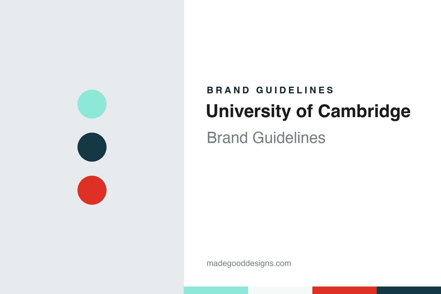
University of Cambridge Brand Guidelines
Four gold lions, a closed Bible and a light blue taken from the river.
Aa
Two constants: a Cambridge Blue, dark blue and red palette and a bookish serif register. Abstract homage — not a University of Cambridge mark; no arms, lion, logo or wordmark is reproduced.
Arms of 1573
Four lions, an ermine cross and a closed book.
The University of Cambridge dates its foundation to 1209, English Wikipedia says, and by 1225 it had a chancellor. Writs issued by King Henry III in 1231 ordered that rents in the town be set according to the custom of the university and created a panel of two masters and two townsmen to settle them, Wikipedia records. The university’s visual identity, though, rests on something much later: a coat of arms granted in the reign of Elizabeth I.
The university says it was granted its arms in 1573 by Robert Cooke, Clarenceux King of Arms and a graduate of St John’s College, during the heraldic visitation of the county of Cambridge. The arms belong to the university as a corporate body, the Chancellor, Masters, Fellows and Scholars. Their official blazon reads: Gules, on a cross ermine between four lions passant guardant Or, a Bible fesswise gules, clasped and garnished Or, the clasps in base.
The university’s own plain-English version spells this out. The field is red; on it sits a cross of ermine fur between four gold lions, each walking with one fore-leg raised and facing the viewer. On the centre of the cross lies a closed book, its spine horizontal, with clasps and decoration, the clasps pointing downward. There is a rule that matters to any designer: the lions must always face the left-hand edge of the page or object on which the arms appear. Wikipedia explains the symbolism as the lions for royal patronage, the ermine for dignity and the Bible for both knowledge and the Christian faith.
The motto sits outside the grant. The university says Hinc lucem et pocula sacra is not an official part of the original arms but may be used under or around them; it translates literally as “From here, light and sacred draughts”. Wikipedia, citing Frank Stubbings’s 1995 Cambridge glossary Bedders, Bulldogs and Bedells, says the phrase comes from an emblem long used by the University Press, which showed the alma mater of Cambridge holding a sun in one hand and, in the other, a cup catching drops from the sky. The university adds that it has no right to change the arms without Royal Authority.
Colour
A colour chosen on the river in 1839.
Cambridge Blue began as a rowing colour, and its history is traced by the Hawks’ Club, the university’s sporting club, in a paper titled “Origins of the Cambridge Blue”. It describes the early contests between the two universities as colourless: at a cricket match at Lord’s on 4 June 1827 both sides wore white. At the Boat Race at Henley-on-Thames on 10 June 1829, Oxford wore dark blue and white, while Cambridge wore white shirts with pink ties or sashes in honour of their captain, Snow, who also captained the Lady Margaret Boat Club of St John’s College.
The paper says that contemporary reports, including Bell’s Life, describe Cambridge rowing in plain white at the second race in 1836. There were no university races in 1837 and 1838, but Cambridge raced the Leander Club in both years in light blue and white striped shirts. For the third Boat Race, in 1839, Cambridge adopted light blue, establishing it as the colour of the Cambridge University Boat Club and then, as each new sport joined the inter-university calendar, the colour of Cambridge sport in general. The story of how the shade was chosen did not appear in print until 1881, when the rower and writer Walter Bradford Woodgate began a history of the races in the sporting weekly Land and Water, and the Hawks’ paper examines how later retellings changed the details.
The colour also gave its name to an honour. Athletes who represent the university in a varsity match may be awarded a Blue or a Half Blue, depending on the sport and other criteria, Wikipedia says.
The colour is still central to rowing. In March 2021 Transform magazine reported that, after merging its three separate rowing clubs into one, the university worked with the design agency Offthetopofmyhead on a single Cambridge University Boat Club brand. The red lion at the centre of the badge was kept but redrawn, and the crossed oars were made bolder and simpler. John Spencer, the agency’s founder and creative director, told the magazine the team had taken the namestyle directly from the University of Cambridge logo to stress the bond between the university and the club. The palette centres on Cambridge Blue, black and red, with yellow, the traditional kit colour of the reserve crews Goldie and Blondie.
Typography
Arms, wordmark, blues and type.
University identities are usually layered rather than single marks. The earliest layer is often heraldic: a coat of arms or shield, granted or adopted at some point in an institution’s history, built from a small vocabulary of charges such as books, crowns, lions, crosses and stars, and carrying its own fixed rules about tinctures and how elements are arranged. Alongside it many institutions keep a seal, a circular device with a legend running around the edge, historically used to authenticate documents and today reserved for diplomas, formal notices and ceremonies.
A second layer is colour. Academic colours often began on the river, the sports field or in ceremonial dress, and over time a named shade became shorthand for the place itself. Because such names predate digital standards, the exact tone can vary between printed matter, kit and screens until an identity programme fixes reference values.
The newest layer is the wordmark and typography. Modern identity work tends to simplify a detailed shield for small sizes, pair it with a set name in a chosen typeface, and set rules for clear space, colour use and how departments sit beneath the main mark, so that hundreds of units can publish without drifting apart.
Aa
A bookish serif — the register of a college library label. (Specimen set in Fraunces, a serif STAND-IN; NOT the University of Cambridge logo or its Feijoa typeface.)
University of Cambridge
Arms plus name, 24 colours and two typefaces.
The modern logo is built from two parts that never separate. The university’s brand resources, as published in October 2026, describe the logo as the coat of arms (the symbol) plus the university name (the wordmark), and say the two must always be used together; the arms must never appear on their own. The university says it has used substantially the same image for more than 450 years, that it is protected by law, and that the logo should appear in full, exactly as specified, in every communication.
Colour is handled through a palette of 24 colours anchored on Cambridge Blue. The guidelines give it as Pantone 7471, #8EE8D8 on screen, and pair it with three related shades: Cambridge Light Blue, a deeper Cambridge Warm Blue and Cambridge Dark Blue (#133844), which is to be used only as an accent and never as the main colour. Designers are told to keep plenty of white space and let Cambridge Blue lead. A secondary palette adds warmth in families named Crest, Cherry, Purple, Indigo and Green, and may only be used alongside the blues; the reds of the Crest family echo the field of the arms.
Type is split between two families. Feijoa, a serif, is the primary face, for headlines, titles and quotes; Open Sans is the secondary face, though the guidelines expect it to be used the most, for subheadings and body copy. Where neither font is available, as in presentations opened on outside machines, staff fall back on Arial, and video subtitles use Roboto Medium. The rules are practical: text is left-aligned, centred text is kept to three lines at most, the minimum size is 16px on screen and 10pt in print, and bold is reserved for print documents rather than web pages and emails.
For a design guide, the University of Cambridge shows how a sixteenth-century grant of arms can sit beside a soft, almost mint-like blue taken from nineteenth-century rowing, with the arms and the name locked together as one mark; compare University of Oxford for the dark blue on the other side of the Boat Race, and Harvard for another university built on arms and a single colour. For this guide we use Cambridge Blue, dark blue and red with a serif, an unofficial interpretation; no product or logo is reproduced.
Explore & save
Keep University of Cambridge’s identity on hand — save it to a board in the Made Good inspiration library.
University of Cambridge identity set
Pin the Cambridge Blue, dark blue and arms-red palette and the bookish serif register to your own board.