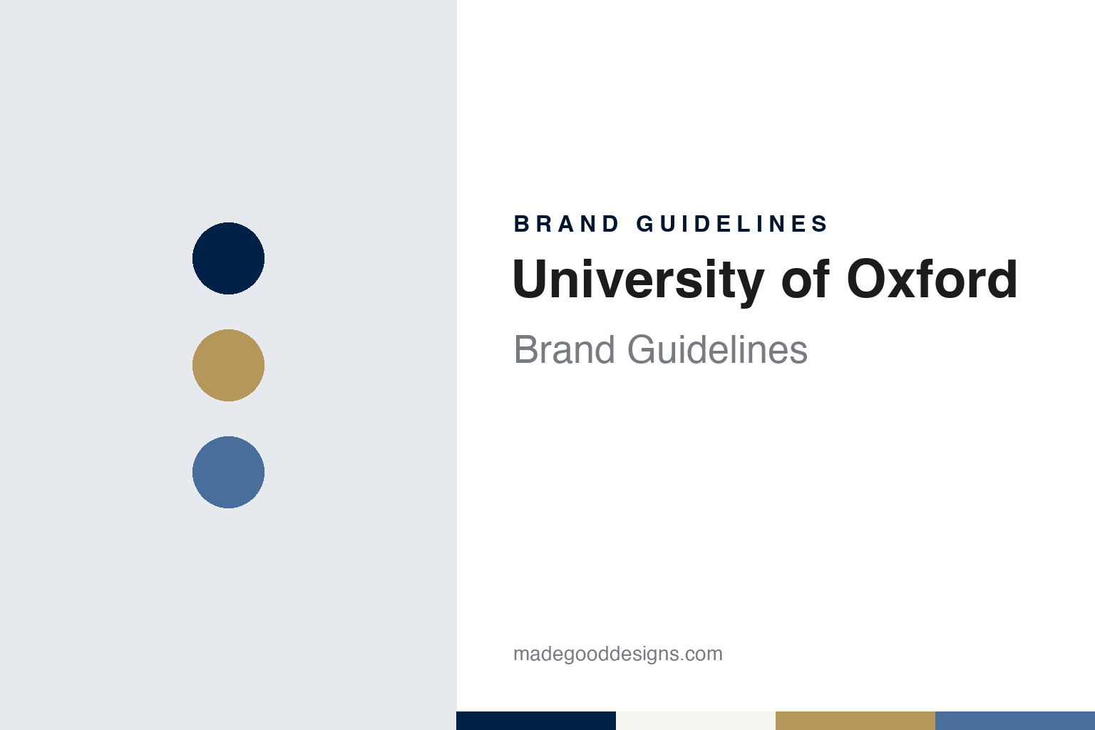
University of Oxford Brand Guidelines
A book with seven seals, three gold crowns and a dark blue from the river.
Aa
Two constants: an Oxford blue, gold and white palette and a clear sans register. Abstract homage — not a University of Oxford mark; no arms, crest, belted device or brand mark is reproduced.
A book and three crowns
Arms adopted around 1400 and a motto from Psalm 27.
The University of Oxford has no single founding date. The university says there is evidence of teaching in the town as early as 1096, and English Wikipedia notes that it is unclear when the university itself came into being. Wikipedia says it grew quickly from 1167, when Henry II barred English students from attending the University of Paris.
The arms came a little over two centuries later. The university’s archives, in a guide held by the Bodleian Libraries, say Oxford adopted its arms around 1400, by which time a book was seen as the natural central emblem for a university. The volume is shown heavy and clasped, its leather straps protecting the leaves and suggesting a treasure chamber of knowledge. The number of clasps was not fixed at first and may have been set for artistic spacing. In heraldic language the arms are blazoned: Azure, upon a book open proper leathered gules garnished Or, having on the dexter side seven seals of the last, the words DOMINVS ILLVMINATIO MEA, all between three open crowns two and one Or — an open book with seven seals on a blue field, between three gold crowns.
Readings of the symbols have varied. In The Display of Heraldrie (1610), John Guillim took the seven seals as the seven liberal sciences and the three crowns as the reward of learning and the three faculties of theology, medicine and law, Wikipedia records. The archives’ guide calls readings of the clasps as the seven subjects of the medieval curriculum, or as the seals of the book in Revelation, almost certainly incorrect. It says the origin of the crowns is not known exactly but may be connected with Thomas Cranley, Warden of New College and Chancellor of the university in 1390, who used three crowns personally from about 1386; Richard II gave three crowns to Robert de Vere, Earl of Oxford, in the same year.
The words on the book have changed too. The archives list Veritas Liberabit, Bonitas Regnabit (“the truth will set you free, goodness will reign”) and Sapientiae et Felicitatis (“of wisdom and happiness”) as earlier legends. The present one, Dominus Illuminatio Mea, “the Lord is my light”, the opening words of Psalm 27, was in at least occasional use by the second half of the sixteenth century. The guide draws on an article by E. A. Greening Lambourn in the journal Oxford in 1938.
Colour
Dark blue, borrowed from Christ Church in 1829.
Oxford blue, the deep navy that now carries the whole identity, started as a rowing colour. A paper by the Hawks’ Club of Cambridge, “Origins of the Cambridge Blue”, records that at the Boat Race at Henley-on-Thames on 10 June 1829 Oxford wore dark blue and white striped shirts in honour of Christ Church, then Head of the River, which supplied five members of the crew. The paper calls that race the well-documented origin of Oxford’s dark blue. Wikipedia’s article on the Blue as a sporting award adds that Christ Church’s college colour was dark blue, and that the light and dark blues became the official colours of the two boat clubs and, through the rivalry of the Boat Race, became linked with the universities and the contests between them.
Two years before, at a cricket match at Lord’s on 4 June 1827, both universities had played in white with no distinguishing colour, the Hawks’ paper says. From the river the colours spread to other sports, and the award of a Blue for representing the university against Cambridge takes its name from them, Wikipedia says.
The colour has a formal specification. The university’s branding toolkit, as archived in 2013, set Oxford blue as the main brand colour and required it to match Pantone 282, with a process breakdown of 100% cyan, 80% magenta and 60% black, and a screen value of #002147 (red 0, green 33, blue 71). Oxford blue or black were the only colours allowed for the brand marks; when only black was available, staff were told to use the black artwork rather than let the blue version print as a half-tone grey. A palette of 20 further colours, chosen to complement the blue, was offered for backgrounds, shapes and type.
The arms keep their own colours. The same toolkit limited the crest to three: Oxford blue, white and a gold printed as a special metallic ink or as Pantone 872. It ruled that the crest should not be used in screen-based media and that no black-only version exists.
Typography
Arms, a belted device, brand marks and type.
University identities are usually layered rather than single marks. The earliest layer is often heraldic: a coat of arms or shield, granted or adopted at some point in an institution’s history, built from a small vocabulary of charges such as books, crowns, lions, crosses and stars, and carrying its own fixed rules about tinctures and how elements are arranged. Alongside it many institutions keep a seal, a circular device with a legend running around the edge, historically used to authenticate documents and today reserved for diplomas, formal notices and ceremonies.
A second layer is colour. Academic colours often began on the river, the sports field or in ceremonial dress, and over time a named shade became shorthand for the place itself. Because such names predate digital standards, the exact tone can vary between printed matter, kit and screens until an identity programme fixes reference values.
The newest layer is the wordmark and typography. Modern identity work tends to simplify a detailed shield for small sizes, pair it with a set name in a chosen typeface, and set rules for clear space, colour use and how departments sit beneath the main mark, so that hundreds of units can publish without drifting apart.
Aa
A clear humanist sans — the register of a faculty noticeboard. (Specimen set in Jost, a sans STAND-IN; NOT the University of Oxford brand marks or Foundry Sterling.)
University of Oxford
A belted device of 1993, two brand marks and Foundry Sterling.
The modern mark built from the arms is the belted device. The archives’ guide says the current university device was designed in 1993: the traditional arms within an encircling belt, registered as a trademark of the university. Wikipedia describes it as the arms on a cartouche inside a garter bearing the words UNIVERSITY OF OXFORD.
The 2013 branding toolkit separated that device from everyday branding. It named two brand marks, the Quadrangle and the Rectangle, as the main identifiers, with the circular logo, which it noted was sometimes called the belted crest, sitting in the top right corner of the brand mark. On its own the logo was reserved for ceremonial items such as certificates, place cards, menus, flags and uniforms, and for merchandise, where use ran through the university’s licensing company, Oxford Limited, for trademark and tax reasons. The logo artwork was set at 40 mm wide at full size with a minimum of 12 mm, no other brand could appear beside it, and the brand marks were never to be used alongside it. The toolkit added that the logo was registered as a trademark in a number of jurisdictions, with the ™ sign used unless the ® had been specifically authorised.
Type was just as tightly drawn. The toolkit named Foundry Sterling, from the type company The Foundry, as the primary typeface for commercially printed material, chosen for clarity and readability and used for titling and department names; of its six weights, a recommended set was shown, with the Book weight also available in italic. Arial was the secondary face for internal documents and reports, selected in consultation with the university’s Equality and Diversity Unit, and Times New Roman was used for the body of letters. Other quality text faces were allowed for variety. The toolkit also noted that the university needed Oxford University Press’s authorisation to use the word “Oxford” in connection with publishing services.
For a design guide, the University of Oxford shows how a medieval book-and-crowns shield can be kept for ceremony while a navy fixed to a single Pantone number does the daily work; compare University of Cambridge for the light blue on the other side of the Boat Race, and Stanford for another university identity led by one colour. For this guide we use Oxford blue, gold and white with a sans, an unofficial interpretation; no product or logo is reproduced.
Explore & save
Keep University of Oxford’s identity on hand — save it to a board in the Made Good inspiration library.
University of Oxford identity set
Pin the Oxford blue, crest gold and white palette and the clear sans register to your own board.