The Metropolitan Museum of Art Brand Guidelines
A Fifth Avenue museum, a lone M and a stacked red name.
Aa
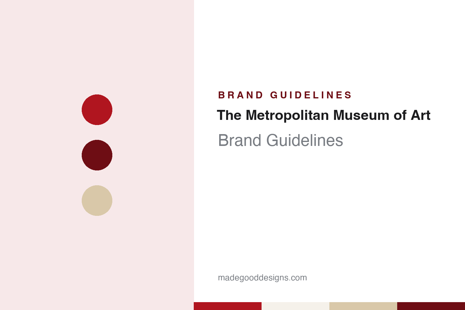
Two constants: a Met red, oxblood and limestone palette and a hybrid serif-sans register. Abstract homage — not a Metropolitan Museum of Art mark; no logo, button or artwork is reproduced.
Fifth Avenue
A charter, a park site and a Beaux-Arts front.
The Metropolitan Museum of Art took its legal form on 13 April 1870, when the New York State Legislature granted it an Act of Incorporation to establish and maintain a museum and library of art in the city. English Wikipedia records an opening reception in the picture gallery at 681 Fifth Avenue on 20 February 1872, held in rented rooms before the museum had a building of its own.
That building came on land in Central Park. The museum was granted the ground between the park’s East Drive, Fifth Avenue and the 79th and 85th Street transverse roads, and the original structure there was a red-brick and stone building designed by the architect Calvert Vaux with his collaborator Jacob Wrey Mould. Wikipedia dates the earliest portion of the present building to 1880. Later came the Fifth Avenue facade, the Great Hall and the Grand Stairway, designed in the Beaux-Arts style by Richard Morris Hunt and his son Richard Howland Hunt in the late 1890s and early 1900s. The firm of McKim, Mead & White completed the wings along the avenue in 1910, and the glass sides and rear of the complex are the work of Roche-Dinkeloo.
The building grew by accretion, so that the original Vaux and Mould brick is now largely enclosed within later additions. The result is a museum that presents two faces to the city: a long stone front with columns and steps on Fifth Avenue, and glass walls that look into the park behind. Both have served the institution’s image, from the steps that act as a meeting place on the avenue to the park-side galleries visible from the paths outside.
The museum also operates The Cloisters, a second site in Fort Tryon Park in Upper Manhattan devoted to the art and architecture of medieval Europe. From 2016 to 2020 it ran a third venue for modern and contemporary art, The Met Breuer, in the Marcel Breuer-designed building at 945 Madison Avenue that had housed the Whitney Museum of American Art. Wikipedia says a further location is planned for 2028 in the building now occupied by the Neue Galerie New York. Over the years the institution has had to name several addresses at once, and its current site names — The Met Fifth Avenue and The Met Cloisters — follow the short form that the 2016 identity made official.
Colour
A lone M, a metal button and a paper ticket.
For more than four decades the museum’s visual shorthand was a single letter. Dezeen, reporting on 19 February 2016, described the mark the museum was retiring as a logo based on the letter M, surrounded by grids and circles in the manner of a Renaissance proportion drawing, and said the institution had used it since the 1970s.
The same letter travelled out of the building on visitors’ clothing. In a press release dated 1 July 2013, the museum said that it had converted that day to a system of paper admission tickets, and that these replaced the metal admission buttons it had issued since January 1971. The museum said the switch was made for greater flexibility in the admissions process, and it coincided with the start of a seven-day opening schedule at both Fifth Avenue and The Cloisters.
Less than three years later the letter itself was replaced. The museum’s argument, as quoted by Dezeen, was that the new logo “no longer relies on symbols” and was instead based on the name people already used, The Met, which it said had an immediacy that spoke to all audiences.
The change also reflected a shift in how the institution referred to itself. The long legal name, The Metropolitan Museum of Art, remains in formal use, but the shorter name had long been the everyday one in conversation, in guidebooks and on the street. Making it the centre of the identity tied the logo to speech rather than to an emblem, and allowed the same two words to head each site name that followed. Directors and presidents changed during the period too: Wikipedia records that Thomas P. Campbell was director and chief executive until he resigned in 2017, and that Max Hollein was named director in April 2018.
Typography
Design and documentation.
A museum’s identity has to work across a wide range of surfaces. The wordmark appears on a banner several storeys high, on a gallery map folded into a coat pocket, on a ticket stub and on a website header, and it has to read the same way on all of them. For that reason many museum marks are built from type alone, with the letterforms doing the work that a pictorial symbol would do elsewhere.
Entrance signage sets the first impression: a name cut into stone or set in metal above a doorway tends to stay in place for decades, so the printed identity often has to sit comfortably beside lettering that is far older than it. Admission tokens add a smaller, more tactile layer. Clip-on badges, stickers and wristbands change colour by day or by season, which turns a simple proof of entry into a recognisable object in its own right.
Exhibition posters are where an identity is tested hardest. Each show brings its own imagery, so a durable system usually fixes only a few things, such as the position and size of the name, a typeface and a grid, and leaves the rest free for the artwork on display.
Aa
A hybrid of serif and sans letterforms — the register of a museum name that joins the classical to the modern. (Specimen set in Fraunces, a serif STAND-IN; NOT The Met logo.)
The Met
A stacked name, conjoined letters and a public argument.
The current logo was designed by the branding firm Wolff Olins and unveiled in February 2016, ahead of the opening of The Met Breuer. Dezeen described it as a stacked setting of the words The Met, with the letters in each word conjoined, and said the version released was red, while promotional material for the Breuer building had already used it in white on a red ground. The museum called it “an original drawing, a hybrid that combines and connects serif and sans serif, classical and modern letterforms”, and said this reflected the scope of its collection and the connections within it.
The identity was not limited to the mark. According to Dezeen, it was to be used on maps, signage, the website and all other material for the museum’s branches, from the flagship on Fifth Avenue to The Cloisters and the Breuer building. Dezeen also noted that Wolff Olins had previously designed the identity for Tate in London.
The reception was mixed. Dezeen reported that initial reaction had been “less than positive”, and quoted the New York magazine architecture critic Justin Davidson, who called the design a “graphic misfire” and compared the arrangement to a double-decker bus that had stopped short, pushing its passengers into one another. The museum anticipated the debate in its own statement, saying there might be argument because the logo involved change, but that it had been chosen because it represented something “simple, bold, and indisputable: The Met is here for everyone.”
The joined letters are the feature the museum tied to its idea of connection, and the same joined, stacked arrangement is what Davidson’s bus comparison described.
For a design guide, The Met shows how an institution with a long legal name can rebuild its identity around the short name the public already used, and how a decades-old emblem, once carried on a metal button, can give way to lettering that asks to be read rather than recognised. Compare it with Tate, an earlier Wolff Olins museum identity, and Guggenheim, another New York museum whose building does much of the branding work. For this guide we use Met red, oxblood and limestone with a serif, an unofficial interpretation; no product or logo is reproduced.
Explore & save
Keep The Metropolitan Museum of Art’s identity on hand — save it to a board in the Made Good inspiration library.
The Met identity set
Pin The Met red, oxblood and limestone palette and the hybrid serif-sans register to your own board.