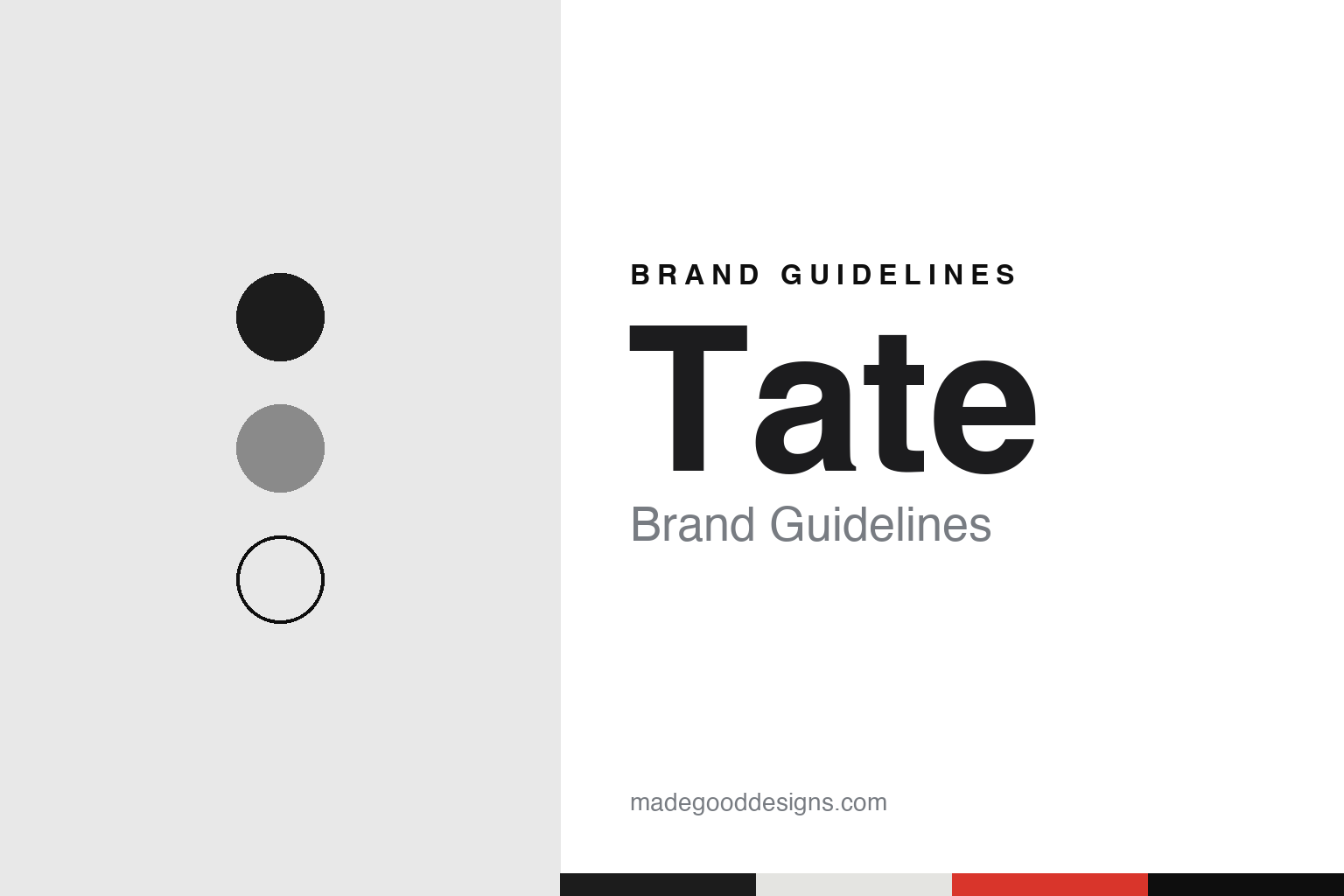
Tate Brand Guidelines
Four galleries, one wordmark that moves in and out of focus.
Aa
Two constants: a black, grey and white palette with a single colour accent, and a grotesque sans register. Abstract homage — not a Tate asset; no logo, artwork or signage is reproduced.
Millbank
A national gallery of British art that took a sugar refiner’s name.
The institution now called Tate opened in 1897 as the National Gallery of British Art, on Millbank in Pimlico, London, on the site of the former Millbank Prison, according to English Wikipedia. The building was funded by Henry Tate, the sugar refiner whose name survives in Tate & Lyle and who had gathered a collection of Victorian painting.
That changed in 1932. When the gallery’s role was widened to cover the national collection of modern art as well as British art, it was renamed the Tate Gallery, Wikipedia says. The new title put a single four-letter word at the front, and that word later came to stand for a whole group of galleries.
The building on Millbank grew in stages. Wikipedia records expansions paid for by the art dealer Joseph Duveen in 1926 and 1937, a modern extension in 1979, and the Clore Wing of 1987, which was built to house the main part of the Turner Bequest. The gallery also began running its own temporary exhibition programme after decades in which the Arts Council organised shows there.
From the late 1980s the name began to travel. Tate Liverpool opened in 1988 and Tate St Ives in Cornwall in 1993, Wikipedia says, each one pairing the founder’s surname with a place. The structure that the brand uses today was fixed in 2000, when the original gallery became Tate Britain and Tate Modern opened in the former Bankside Power Station on the south bank of the Thames. From then on the institution called itself simply Tate, and the four galleries share a single collection.
Each gallery has its own brief within that shared collection. Wikipedia describes Tate Britain as showing British art from 1500 to the present day, and Tate Modern as showing British and international modern and contemporary art from 1900 onwards; Tate Liverpool works to the same purpose as Tate Modern on a smaller scale, and Tate St Ives shows modern and contemporary art by artists connected with the area. Tate also runs the Turner Prize, awarded each year to a British visual artist, which Wikipedia says is held at Tate Britain every other year and at venues outside London in the alternate years. That spread of buildings, audiences and events is the background against which the visual identity had to work.
Colour
Wolff Olins and a logo that blurs.
The split into four galleries needed a visual identity that could hold them together, and the commission went to the London consultancy Wolff Olins. Its work launched in 2000 to coincide with the opening of Tate Modern, It’s Nice That reported in 2016. English Wikipedia describes the idea behind it as “look again, think again” and says the result was a family of logos that “move in and out of focus.”
The device is easy to describe. The word TATE is built from dots, and the dots are arranged so that the letters can appear sharp, softened or close to dissolving. Wikipedia lists a standard version, a blurred version, a faded version and a halftone version made of dots rather than a smooth fade. Instead of one fixed mark, Tate had a set of related marks that could be chosen to suit a poster, a banner or a leaflet, which the museum described as suggesting an institution that is “always changing but always recognizable,” Wikipedia says.
The scheme also fixed a pattern for naming. Each gallery was presented as Tate plus a place, and in the original system that place name sat inside a lock-up with the logo. By 2016 the identity was being used as multiple logo variations, It’s Nice That reported.
The house typeface is called Tate Pro, according to It’s Nice That.
Typography
Signage, badges and posters.
A museum’s identity has to work across a wide range of surfaces. The wordmark appears on a banner several storeys high, on a gallery map folded into a coat pocket, on a ticket stub and on a website header, and it has to read the same way on all of them. For that reason many museum marks are built from type alone, with the letterforms doing the work that a pictorial symbol would do elsewhere.
Entrance signage sets the first impression: a name cut into stone or set in metal above a doorway tends to stay in place for decades, so the printed identity often has to sit comfortably beside lettering that is far older than it. Admission tokens add a smaller, more tactile layer. Clip-on badges, stickers and wristbands change colour by day or by season, which turns a simple proof of entry into a recognisable object in its own right.
Exhibition posters are where an identity is tested hardest. Each show brings its own imagery, so a durable system usually fixes only a few things, such as the position and size of the name, a typeface and a grid, and leaves the rest free for the artwork on display.
Aa
A grotesque sans — for a house typeface called Tate Pro. (Specimen set in Archivo, a sans STAND-IN; NOT the Tate logo or typeface.)
Tate
North’s 2016 refresh: one logo, two weights.
Sixteen years after the launch, Tate asked for the identity to be reviewed. The job went to the London studio North, which was approached the year before the 2016 refresh and chose to “evolve” the existing scheme rather than replace it, It’s Nice That reported on 21 June 2016. “For us to propose getting rid of the identity system entirely would be irresponsible and a selfish act as designers,” the North partner Jeremy Coysten told the magazine.
The changes were mostly about reduction. North redrew the logo and moved the whole of Tate — all four galleries and its digital channels — onto one logo in place of the many variants. “We wanted to create one logo which was still recognisably Tate but could be used more dynamically and exist more effectively in the digital world,” the partner Stephen Gilmore said, according to the same report. The gallery names were untied from the logo lock-up so that each could be set more clearly on its own.
Type was simplified in the same way. Tate Pro stayed, but in two weights, with an all-caps setting for headlines, It’s Nice That reported. Colour took an unusual route: the palette for Tate communications was chosen from a Tate Members commission by Martin Creed, and the plan was to refresh it every few years with a new artist. The refresh rolled out from January 2016 and culminated with the opening of the new Tate Modern building, the Switch House, on 17 June 2016.
For a design guide, Tate shows how one short name and a single movable idea can carry four buildings, and how a later studio can tidy a system without throwing it away. Compare the Metropolitan Museum of Art and the Guggenheim. For this guide we use black, grey and white with a single red with a sans, an unofficial interpretation; no product or logo is reproduced.
Explore & save
Keep Tate’s identity on hand — save it to a board in the Made Good inspiration library.
Tate identity set
Pin the Tate black, grey and white palette and the grotesque sans register to your own board.