Pittsburgh Penguins Brand Guidelines
A bird for an arena called the Igloo, set on the city’s Golden Triangle.
Aa
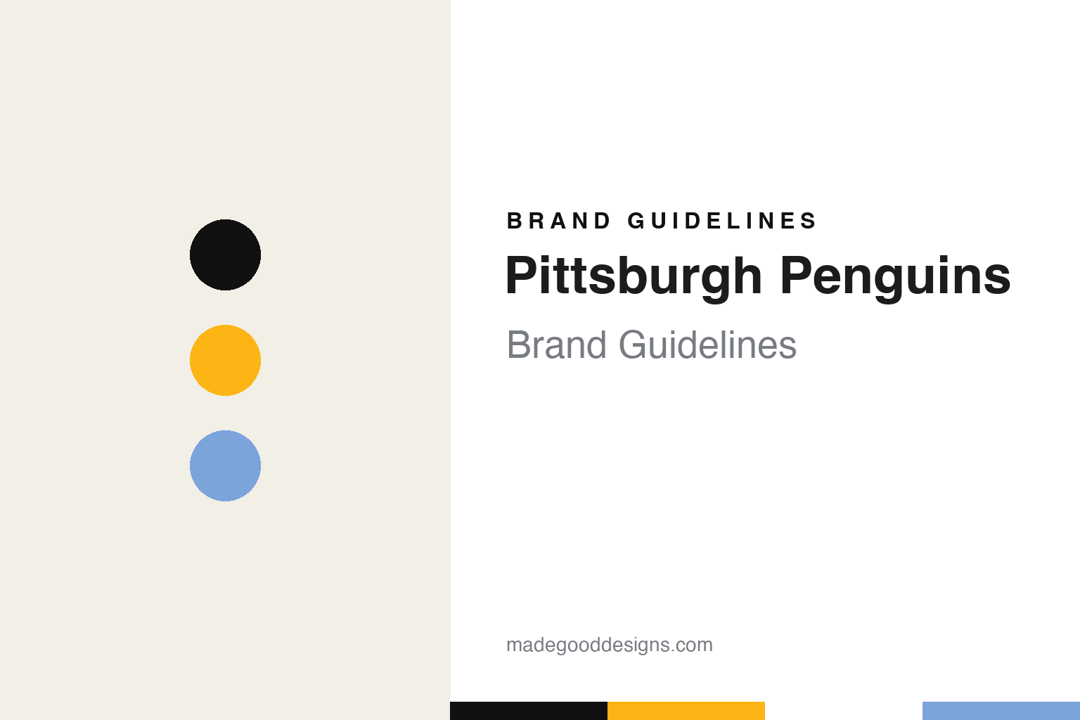
Two constants: a penguin black, Pittsburgh gold and powder blue palette and a condensed sweater lettering register. Abstract homage — not a Pittsburgh Penguins mark; no penguin, triangle or wordmark is reproduced.
A team for the Igloo
Jack McGregor’s investors, a naming contest and a triangle downtown.
Pittsburgh had professional hockey long before the Penguins, including the NHL’s Pittsburgh Pirates from 1925 to 1930 and the American Hockey League’s Hornets. English Wikipedia says that in the spring of 1965 Jack McGregor, a Pennsylvania state senator, began gathering support to bring the NHL back, forming a group of local investors that included H. J. Heinz III, Steelers owner Art Rooney and Richard Mellon Scaife. On 8 February 1966 the league awarded Pittsburgh an expansion team for the 1967–68 season.
The name came from the public. Wikipedia says the club held a naming contest, and that the winning entry, by Mark Peters, was inspired by the “Igloo,” the nickname of the domed Civic Arena where the team would play. The same choice led to the logo: a penguin in front of a triangle, which stood for the “Golden Triangle” of downtown Pittsburgh.
The original uniforms were blue. When the team began play in 1967, Wikipedia says, it wore dark blue, light blue and white, with the word “Pittsburgh” written diagonally down the front of the sweater and three dark blue stripes around the sleeves and hem. The crest showed a hockey-playing penguin wearing a scarf over an inverted triangle. A refined version appeared on a redesigned uniform in the second season, removing the scarf and giving the bird a sleeker outline, and the circle around the logo was later dropped. Wikipedia lists the colours of the period as powder blue, navy and white; the powder blue gave way to royal blue in 1973 and returned in 1977.
The early business was unsteady. Wikipedia records that in early 1975 the club’s creditors demanded payment of back debts and the team went into bankruptcy.
Colour
Black and gold, a borrowed palette and a string of owners.
The colour change came in January 1980. Wikipedia says the Penguins switched from blue and white to black and gold to match Pittsburgh’s other professional teams, the baseball Pirates and the football Steelers, and the flag of the city. The change was contested: the Boston Bruins protested, claiming rights to black and gold, and the Penguins answered by pointing to the colours worn by the NHL’s Pittsburgh Pirates in the 1920s and to black and gold as the official colours of the City of Pittsburgh. They obtained permission to use them. Wikipedia adds that the gold of that period, like the Pirates’ and Steelers’, was closer to yellow.
Ownership changed repeatedly in the decades that followed. In the 1990s the club was owned by Howard Baldwin and Morris Belzberg, and after a second financial crisis Mario Lemieux bought it out of bankruptcy in 1999, Wikipedia says. The Boston Globe reported on 28 November 2021 that Fenway Sports Group had signed an agreement to buy a controlling stake, subject to approval by the league’s owners, and that Lemieux and his co-owner Ron Burkle would keep ownership stakes. Wikipedia says FSG took over as majority owner on 31 December 2021. Fenway Sports Group has owned the majority since then.
The arena changed too. The Penguins played at the Civic Arena from 1967 and moved in September 2010 to the Consol Energy Center, now PPG Paints Arena. Wikipedia says the team has worn its black sweater at home since the league introduced dark home uniforms in 2003–04, and that in 2014 it brought back “Pittsburgh gold,” the shade it had dropped in 2002, on a black alternate modelled on its early-1990s uniforms. The metallic Vegas gold sets worn from 2000 were retired in 2016.
Typography
Design and documentation.
A hockey sweater carries its identity in a few fixed places. The crest sits square on the chest, sized to read from the upper rows of an arena and on a broadcast frame, so it tends to be built from heavy shapes, thick outlines and a small number of flat colours. Twill and embroidery limit fine detail, which pushes designers towards bold letterforms and simple silhouettes rather than thin lines or gradients.
Shoulder patches give a second, smaller mark room to work, often a secondary logo, a monogram or a city reference. Sleeve and hem stripes repeat the colour order in bands, and numbers and nameplates on the back usually follow a block or arched lettering style that has to stay legible at speed and from a distance.
Away from the sweater, the same marks travel onto rink graphics: centre-ice logos painted beneath the surface, dasher-board panels, scoreboards, tickets and arena signage. For a designer studying a hockey identity, the useful exercise is to look at how one crest holds up across all of these sizes, from a small pin or patch to centre ice.
Aa
A tall condensed sans — the register of a sweater number and an arena scoreboard. (Specimen set in Anton, a condensed sans STAND-IN; NOT the Pittsburgh Penguins logo or wordmark.)
Pittsburgh Penguins
A skating bird, a streamlined one and a return.
The Penguins have worked through two main versions of their bird. The skating penguin over the triangle was the team’s mark from 1967, and Wikipedia says the black and gold “skating penguin” uniform was worn, with changes to lettering and striping, between 1980 and 1992.
In the 1992–93 season the club introduced a new uniform and the “flying penguin” logo, nicknamed the “Robopenguin.” The design firm Vance Wright Adams and Associates says on its website, in a post dated 21 January 2013, that owner Howard Baldwin chose it in June 1992 to create the new logo and uniforms, and that the design kept the black and gold colours, the Golden Triangle background and the penguin. Writing in the Pittsburgh Post-Gazette on 22 August 2002, Dejan Kovacevic said the 1992 mark was created when Baldwin sought to boost merchandise sales, and that many fans had criticised it as too corporate.
The reversal came under Lemieux. Kovacevic reported that the original skating penguin, which had returned two years earlier as the crest of a black alternate sweater, would be rechristened the team’s official symbol at a Mellon Arena news conference, and would appear on nearly all merchandise, publications and promotions. He wrote that Lemieux had often stated his affinity for the original logo. The firm’s 2013 post says its streamlined penguin then moved to a shoulder patch, and Wikipedia says it was removed from the shoulders when new league-wide uniforms arrived for 2007–08.
The newest uniforms lean on local geography. For the 2025–26 home opener, Wikipedia says, the Penguins wore a gold alternate with the skating penguin minus its triangle; three black sleeve stripes stand for the Three Rivers, the Allegheny, the Monongahela and the Ohio, a triangle shoulder patch carries three gold waves and an igloo in a nod to the Civic Arena, and the letters and numbers are based on Pittsburgh’s historic trolley system.
For a design guide, Pittsburgh Penguins shows how a club can retire a redesign and return to its earlier drawing while keeping the colours of the newer era. Compare the NHL, the Detroit Red Wings and the Pittsburgh Steelers. For this guide we use penguin black, Pittsburgh gold and powder blue with a condensed sans, an unofficial interpretation; no product or logo is reproduced.
Explore & save
Keep Pittsburgh Penguins’s identity on hand — save it to a board in the Made Good inspiration library.
Pittsburgh Penguins identity set
Pin the Pittsburgh Penguins penguin black, Pittsburgh gold and powder blue palette and the condensed sweater lettering register to your own board.