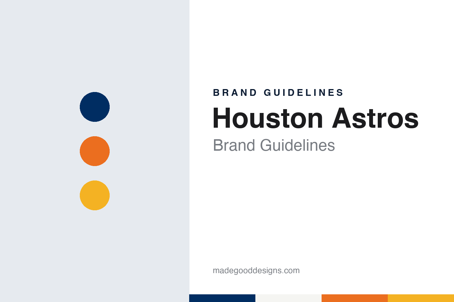
Houston Astros Brand Guidelines
From Colt Stadium to Space City, in navy, orange and a rainbow of stripes.
Aa
Two constants: an Astros navy, star orange and sunrise yellow palette and a condensed athletic sans register. Abstract homage — not a Houston Astros product or mark; no cap, uniform or logo is reproduced.
From Colts to Astros
A pistol, then a space programme.
Major League Baseball came to Houston through a syndicate. English Wikipedia names four men as chiefly responsible: the journalist and promoter George Kirksey, Craig Cullinan Jr., the oil and real-estate businessman R.E. “Bob” Smith, and Roy Hofheinz, a former mayor of Houston and Harris County judge. Together they formed the Houston Sports Association, and on 17 October 1960 the National League granted it an expansion franchise to begin play in 1962. To secure territorial rights, the association bought the minor-league Houston Buffaloes on 17 January 1961.
The club’s original name came from the public. Wikipedia says the team was called the Colt .45s after a “Name the Team” contest won by William Irving Neder, after the revolver known as “the gun that won the West”, and that the colours chosen were navy and orange. The team opened on 10 April 1962 at Colt Stadium, a temporary ground built beside the construction site of its permanent home: the owners believed a covered stadium was essential to baseball in Houston’s humidity. Wikipedia says the original home uniform showed a navy pistol with orange smoke curling from the barrel to form the “C” in “Colts”, while the caps were all navy with “.45s” in orange.
The name lasted three seasons. Writing for MLB.com on 1 December 2021, Brian McTaggart reported that Hofheinz announced on 1 December 1964 that the Colt .45s would become the Astros, in step with the team’s move into the Astrodome for the 1965 season. McTaggart wrote that while Hofheinz was considering a change in 1964, the Colt Firearms Company wanted a share of the team’s revenues. Hofheinz hired an artist, who sketched concepts while attending games at Colt Stadium that season, and the shortlist came down to Astros and Stars. Hofheinz asked his friend, the astronaut Alan Shepard, for advice, and Shepard favoured Astros, short for Astronauts, a nod to NASA’s presence in Houston.
McTaggart quoted Hofheinz at the time saying the space idea made sense because the club was in “Space City, U.S.A.”, with its spring-training base at Cocoa Beach near Cape Kennedy, and that he hoped the name would help dispel the image of Texas as a land of cowboys. Soon after, McTaggart wrote, the club unveiled a logo showing baseballs orbiting around the Astrodome, a version of which stayed in use until 1993.
Colour
Hofheinz, the creditors, McMullen, McLane, Crane.
Hofheinz did not hold the club alone at the start. Wikipedia says Smith and Cullinan were brought in for their financial resources and Hofheinz for his salesmanship, and that by the time the team moved into the Astrodome in 1965 he was the franchise’s sole owner. Wikipedia says that in 1975, with the Astrodome carrying heavy debts, control of the Astrodomain, the business that included the Astros, passed from Hofheinz to the creditors GE Credit and Ford Motor Credit.
The corporate years ended with a sale to an individual. Wikipedia says the New Jersey shipping executive John McMullen, who also owned the NHL’s New Jersey Devils, agreed to buy the Astros in May 1979, and that he sold the team in 1993 to the Texas businessman Drayton McLane, who committed to keeping it in Houston. McLane wanted to leave the Astrodome, and in 2000 the club moved to a new downtown ballpark on the site of the city’s old Union Station. Wikipedia says it opened as Enron Field after the naming rights were sold to the energy company; the Houston firm Minute Maid bought the rights in 2002 after Enron’s bankruptcy, and the ground is now called Daikin Park.
Jim Crane has owned the Astros since 2011. Wikipedia says McLane put the club up for sale in November 2010, that Crane, a Houston businessman who had founded an air-freight company in the 1980s, emerged as the front-runner in March 2011, and that on 15 November 2011 it was announced that he had agreed to move the franchise from the National League to the American League for the 2013 season, a condition of the sale. The other owners approved the sale two days later. McTaggart wrote that Crane briefly considered changing the club’s name to coincide with the league switch, before deciding that the Astros had too much history to drop.
The mascots have followed the same arc as the uniforms. Wikipedia says the club’s earliest mascot, introduced in April 1977, was Chester Charge, a Texas cavalry soldier on a horse created by Ed Henderson. Orbit, a lime-green space creature with baseball antennae, served from 1990 through 1999 and gave way in 2000 to a rabbit, Junction Jack, with the move to the new ballpark. The Associated Press, in a report carried by ESPN on 2 November 2012, recorded the club shedding Junction Jack and bringing back a redesigned green Orbit at the launch of its new look.
Typography
Design and documentation.
Baseball identity work is spread across a handful of surfaces, each with its own constraints. The cap carries a compressed version of a club’s mark: usually a single letter, a monogram or a small emblem, embroidered in raised thread on a curved front panel and read from across a field or a street. Because embroidery fills shapes with stitches rather than ink, thin hairlines and tight counters tend to be simplified for the crown.
The jersey script is a different exercise. Running diagonally or across the chest, it is lettering rather than type: connected strokes, swashes and tails that underline the word, often in tackle twill with a contrasting outline. Road and home shirts frequently carry different words, so a club may maintain two or more scripts in matching style.
Sleeve patches add a third layer: a fuller badge or commemorative mark sewn to the shoulder, where there is room for detail the cap cannot hold. Finally, ballpark signage scales everything up, from the lettering over a gate to painted outfield walls and scoreboard graphics, where a mark must survive distance, weather and daylight. Reading a club’s identity means looking at all four together.
Aa
A condensed athletic sans — the register of a jersey number and a ballpark board. (Specimen set in Barlow Condensed, a sans STAND-IN; NOT the Houston Astros logo or wordmark.)
Rainbow, then navy
A rocket trail, and a return to the start.
The Astros’ uniforms have changed more than their name. When the team became the Astros in 1965, Wikipedia says, the home uniform took on a “shooting star” design with “Astros” in navy trimmed in orange, and the cap gained an orange star with an “H” in block serif letters. In 1971 the colours were inverted, navy becoming orange and orange a lighter blue, and in 1972 the club switched to polyester, with elastic waistbands and zip-up jerseys.
The break came in 1975. Wikipedia describes the new uniform as a solid block of yellow, orange and red stripes from the chest down, with a large dark blue star over the midsection, the same stripes running down the trouser legs and the player’s number repeated on the leg. The stripes were meant to suggest the fiery trail of a rocket; critics panned the design, Wikipedia says, but the public took to it, and versions appeared at high school and little league level. Known as the “tequila sunrise” or rainbow uniform, it was worn at home and on the road until 1980, when a cleaner design moved the rainbow to the sleeves.
New owners brought new colours. Wikipedia says that after McLane’s purchase the club retired the rainbow uniforms and switched to midnight blue and metallic gold for 1994, with a more aggressive “Astros” lettering and a stylised “flying” star. The move downtown in 2000 brought a retro look in brick red, sand and black, with pinstripes and script lettering; Wikipedia says the colours drew on the ballpark’s past as a railway depot, and navy was absent from the palette.
Under Crane the club went back to where it began. The Associated Press, reporting for ESPN on 2 November 2012, described the new look unveiled at Minute Maid Park ahead of the move to the American League: the navy and orange colour scheme used from 1962 to 1993, the orange star with a white “H” from that era on the caps, white home uniforms with orange piping, grey road uniforms with blue piping, an orange alternate, and the rainbow print worked into a blue jersey with stripes down the side. In 2022 the club’s City Connect uniform added a “Space City” wordmark that Wikipedia says pays homage to NASA’s “worm” logo, and in 2025 a white City Connect read “STROS” with tequila-sunrise trim and a lunar pinstripe.
For a design guide, the Astros show how a club can treat its own archive as a palette: a pistol, a domed stadium, a rocket trail and a star have each taken a turn, and the navy and orange of 1962 came back. Compare the wider league in our MLB brand guidelines and the maker of the City Connect series in our Nike brand guidelines. For this guide we use Astros navy, star orange and sunrise yellow with a condensed sans, an unofficial interpretation; no product or logo is reproduced.
Explore & save
Keep Houston Astros’s identity on hand — save it to a board in the Made Good inspiration library.
Houston Astros identity set
Pin the Houston Astros navy, orange and sunrise yellow palette and the condensed athletic sans register to your own board.