Atlanta Braves Brand Guidelines
A Boston nickname carried through three cities, and a script that has led the jersey since 1987.
Aa
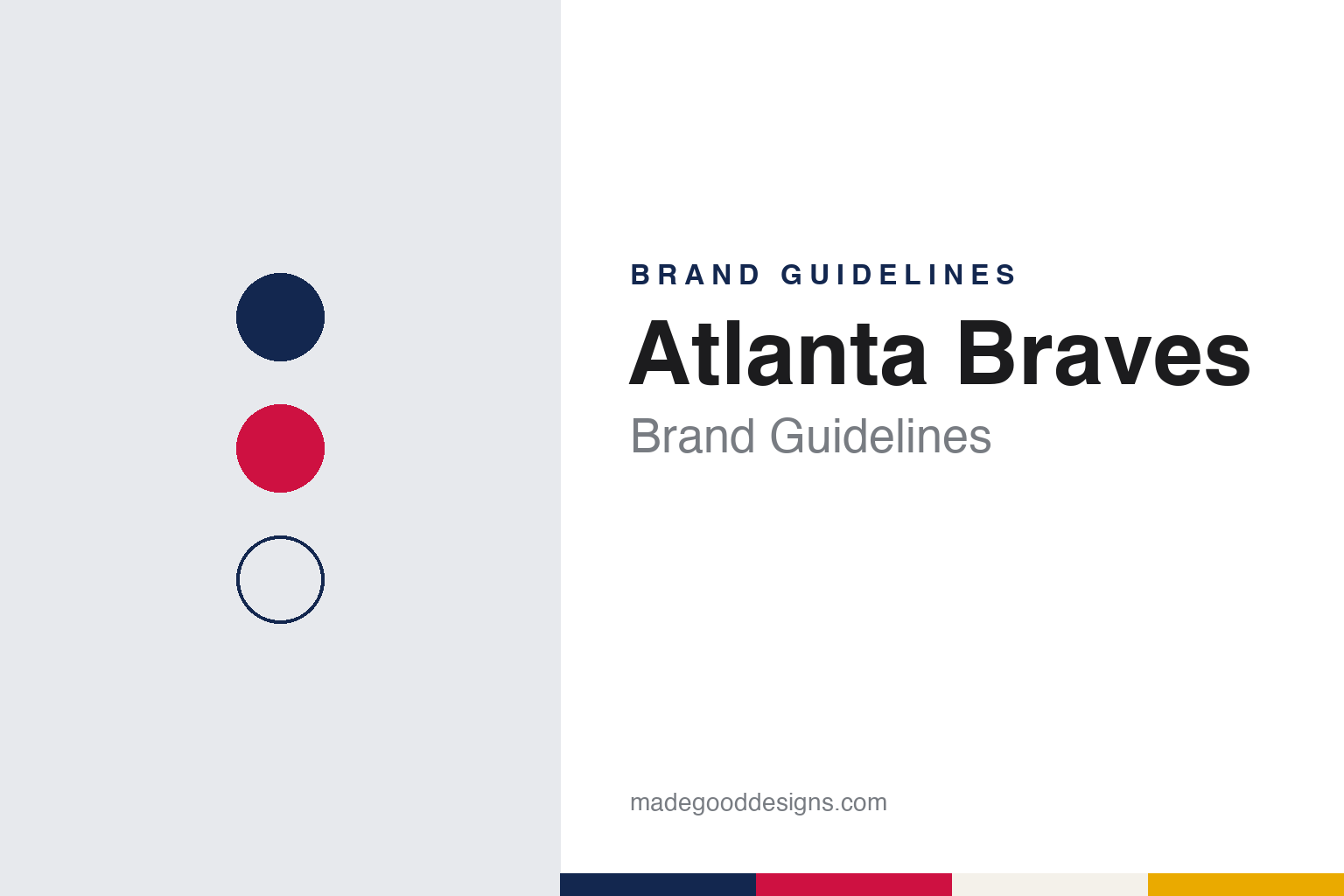
Two constants: a Peachtree navy, scarlet and home white palette and a cursive script and block lettering register. Abstract homage — not an Atlanta Braves mark; no cap logo, script or wordmark is reproduced.
A Boston name
Red Stockings, Beaneaters, Doves and a Tammany Hall owner.
The Atlanta Braves began in Boston. English Wikipedia records that when the Cincinnati Red Stockings disbanded after the 1870 season, manager Harry Wright and several of his players moved to Boston and formed the Boston Red Stockings in 1871, a charter club of the National Association. The club joined the new National League in 1876, when it was known as the Red Caps, and over the next decades it passed through a run of nicknames: the Beaneaters from 1883 to 1906, the Doves from 1907, the Rustlers in 1911. In 1907, Wikipedia adds, the team temporarily dropped red from its stockings altogether.
The current name dates from 1912. Wikipedia says the club’s president, John M. Ward, named it after the owner, James Gaffney, who was known as one of the “braves” of Tammany Hall, the New York political machine, which used a Native American chief as its symbol. The name did not hold without a break: after owner Emil Fuchs lost control of the club in 1935, it was rebranded the Boston Bees from 1936 to 1940, until construction executive Lou Perini took over and restored “Braves.” Gaffney also built Braves Field, which opened in August 1915; before that the club had played at the South End Grounds.
Boston was not the last stop. On 13 March 1953, Wikipedia says, Perini announced a move to Milwaukee, citing television and waning local enthusiasm, and the club played at Milwaukee County Stadium from that season. In 1962 Perini sold the team to a Chicago-based group led by William Bartholomay, which planned to move again. National League owners approved a relocation to Atlanta in October 1964, but legal action in Wisconsin held the team in Milwaukee for the 1965 season. The Braves opened in Atlanta in 1966, at Atlanta Stadium, later called Atlanta–Fulton County Stadium.
Colour
From Ted Turner to Time Warner to Liberty Media and a listed company.
Television shaped the Atlanta years. Wikipedia records that media owner Ted Turner, whose superstation WTBS carried the team’s games, bought the Braves in 1976 as a way to keep the club, and one of his main programming staples, in Atlanta. WTBS marketed the club as “America’s Team.” When Time Warner acquired Turner Broadcasting System in 1996, the Braves went with it.
The next owner was another media company. Time Warner put the club up for sale in December 2005, Wikipedia says, and reached a deal with Liberty Media in February 2007. Sports Video Group reported on 17 May 2007 that Liberty Media and Time Warner had completed the transaction the previous day: Liberty exchanged Time Warner shares it held for a newly created Time Warner subsidiary that held the Atlanta Braves, and Major League Baseball approved the deal. The club was later moved out of Liberty into its own company. In a release dated 18 July 2023, Liberty Media said it had completed the split-off of Atlanta Braves Holdings, leaving the two as separate publicly traded companies, with the new company’s shares trading from the following day. Atlanta Braves Holdings has owned the club since then.
The ballparks changed with the owners. Wikipedia lists Turner Field as the team’s home from 1997 to 2016 and Truist Park, in Cobb County, from 2017. The colours have held steadier: Wikipedia gives them as navy blue, scarlet red, gold and white, and a note in the article cites the team’s mascot page describing the official colours as navy blue and scarlet red.
The name and some fan traditions have drawn criticism. Wikipedia records that in 1991 fans popularised the “tomahawk chop,” which Native American groups have criticised as demeaning, and that the debate resurfaced in 2019 and continued in 2021.
Typography
Design and documentation.
Baseball identity work is spread across a handful of surfaces, each with its own constraints. The cap carries a compressed version of a club’s mark: usually a single letter, a monogram or a small emblem, embroidered in raised thread on a curved front panel and read from across a field or a street. Because embroidery fills shapes with stitches rather than ink, thin hairlines and tight counters tend to be simplified for the crown.
The jersey script is a different exercise. Running diagonally or across the chest, it is lettering rather than type: connected strokes, swashes and tails that underline the word, often in tackle twill with a contrasting outline. Road and home shirts frequently carry different words, so a club may maintain two or more scripts in matching style.
Sleeve patches add a third layer: a fuller badge or commemorative mark sewn to the shoulder, where there is room for detail the cap cannot hold. Finally, ballpark signage scales everything up, from the lettering over a gate to painted outfield walls and scoreboard graphics, where a mark must survive distance, weather and daylight. Reading a club’s identity means looking at all four together.
Bb
A flowing brush script — the register of a cursive jersey wordmark underlined by a long tail. (Specimen set in Yellowtail, a script STAND-IN; NOT the Atlanta Braves logo, script or wordmark.)
Atlanta Braves
A script, a lowercase a and a nod to a television logo.
The club’s present primary mark dates from 1987. Wikipedia describes the modern logo, introduced that year, as the cursive word “Braves” with a tomahawk beneath it, and says the uniforms adopted at the same time evoked the club’s classic look of the 1950s, the Milwaukee era. Earlier logos had used figures rather than lettering: Wikipedia lists a Native American warrior from 1945 to 1955 and a laughing Native American with a mohawk and a feather from 1956 to 1965.
The uniform set has grown around that script. Wikipedia says that for the 2023 season the Braves had four combinations: the white home and grey road uniforms, a navy road alternate and a red Friday-night home alternate, alongside a City Connect uniform worn on Saturdays as a tribute to Hank Aaron. That City Connect set put “The A” across the chest and paired it with an “A” cap in the colours of 1974, the year associated with Aaron.
The newest alternate looks back to the Turner years. Wikipedia records that the club retired the 1970s-style City Connect set and, ahead of the 2026 season, unveiled a new alternate as an homage to its growth through cable television in the 1980s. It is a powder-blue pullover with a script “Atlanta” on the front and a lowercase “a” on the cap, with an “ATL” wordmark on the left sleeve and printing above the laundry tag drawn in the style of the classic TBS SuperStation logo. It connects the uniform to the same broadcaster that marketed the club across the country from 1976.
For a design guide, the Atlanta Braves show how a club with a long chain of names, cities and owners can settle on one script and one colour pair and then rotate everything else, from 1950s-inspired whites to a powder-blue pullover borrowed from cable television. Compare it with the New York Mets, a National League East rival, and MLB, whose City Connect programme produced the Aaron tribute. For this guide we use Peachtree navy, scarlet and home white with a serif, an unofficial interpretation; no product or logo is reproduced.
Explore & save
Keep Atlanta Braves’s identity on hand — save it to a board in the Made Good inspiration library.
Atlanta Braves identity set
Pin the Atlanta Braves Peachtree navy, scarlet and home white palette and the cursive script and block lettering register to your own board.