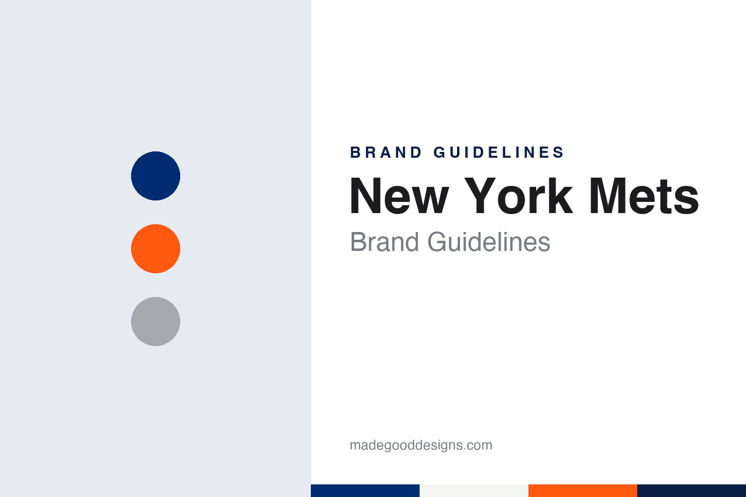
New York Mets Brand Guidelines
From the Polo Grounds to Queens, in Dodgers blue and Giants orange.
Aa
Two constants: a Mets blue, Giants orange and road grey palette and a condensed athletic sans register. Abstract homage — not a New York Mets product or mark; no cap, uniform or logo is reproduced.
Just plain Mets
A new National League club for an emptied city.
The New York Mets were created to fill a gap. After the 1957 season the Brooklyn Dodgers and the New York Giants both moved to California, leaving New York without a National League club. English Wikipedia says that, faced with the prospect of a New York team in the proposed Continental League, a third major league announced by the lawyer William Shea, the National League expanded, and that on 6 March 1961 league president Warren Giles formally sent the new club its certificate of membership. The Mets began play in 1962, the same season as the Houston Colt .45s, the other National League expansion club of that year.
The money came from Joan Whitney Payson. In the Society for American Baseball Research’s team ownership history, published on 11 January 2017, Leslie Heaphy writes that the group was led by Payson and her husband, Charles Shipman Payson, with Donald Grant as a minority partner; Payson and Grant had met in Florida in the 1940s and had both wanted to buy the New York Giants. Heaphy writes that the club’s opening management decision came in March 1961, when it hired George Weiss as president and general manager.
The name followed that spring. According to Heaphy, Payson hosted a gathering at her Manhattan home in May 1961 to choose it; some of those present recalled that her own favourite was the Meadowlarks, but the New York Metropolitans was chosen, and Payson announced it at the Savoy on 8 May 1961, saying the team would be known as the Mets. Wikipedia says the nickname was a natural shorthand for the corporate name, the New York Metropolitan Baseball Club, Inc., that it recalled the Metropolitans who played in the American Association from 1880 to 1887, and that its brevity suited newspaper headlines.
The colours made the same argument as the name. Heaphy writes that the club combined Dodgers blue and Giants orange to encourage support from fans of the two departed teams; Wikipedia adds that blue and orange also appear on the flag of New York City. The Mets spent their opening two seasons at the Polo Grounds in Manhattan, the Giants’ old home, before moving in 1964 to Shea Stadium in Queens, named after William Shea. They played there until 2008 and have played since 2009 at Citi Field, built next to the site where Shea Stadium stood.
Colour
Payson, Doubleday and Wilpon, then Cohen.
Ownership of the Mets has changed hands only a few times. Heaphy writes that Payson took little part in day-to-day decisions, which largely fell to Grant as chairman of the board. After Payson died in October 1975, her shares were bought by her husband, and the family’s involvement passed to their daughter, Lorinda de Roulet, who became president and then chairwoman after Grant resigned in 1978. The club stayed with the Payson family until January 1980, when, Heaphy writes, it changed hands after Charles Payson invited bids.
The buyers were the publishing house Doubleday and Co. Fred Wilpon. Wikipedia says Nelson Doubleday Jr. was named chairman of the board and Wilpon, then a minority shareholder, club president. Heaphy writes that Doubleday and Co. kept primary control until 1986, after which ownership stayed with Nelson Doubleday and Wilpon as partners, and that in 2002 Wilpon and his firm Sterling Equities bought out Doubleday. Wikipedia dates Wilpon becoming sole owner to 23 August 2002.
Steve Cohen has owned the Mets since 2020. Wikipedia says the hedge fund manager became majority owner on 30 October 2020, buying the club from the Wilpon family, who kept a minority stake. The club’s television home is also part of the business: Wikipedia says Mets games are mainly carried by SportsNet New York, a joint venture of the Mets and NBC Sports Regional Networks that launched in 2006.
Some of the club’s identity was settled before a game was played. Wikipedia says the club song, “Meet the Mets”, was written in 1961 by Bill Katz and Ruth Roberts, and is still played on broadcasts and at home games. The club’s earliest mascot was Homer, a beagle trained by Rudd Weatherwax and sponsored by Rheingold Beer, who had his own platform behind home plate at the Polo Grounds and did not make the move to Shea. Mr. Met appeared on the covers of game programmes in 1963, and fans met a live costumed version when the team moved to Shea in 1964; he has since been joined by Mrs. Met. Under de Roulet the club tried a mule, Mettle, named through a fan contest, for the 1979 season only.
Typography
Design and documentation.
Baseball identity work is spread across a handful of surfaces, each with its own constraints. The cap carries a compressed version of a club’s mark: usually a single letter, a monogram or a small emblem, embroidered in raised thread on a curved front panel and read from across a field or a street. Because embroidery fills shapes with stitches rather than ink, thin hairlines and tight counters tend to be simplified for the crown.
The jersey script is a different exercise. Running diagonally or across the chest, it is lettering rather than type: connected strokes, swashes and tails that underline the word, often in tackle twill with a contrasting outline. Road and home shirts frequently carry different words, so a club may maintain two or more scripts in matching style.
Sleeve patches add a third layer: a fuller badge or commemorative mark sewn to the shoulder, where there is room for detail the cap cannot hold. Finally, ballpark signage scales everything up, from the lettering over a gate to painted outfield walls and scoreboard graphics, where a mark must survive distance, weather and daylight. Reading a club’s identity means looking at all four together.
Aa
A condensed athletic sans — the register of a jersey number and a ballpark board. (Specimen set in Barlow Condensed, a sans STAND-IN; NOT the New York Mets logo or script.)
Skyline and bridge
A cartoonist’s map of the city, barely altered.
The Mets’ logo has barely moved since it was drawn. Heaphy writes that the club commissioned it from the sports cartoonist Ray Gotto and unveiled it in November 1961. Wikipedia describes it as “Mets” written in orange script trimmed in white across a blue New York skyline, with a white suspension bridge in the foreground, all held inside an orange circle with baseball stitching. Each part of the skyline was chosen: at the left a church spire for Brooklyn, the borough of churches; then the Williamsburgh Savings Bank Building; the Woolworth Building; a general view of midtown; the Empire State Building; and, at the far right, the headquarters of the United Nations. Wikipedia says the bridge stands for the club representing all five boroughs. In 1999 a small “NY” to the left of the script was removed.
The logo has resisted tinkering. Wikipedia says that towards the end of the 2014 season the club altered the logo on its Facebook and Twitter accounts, tilting the roof of the far-right building so that it became the Citigroup Center rather than the UN, and reverted the change after a negative reaction from fans. A black-skyline alternate, with the script in blue trimmed in orange and white, was created in 1999 after black joined the colour scheme in 1998; Wikipedia says black was phased out of the uniforms from 2012, eliminated in 2013 and brought back for alternate uniforms in 2021.
The cap borrows from both predecessors. Wikipedia says it carries an orange interlocking “NY” identical to the one the New York Giants used in their final years, on a blue cap reminiscent of the Brooklyn Dodgers. The home uniform is white with blue pinstripes and “Mets” in blue script outlined in orange, with the team logo on the sleeve. The grey road uniform, in its current form since 2025, carries a radially arched “NEW YORK” in Tiffany-style letters, and a blue pullover road alternate with “New York” in script was added the same year. The City Connect uniform introduced in 2024 is dark grey with an “NYC” wordmark, black pinstripes and a subway-token patch; Wikipedia says its purple accent comes from the 7 line that runs to Citi Field, and its cap carries a silhouette of the Queensboro Bridge.
For a design guide, the Mets show how much a single drawing can carry: a skyline, a bridge and two borrowed colours have carried the club’s identity since 1961. Compare the pinstripes across town in our New York Yankees brand guidelines, and the blue the Mets inherited in our Los Angeles Dodgers brand guidelines. For this guide we use Mets blue, Giants orange and road grey with a condensed sans, an unofficial interpretation; no product or logo is reproduced.
Explore & save
Keep New York Mets’s identity on hand — save it to a board in the Made Good inspiration library.
New York Mets identity set
Pin the New York Mets blue, orange and road grey palette and the condensed athletic sans register to your own board.