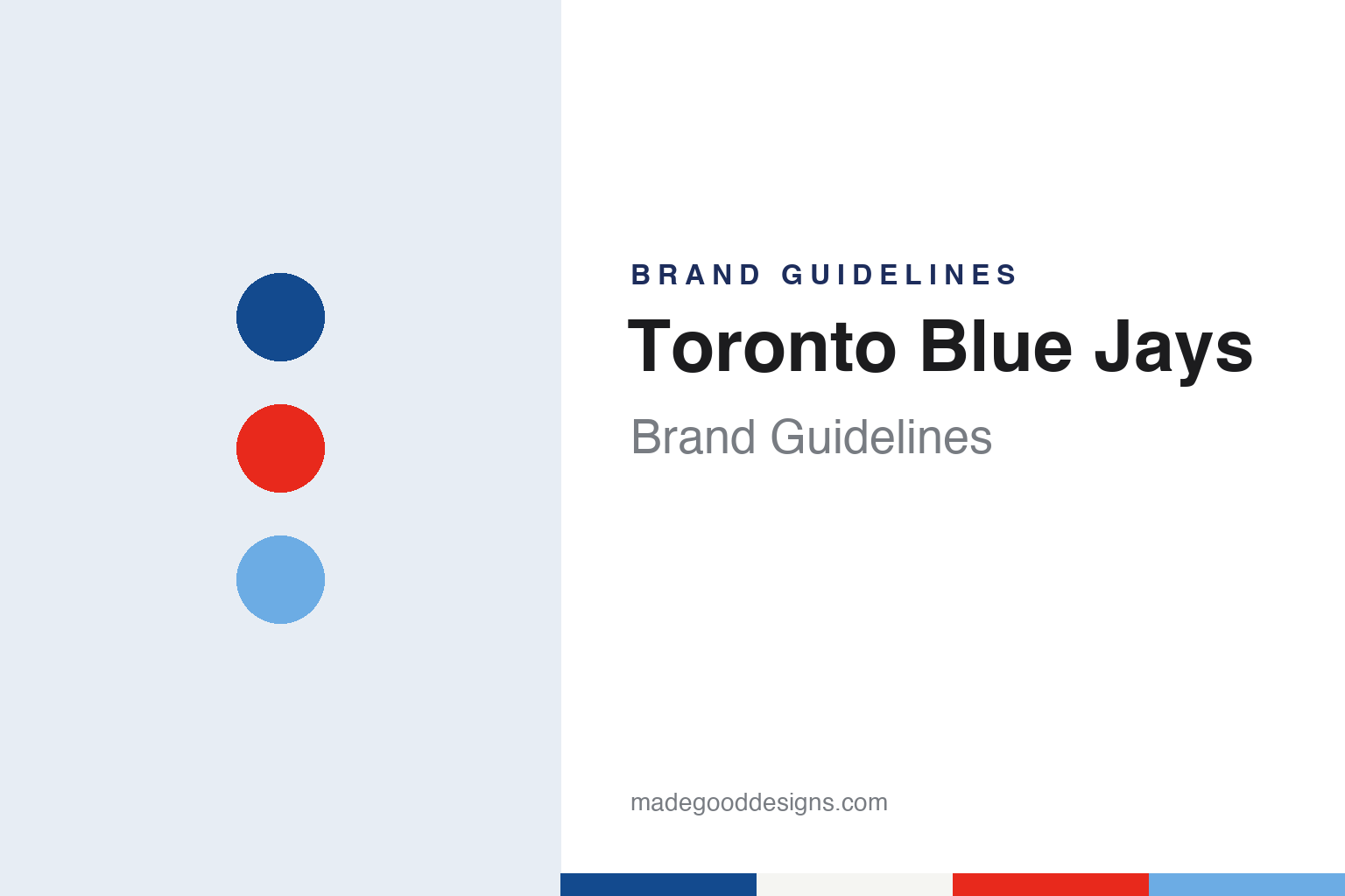
Toronto Blue Jays Brand Guidelines
From Exhibition Stadium to the dome, in royal blue, navy and a red maple leaf.
Aa
Two constants: a royal blue, maple red and powder blue palette and a condensed athletic sans register. Abstract homage — not a Toronto Blue Jays product or mark; no cap, uniform or logo is reproduced.
Picked from a draw
A contest, a brewery and the colour blue.
Toronto came close to getting an existing club before it got its own. English Wikipedia says that in January 1976 the San Francisco Giants nearly moved to the city, after owner Horace Stoneham agreed to sell to a Canadian consortium that included Labatt Breweries of Canada, Howard Webster of The Globe and Mail and the Canadian Imperial Bank of Commerce; the plan was to rebrand the team the Toronto Giants and play at Exhibition Stadium. That deal fell through, and later in 1976 Toronto was granted one of two American League expansion clubs that would begin play the following season. The Toronto Blue Jays took the field in 1977, with Labatt as majority owner.
The name came from a public contest. Writing for University of Toronto News on 24 October 2025, Rachel Boutet told the story of William Mills, a U of T dentistry graduate who entered the naming contest in 1976 with two of his daughters. Boutet reported that a panel of judges shortlisted ten names for the new club’s board of directors, which chose “Blue Jays”. Many other entrants had suggested the same name, so the club held a draw to pick the grand-prize winner, and Mills won it.
Mills told Boutet the family reasoned that Toronto team colours were usually blue and that Labatt was involved, so blue would be part of the name. He recalled that “Toronto Blues” had been a popular choice among fans but was ruled out because the University of Toronto already used the name Varsity Blues. Wikipedia gives the same two threads: the blue jay is a bird, and blue is the traditional colour of Toronto’s college and professional teams, including the Maple Leafs in hockey and the Argonauts in Canadian football; it adds that the name was influenced by the majority owner’s flagship beer, Labatt Blue.
The club’s early staff shaped the brand too. Wikipedia says the franchise’s earliest employee, Paul Beeston, began as vice president of business operations, and that before the opening 1977 season Peter Bavasi was appointed president and Pat Gillick assistant general manager. Bavasi would play a part in the logo story as well.
Colour
Labatt, Interbrew, then Rogers.
The brewery behind the name did not stay Canadian-owned. ESPN.com reported on 1 September 2000 that the Belgian brewer Interbrew had acquired the Blue Jays in 1995, when it bought Labatt Brewing Co., and that Rogers Communications had agreed to buy a majority of the team from Interbrew, which would keep a minority interest. The report quoted Ted Rogers, the company’s president, saying the company looked forward to owning the Blue Jays and being part of a Canadian sports institution.
Rogers Communications has owned the Blue Jays since 2000. Wikipedia says the company bought the club’s ballpark, SkyDome, in 2004 and renamed it Rogers Centre. The team had moved there from Exhibition Stadium when SkyDome opened in 1989, and Wikipedia says the move brought buttoned uniforms in place of the pullovers of the opening decade. ESPN’s 2000 report described the deal as a strategic move by Rogers to acquire content for its cable, wireless and broadcasting businesses.
The club has also drawn on Canadian symbols beyond the logo. Wikipedia says that since 1996 the Blue Jays have worn predominantly red or red-accented uniforms every 1 July, Canada Day, sometimes adding the flag of Canada or a red maple leaf, and that since 2012 the club has paid tribute to a member of the Canadian Armed Forces at every Sunday home game.
Wikipedia says BJ Birdy served alone from 1979 to 1999, played by Kevin Shanahan, and was replaced in 2000 by a pair named Ace and Diamond. Diamond was dropped after the 2003 season, leaving Ace, who since the 2010s has been accompanied by a younger brother, Junior.
Typography
Design and documentation.
Baseball identity work is spread across a handful of surfaces, each with its own constraints. The cap carries a compressed version of a club’s mark: usually a single letter, a monogram or a small emblem, embroidered in raised thread on a curved front panel and read from across a field or a street. Because embroidery fills shapes with stitches rather than ink, thin hairlines and tight counters tend to be simplified for the crown.
The jersey script is a different exercise. Running diagonally or across the chest, it is lettering rather than type: connected strokes, swashes and tails that underline the word, often in tackle twill with a contrasting outline. Road and home shirts frequently carry different words, so a club may maintain two or more scripts in matching style.
Sleeve patches add a third layer: a fuller badge or commemorative mark sewn to the shoulder, where there is room for detail the cap cannot hold. Finally, ballpark signage scales everything up, from the lettering over a gate to painted outfield walls and scoreboard graphics, where a mark must survive distance, weather and daylight. Reading a club’s identity means looking at all four together.
Aa
A condensed athletic sans — the register of a jersey number and a ballpark board. (Specimen set in Barlow Condensed, a sans STAND-IN; NOT the Toronto Blue Jays logo or lettering.)
Jay and maple leaf
A brewery’s design team, a debated leaf and a long way back.
The original logo came out of Labatt’s marketing department. Canada Modern, an archive of Canadian graphic design, credits the 1977 mark to Paco Belsue, Dave Savage and Richard Walker, with the industrial design firm Savage Sloan as studio. It says Walker, Labatt’s director of creative services, oversaw the concepts and worked with Savage Sloan to refine them, and that central to the chosen design was a red maple leaf, worked into the outline of a baseball. According to the archive, Bavasi did not want the leaf and asked for versions without it, and in two colours and one colour, before Walker urged Labatt’s president, Don McDougall, to get the three-colour design with the leaf approved; the board approved it.
Wikipedia describes the uniforms that carried it. From 1977 to 1988 the club wore pullovers: the home whites spelled the team name in a distinctive blue, white and blue split-letter style with the logo centred below, the road uniforms were powder blue, and the caps were blue with the logo on a white front panel. Before the 1997 season the logo was updated with a new bird and an enlarged red maple leaf behind it, and red and teal took a larger role; in 2003 a “T-bird” logo of a jay flexing its biceps became the primary mark.
The furthest move came in 2004, when Wikipedia says the club adopted a black, silver and graphite identity, with “Jays” in a three-dimensional diagonal arrangement and the bird joined to the letter J; the road uniform was tweaked in 2008 after complaints about legibility. Canada Modern says the later rebrands reduced the blue, dropped the maple leaf, tried a more intimidating jay and stressed the word “Jays”.
Then the club went back. Wikipedia says that before the 2012 season the Blue Jays unveiled new uniforms and a logo that is a modernised version of the 1977–1996 original, with a sleeker head, uniforms close to those of 1989–1996 and new serifed split letters. The white-panelled cap returned as an alternate in 2015, a modernised powder-blue uniform with navy, white and navy split letters arrived for 2020, and the 2024 City Connect uniform, nicknamed “Night Mode”, uses a dark “pitch blue” that Wikipedia says refers to Lake Ontario’s reflection at night, with a skyline illustration and a red “Toronto” wordmark. Wikipedia lists the official colours as royal blue, white, red and navy blue.
For a design guide, the Blue Jays show what a club gains by returning to its own drawing: a bird, a leaf and split letters that needed only refreshing. Compare the beer that shared its colour in our Labatt Blue brand guidelines and the city’s hockey blue in our Toronto Maple Leafs brand guidelines. For this guide we use royal blue, maple red and powder blue with a condensed sans, an unofficial interpretation; no product or logo is reproduced.
Explore & save
Keep Toronto Blue Jays’s identity on hand — save it to a board in the Made Good inspiration library.
Toronto Blue Jays identity set
Pin the Toronto Blue Jays royal blue, maple red and powder blue palette and the condensed athletic sans register to your own board.