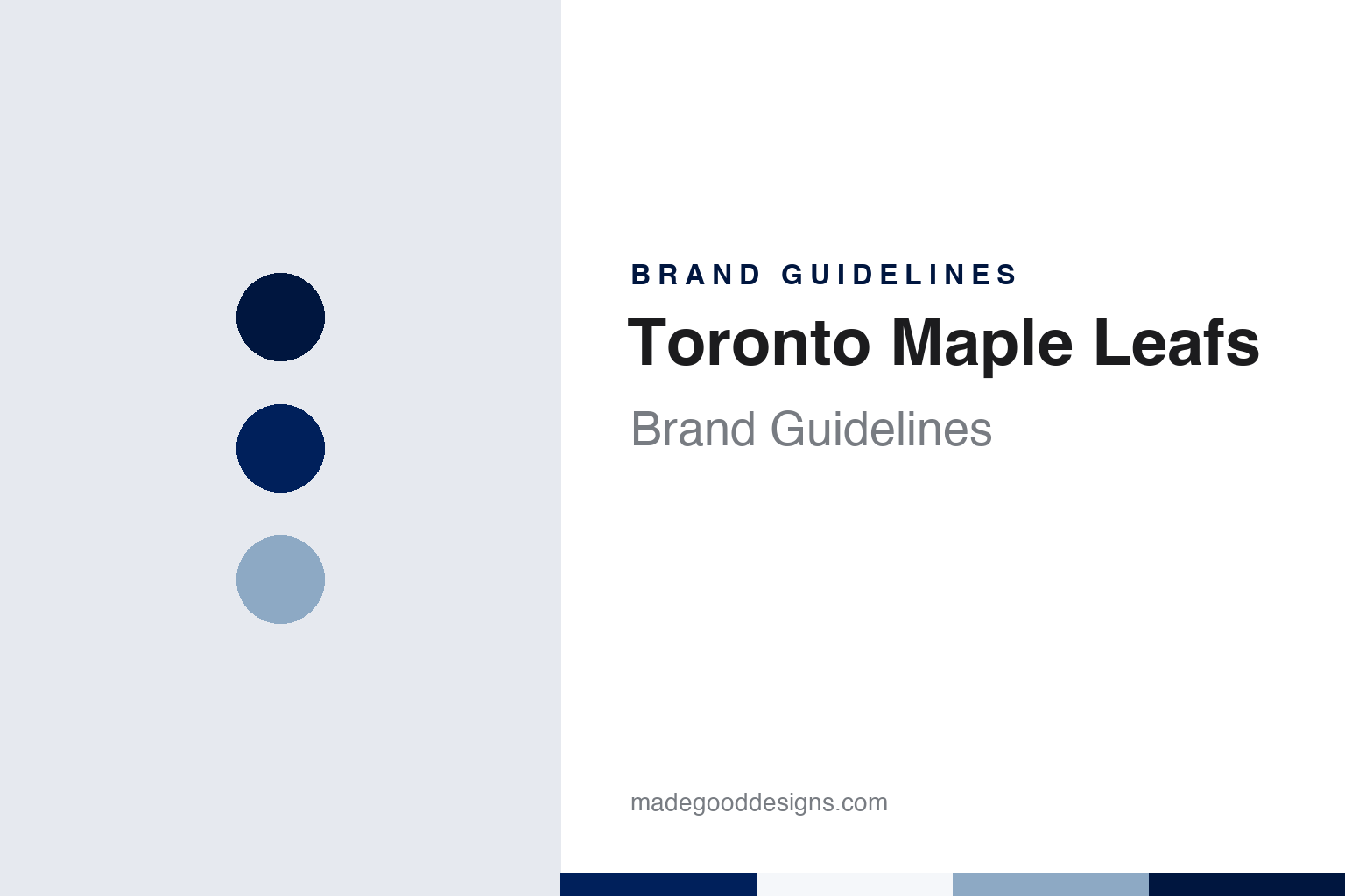
Toronto Maple Leafs Brand Guidelines
The Arenas and St. Pats who became the Maple Leafs, in blue and white.
Aa
Two constants: a leaf blue, sky haze and snow white palette and a geometric sans register. Abstract homage — not a Toronto Maple Leafs product or mark; no crest, sweater or logo is reproduced.
Arena Gardens
Arenas, St. Pats, then Maple Leafs.
The club now called the Toronto Maple Leafs began as the Toronto Arenas, the Toronto entry in the National Hockey League’s inaugural 1917–18 season. English Wikipedia says the franchise was granted to the Arena Company, the owners of the Arena Gardens on Mutual Street, and that the club played there until 1931. Its earliest sweaters were blue and carried a capital letter T.
Legal disputes pushed the Arena Company into bankruptcy, and in December 1919 the team was sold to the owners of the St. Patricks Hockey Club. They renamed it the Toronto St. Patricks, or St. Pats, and changed its colours: Wikipedia says the uniforms became green, with “Toronto St. Pats” lettered in green on a white pill shape or on stripes.
The name that stuck arrived in 1927. A group led by Conn Smythe, then coach of the University of Toronto’s varsity team, bought the St. Pats in February of that year. Writing for NHL.com on 22 November 2016, Cristina Ledra and Pat Pickens said Smythe bought the club after it had almost been sold to a group in Philadelphia, and that he immediately renamed it the Maple Leafs to honour the Canadian soldiers who wore the maple leaf in the First World War. They quoted Smythe saying he hoped the team would wear the badge “with honor and pride and courage,” the way the soldiers had. Wikipedia adds that Smythe had served as an army officer and been a prisoner of war, and that a Toronto baseball club had already been using the Maple Leafs name since 1895.
The team played out the rest of that season as the St. Pats. Smythe then built the club a new home: Maple Leaf Gardens, at Carlton and Church streets, opened in November 1931 and stayed the team’s arena until February 1999, when the Leafs moved to the Air Canada Centre on Bay Street, the building now called Scotiabank Arena. The club’s mascot, Carlton the Bear, a polar bear wearing number 60, takes both his name and his number from the Gardens’ address at 60 Carlton Street; the club’s own timeline dates his debut to July 1995.
Colour
Green, then blue and white, on a leaf that kept changing.
The colours took a few months to settle. Wikipedia says early reports had the renamed club in red and white, but the Leafs wore white sweaters with a green maple leaf in their opening game under the new name in February 1927. On 27 September 1927 the club announced it was switching to blue and white. Smythe later said blue stood for Canadian skies and white for snow; Wikipedia notes that the same colours also appeared on the trucks of his sand and gravel business. Ledra and Pickens likewise describe Smythe changing the team’s colours from green and white to blue and white.
Blue already had a long Toronto pedigree. In a 12 November 2008 article for the Toronto Star, Nicole Baute quoted Christopher Brands of the City of Toronto saying the colour had been associated with the city for years. She wrote that the Toronto Argonaut Rowing Club copied the two blues worn by the Oxford and Cambridge rowing crews, that the club kept blue when it founded the Toronto Argonauts football team in 1873, and that the Maple Leafs and the Blue Jays followed suit.
The crest has been redrawn many times. Wikipedia, drawing on the club’s media guide and team histories, describes a 48-point leaf with white lettering for 1927–28, veins added to the leaf in 1937, a 35-point leaf in 1942 and a white or blue border from 1946. For the 1966–67 season the club adopted a simpler 11-point leaf, modelled on the leaf of the new Canadian flag for the country’s centennial, with lettering in Futura Display. Before the 1970–71 season another 11-point leaf arrived, with “Toronto” set straight across in a bold Kabel; that mark remained the primary logo until 2016.
The sweater moved through several makers. Wikipedia says Nike took over manufacture in 1997 and switched names and numbers to Kabel to match the logo; CCM returned in 1999; Reebok’s Edge system followed in 2007; and lace-up collars came back in 2010. In February 1978 the club briefly sewed blue names onto blue road sweaters, honouring the letter of a new league rule on player names rather than its spirit, before complying the following season.
Typography
Design and documentation.
A hockey sweater carries its identity in a few fixed places. The crest sits square on the chest, sized to read from the upper rows of an arena and on a broadcast frame, so it tends to be built from heavy shapes, thick outlines and a small number of flat colours. Twill and embroidery limit fine detail, which pushes designers towards bold letterforms and simple silhouettes rather than thin lines or gradients.
Shoulder patches give a second, smaller mark room to work, often a secondary logo, a monogram or a city reference. Sleeve and hem stripes repeat the colour order in bands, and numbers and nameplates on the back usually follow a block or arched lettering style that has to stay legible at speed and from a distance.
Away from the sweater, the same marks travel onto rink graphics: centre-ice logos painted beneath the surface, dasher-board panels, scoreboards, tickets and arena signage. For a designer studying a hockey identity, the useful exercise is to look at how one crest holds up across all of these sizes, from a small pin or patch to centre ice.
Aa
A geometric sans — the register of a centennial crest and a block-lettered sweater. (Specimen set in Jost, a geometric sans STAND-IN; NOT the Toronto Maple Leafs logo.)
The centennial leaf
Back to an older leaf, with numbers hidden in it.
The current crest was unveiled on 2 February 2016, ahead of the club’s centennial season. TSN.ca reported that day that the new logo was inspired by the classic leaf the team wore from the 1940s to the 1960s, and that the mark it replaced had been largely unchanged since 1970. The design hides dates in its drawing: TSN listed 31 points on the leaf as a nod to 1931, the year Maple Leaf Gardens opened, and 17 veins for the club’s founding year of 1917. It also reported that the team president, Brendan Shanahan, linked the redesign to Smythe’s original choice of a soldier’s badge, and that the American Hockey League’s Toronto Marlies would adopt the same leaf with their crown added.
New sweaters followed at the NHL Draft on 24 June 2016, and Wikipedia says they introduced a custom block typeface for player names and numbers, two stripes on the sleeves and a single stripe at the waist, a look carried over to adidas uniforms from 2017. The club has also worn history on its alternates: an Arenas-style design for the 2022 Heritage Classic, and a black “Next Gen” sweater unveiled in March 2022 with blue as the trim colour.
Ownership sits a layer above the team. Maple Leaf Gardens Limited bought the Toronto Raptors in 1998 and renamed itself Maple Leaf Sports & Entertainment (MLSE), which also owns the Marlies, Toronto FC and the Argonauts. The Ontario Teachers’ Pension Plan sold its stake to Bell and Rogers in 2012. CBC Sports, carrying a Canadian Press report on 2 July 2025, said Rogers had closed its purchase of BCE’s stake and become MLSE’s majority owner; Wikipedia says MLSE chairman Larry Tanenbaum holds the remaining stake.
For a design guide, the Toronto Maple Leafs show how a wartime badge, a two-colour scheme fixed in 1927 and a leaf redrawn to carry its own dates can keep one idea legible across a century of sweater makers and owners. Compare it with NHL, the league whose shield sits on the collar, and Montréal Canadiens, the club Toronto has faced since 1917. For this guide we use leaf blue, sky haze and snow white with a sans, an unofficial interpretation; no product or logo is reproduced.
Explore & save
Keep Toronto Maple Leafs’s identity on hand — save it to a board in the Made Good inspiration library.
Toronto Maple Leafs identity set
Pin the Toronto Maple Leafs leaf blue, sky haze and snow white palette and the geometric sans register to your own board.