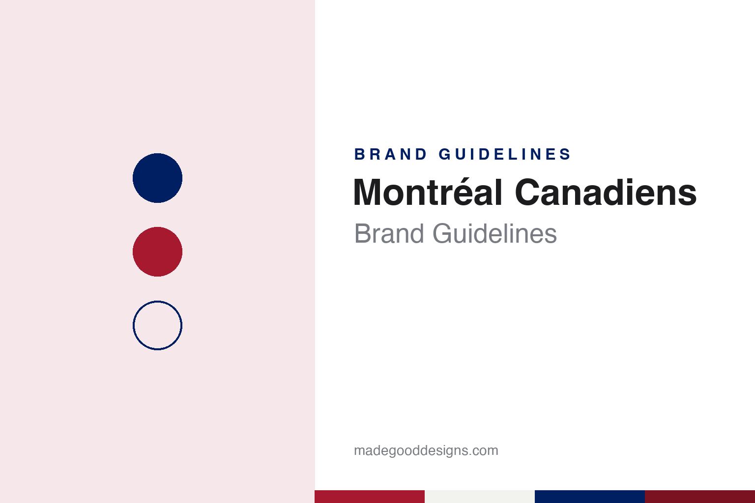
Montréal Canadiens Brand Guidelines
The Club de hockey Canadien, in bleu, blanc et rouge.
Aa
Two constants: a sweater red, deep blue and ice white palette and a heavy grotesque sans register. Abstract homage — not a Montréal Canadiens product or mark; no crest, sweater or logo is reproduced.
Les Canadiens
A francophone club, named for French speakers.
The Montréal Canadiens were founded by J. Ambrose O’Brien on 4 December 1909 as a charter member of the National Hockey Association, the league that preceded the NHL. English Wikipedia, drawing on D’Arcy Jenish’s 2008 history of the club, says the team was meant to belong to Montreal’s francophone community, with francophone players and, as soon as possible, francophone owners. The founders chose the name “Les Canadiens”, a word identified at the time with French speakers, and the French spelling is kept even in English.
Ownership passed after the opening season to the Montreal promoter George Kennedy, and in 1917 the Canadiens and four other NHA clubs formed the National Hockey League. The club’s official name is the Club de hockey Canadien, and Wikipedia lists the nicknames that grew around it: the Habs, Le Tricolore, Le Bleu-Blanc-Rouge, La Sainte-Flanelle and simply Le CH.
That name explains the crest. Writing in his “Ice Age” column for NHL.com on 8 February 2008, Phil Coffey answered a reader who assumed the H stood for “Habs.” Coffey wrote that the H stands for hockey, from Club de Hockey Canadien, the name the team took in 1917 in place of Club Athlétique Canadien. He added that in 1924 the Madison Square Garden owner Tex Rickard was wrongly told the H stood for “habitant,” a French word then used for the farmers of Quebec, and that the Canadiens were at the time recognised as Montreal’s French team, as against the English-speaking Montreal Maroons. NHL.com’s Cristina Ledra and Pat Pickens repeated the point on 22 November 2016: O’Brien gave the club its official name, and the H stands for hockey. Wikipedia adds that “Habitants” was already used for the team in a Le Devoir match report of 9 February 1914.
The team played at the Montreal Forum for seven decades. In March 1996 it moved to the newly built Molson Centre, the arena now known as the Bell Centre.
Colour
A C, a C with an A, then the C and H.
The crest grew in steps. Wikipedia, citing the club’s own history of its jerseys and logos, says the 1909–10 mark was a plain C for Canadiens; from 1913 to 1916 the club used a C with an A inside it, for Athlétique; and the C and H appeared together from the 1917–18 season, when the name changed to Club de Hockey Canadien. The crest reached its current form in 1952–53.
The colours and sweater were also worked out early. Wikipedia says the team’s primary colours have been blue, white and red since 1911. The original shirt of 1909–10 was blue with a white C. The second season brought a red shirt with a green maple leaf carrying the C, worn with green pants. In the season before the club settled on its current look, it wore a “barber pole” jersey striped in red, white and blue, with a white maple leaf reading “CAC” for Club athlétique Canadien. All three designs returned on the ice during the 2009–10 centenary season.
The home sweater that followed is predominantly red, with four blue-and-white stripes: one across each arm, one across the chest and one at the waist. The road sweater is white, with a red-and-blue stripe at the waist, red cuffs and red shoulder yokes. Wikipedia says the basic design has been in use since 1914 and took its present form in 1925, changing mainly as materials did. As of 2015, the red home sweater carried the French-language LNH version of the league shield at the collar, while the white road sweater carried the English NHL shield.
The club has kept alternates close to that template. For 2020–21 it wore an adidas “Reverse Retro” uniform that swapped the red base for blue with red stripes, and a second version in 2022–23 used a light blue base, keeping red only in the crest. The club’s motto, a line from John McCrae’s 1915 poem “In Flanders Fields” about passing on a torch, appears on the dressing-room wall and was stitched inside the collar of the adidas sweaters introduced in 2017.
Typography
Design and documentation.
A hockey sweater carries its identity in a few fixed places. The crest sits square on the chest, sized to read from the upper rows of an arena and on a broadcast frame, so it tends to be built from heavy shapes, thick outlines and a small number of flat colours. Twill and embroidery limit fine detail, which pushes designers towards bold letterforms and simple silhouettes rather than thin lines or gradients.
Shoulder patches give a second, smaller mark room to work, often a secondary logo, a monogram or a city reference. Sleeve and hem stripes repeat the colour order in bands, and numbers and nameplates on the back usually follow a block or arched lettering style that has to stay legible at speed and from a distance.
Away from the sweater, the same marks travel onto rink graphics: centre-ice logos painted beneath the surface, dasher-board panels, scoreboards, tickets and arena signage. For a designer studying a hockey identity, the useful exercise is to look at how one crest holds up across all of these sizes, from a small pin or patch to centre ice.
Aa
A heavy grotesque sans — the register of a chest crest and a block-lettered sweater number. (Specimen set in Archivo, a sans STAND-IN; NOT the Montréal Canadiens logo.)
Brewery, buyer, family
From the Molson brewery to Gillett and back to the Molsons.
Ownership of the Canadiens has moved between a brewery, an American investor and a family. Wikipedia says that by the late 1990s the team was losing money, and that the Molson brewery sold control of the club and the Molson Centre to the American businessman George N. Gillett Jr. in 2001, keeping a right of first refusal on any future sale and a condition that any move to another city would need the unanimous approval of the NHL’s board of governors.
Christopher Curtis of the Montreal Gazette told the rest of that story on 26 November 2014. He wrote that Gillett bought control of the Canadiens from the Molson brewery in 2001 and hired Pierre Boivin as club president, and that eight years later, in 2009, a consortium known as Groupe CH, led by the Molson family, bought the team back from him. He noted that the arena, now the Bell Centre, was still called the Molson Centre during the Gillett years. Wikipedia lists the consortium’s members as including the Woodbridge Company, BCE/Bell, the Fonds de solidarité FTQ and the National Bank, and gives Geoff Molson as chairman of the majority-owning Molson family group.
The club’s mascot arrived during that period. Since the 2004–05 season the Canadiens have used Youppi!, the orange mascot that had belonged to baseball’s Montreal Expos until that team moved to Washington.
The sweater also carries weight beyond the rink. Roch Carrier’s short story “The Hockey Sweater”, published in French as “Une abominable feuille d’érable sur la glace”, turns on a boy in rural Quebec in the 1940s sent a Toronto Maple Leafs sweater in place of a Canadiens one, and Wikipedia notes that a passage from it appeared on the Canadian five-dollar note issued in 2002.
For a design guide, the Montréal Canadiens show how a club name in French, two letters and a striped red sweater settled by 1925 can do the work of a whole identity system. Compare it with NHL, the league whose shield the club sets in French on its home collar, and Toronto Maple Leafs, the club whose leaf sweater appears in Carrier’s story. For this guide we use sweater red, deep blue and ice white with a sans, an unofficial interpretation; no product or logo is reproduced.
Explore & save
Keep Montréal Canadiens’s identity on hand — save it to a board in the Made Good inspiration library.
Montréal Canadiens identity set
Pin the Montréal Canadiens sweater red, deep blue and ice white palette and the heavy grotesque sans register to your own board.