Seattle Mariners Brand Guidelines
A name from a city on the water, a trident turned compass, and a green made for one team.
Aa
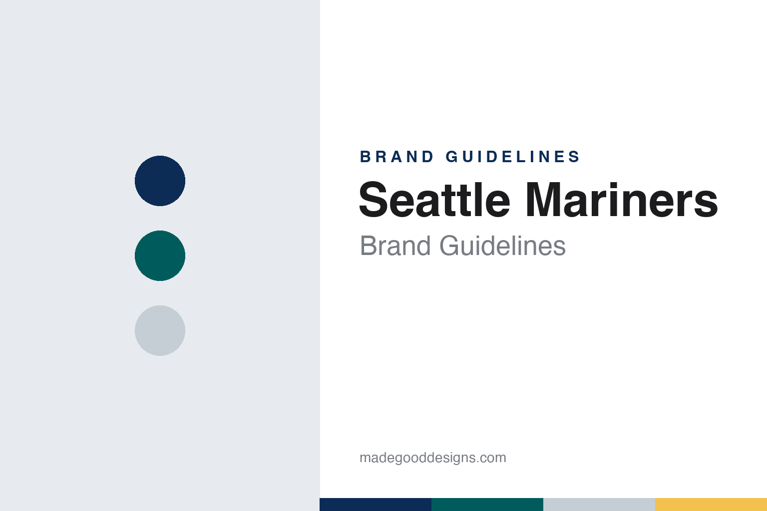
Two constants: a Sound navy, Northwest green and rain silver palette and a block wordmark and compass mark register. Abstract homage — not a Seattle Mariners mark; no cap logo, script or wordmark is reproduced.
A name from the water
A lawsuit, a domed stadium and a name-the-team contest.
The Seattle Mariners exist because Seattle lost a team. English Wikipedia records that after the Seattle Pilots were bought and moved to Milwaukee in 1970, becoming the Milwaukee Brewers, the city of Seattle, King County and the state of Washington sued the American League for breach of contract. Wikipedia says the Mariners were created as a result of that lawsuit. King County built the Kingdome, a multi-purpose stadium that opened to football in 1976, and the Mariners began play there in the American League in 1977, in the same expansion that created the Toronto Blue Jays.
The name came from the public. Wikipedia says club officials chose “Mariners” in August 1976 from names submitted in a “name the team” contest, and that it reflects the prominence of marine culture in Seattle. The winning entry came from a resident of suburban Bellevue. The club is nicknamed the M’s, and Wikipedia notes that the nickname appeared in the team’s primary logo from 1987 to 1992.
The first identity leaned on the sea in a literal way. Wikipedia says the original colours were blue and gold, the scheme the Pilots and then the Brewers had used, and that for the first four seasons the home pullover jerseys spelled out “Mariners” with the “M” shaped like a trident. The road jerseys were baby blue with the city name in front. The cap was all blue and carried a gold trident trimmed in white, and from 1979 the trident also appeared on the left sleeve. A version of the trident set on a white star was drawn for the 1979 All-Star Game, and then moved to the cap. Writing in The Seattle Times in April 2023, Ryan Divish noted that this original trident pointed downward, tines first, and stayed on the caps for about the first decade of the franchise.
Colour
From George Argyros to Nintendo to a local partnership.
The Mariners have changed hands several times. Wikipedia records that California businessman George Argyros bought the club in 1981 and sold it in 1989 to a group led by Jeff Smulyan of Indianapolis, an owner of radio and television stations. Smulyan explored moving the team before putting it up for sale. The buyer was a video-game company. An Associated Press report published by the Peninsula Daily News on 19 August 2016 says Nintendo of America, under the direction of Nintendo president Hiroshi Yamauchi, bought the Mariners from Smulyan in 1992, and that under Nintendo’s ownership the team moved from the Kingdome to Safeco Field in 1999. The ballpark in SoDo has been called T-Mobile Park since 2019.
That AP report records the next change. Major League Baseball’s owners approved the sale of a controlling stake in the club from Nintendo of America to a group of existing minority owners led by John Stanton, founder of Western Wireless, and retired Microsoft executive Chris Larson. Stanton took over as control person from chairman Howard Lincoln, who was retiring. The franchise is owned by First Avenue Entertainment, a limited partnership, and Wikipedia notes that Nintendo kept a minority interest. The link to the game company has resurfaced on the uniform: Wikipedia says that in 2025 the club partnered with Nintendo of America to put the company’s logo on the sleeve of the home jersey and the Switch 2 logo on the sleeve of the away jersey.
The blue and gold era was refined before it ended. Wikipedia says the 1981 uniforms replaced the trident on the jersey with blue and gold racing stripes on the shoulders, the road jersey turned grey in 1985, and in 1987 the club moved to traditional buttoned shirts and belted trousers with a block “Mariners” wordmark in blue with gold and blue outlines. The cap mark became a gold “S.”
Typography
Design and documentation.
Baseball identity work is spread across a handful of surfaces, each with its own constraints. The cap carries a compressed version of a club’s mark: usually a single letter, a monogram or a small emblem, embroidered in raised thread on a curved front panel and read from across a field or a street. Because embroidery fills shapes with stitches rather than ink, thin hairlines and tight counters tend to be simplified for the crown.
The jersey script is a different exercise. Running diagonally or across the chest, it is lettering rather than type: connected strokes, swashes and tails that underline the word, often in tackle twill with a contrasting outline. Road and home shirts frequently carry different words, so a club may maintain two or more scripts in matching style.
Sleeve patches add a third layer: a fuller badge or commemorative mark sewn to the shoulder, where there is room for detail the cap cannot hold. Finally, ballpark signage scales everything up, from the lettering over a gate to painted outfield walls and scoreboard graphics, where a mark must survive distance, weather and daylight. Reading a club’s identity means looking at all four together.
Mm
A tall condensed block letter — the register of a straight wordmark across a jersey and a sign above a gate. (Specimen set in Bebas Neue, a condensed sans STAND-IN; NOT the Seattle Mariners logo, script or wordmark.)
Seattle Mariners
A compass rose, a team green and a trident brought back.
The current identity dates from 1993. Wikipedia says the Mariners adopted navy blue, Northwest Green and silver before that season, after playing in royal blue and gold since 1977. The teal shade was named “Northwest Green” exclusively for the club. The new white home uniform carried “Mariners” in navy trimmed in that green, with a compass rose set atop the “M”; the grey road uniform read “Seattle,” and from 2001 the compass rose sat in the middle of its “S.” In 2015 a silver inline was added to the wordmarks, letters and numbers, and the primary logo is worn on the left sleeve. The cap shows a ball and compass-rose “S” on navy.
Alternates have revisited each era. Wikipedia records a Northwest Green alternate first unveiled in 1994 and back in regular rotation from 2011, a navy alternate from 1997, and a cream “fauxback” for Sunday home games introduced in January 2015 that set the modern logo and lettering in the original royal blue and gold. From 2023 the navy jersey replaced grey as the standard road uniform, and for 2026 the club announced a black-and-cream alternate modelled on the Seattle Steelheads, the city’s Negro league team of 1944 to 1946.
The 2023 City Connect uniform brought the trident home. In his Seattle Times report of 28 April 2023, Divish quoted Kevin Martinez, the club’s senior vice president of marketing and communications, describing the set as a celebration of Pacific Northwest baseball developed with Nike from early 2021. Martinez said Nike helped the team arrive at rush blue, a sundown yellow, an amarillo gold and black, with the blues and golds recalling the Mariners and the Pilots and the black drawn from the 1940s Steelheads. The cap has a slim gold trident outlined in black on a rush blue crown with a black bill. The chest reads “Seattle” in lettering Martinez called evocative of the Pilots, with a black drop shadow borrowed from the 1955 Pacific Coast League Seattle Rainiers, and the socks salute Mount Rainier. Wikipedia adds a sleeve patch with the mountain and the letters “PNW.”
For a design guide, the Seattle Mariners show how a club can rebuild an identity around a new colour without losing its first one, keeping royal blue, gold and the trident on hand for alternates while navy, Northwest Green and the compass rose do the daily work. Compare it with the Toronto Blue Jays, the other club from the 1977 expansion, and MLB, whose City Connect programme produced the trident’s return. For this guide we use Sound navy, Northwest green and rain silver with a sans, an unofficial interpretation; no product or logo is reproduced.
Explore & save
Keep Seattle Mariners’s identity on hand — save it to a board in the Made Good inspiration library.
Seattle Mariners identity set
Pin the Seattle Mariners Sound navy, Northwest green and rain silver palette and the block wordmark and compass mark register to your own board.