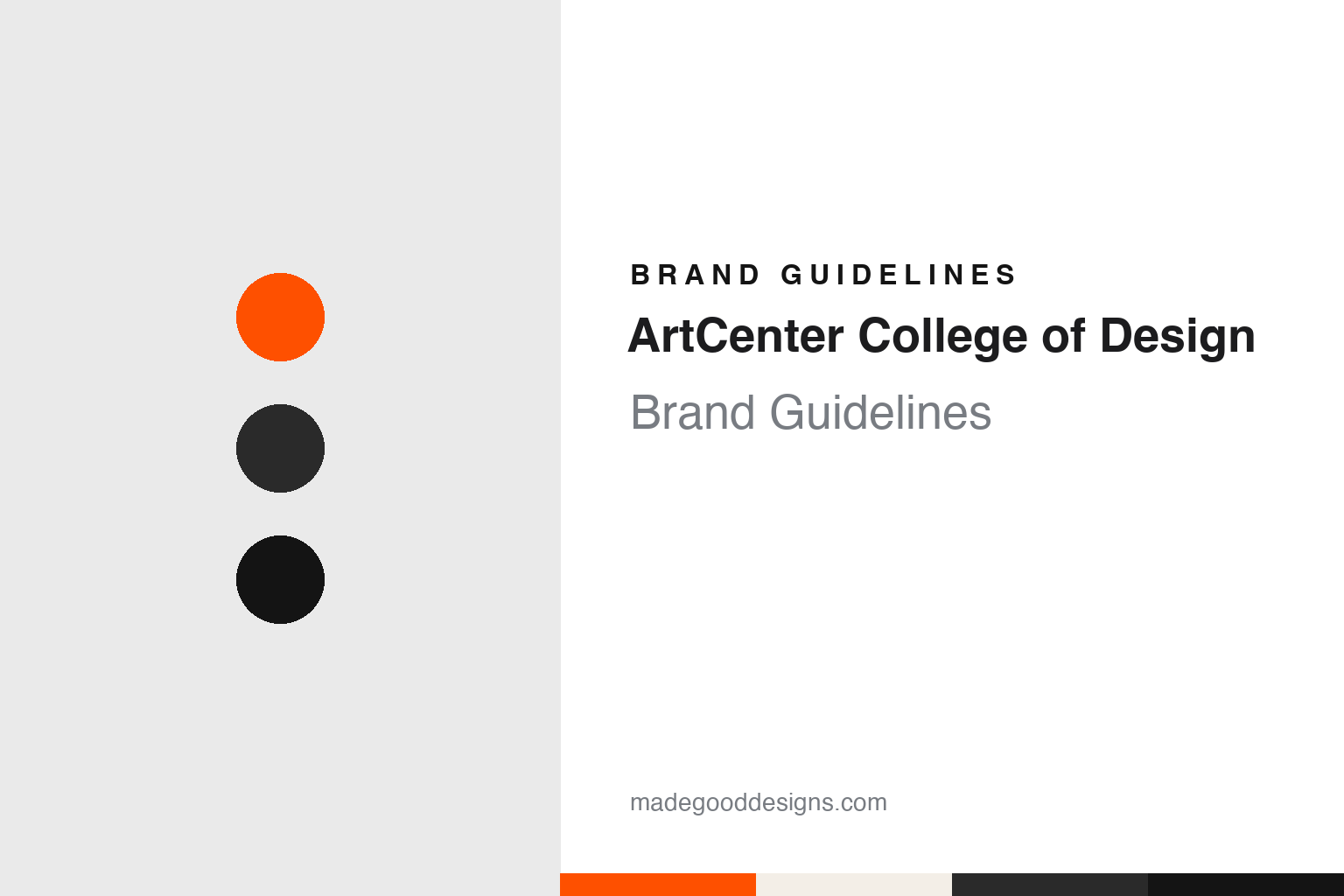
ArtCenter College of Design Brand Guidelines
A dot, a colour and a bridge.
Aa
Two constants: a dot orange, steel grey and black palette and a geometric sans register. Abstract homage — not an ArtCenter asset or mark; no logo, icon or wordmark is reproduced.
From The Art Center School to ArtCenter
Los Angeles, 1930 to 1976.
ArtCenter College of Design began in 1930 in downtown Los Angeles. Wikipedia names Edward A. “Tink” Adams as its founder and says the school was set up for students of both the visual arts and design. The school’s own identity pages give its original name as The Art Center School, and say that almost from the beginning people called it simply “Art Center”.
The colour came with the building. ArtCenter’s identity history says that in 1930 the front door of the school had a border of red-orange, and that in the front window the name of the school sat beside a matching red-orange dot. The school attributes the choice of colour to Adams’ own liking for it, and suggests that it may have come from his interest in Asian art.
Wikipedia traces how the school grew out of that downtown address. It says the photographer Fred R. Archer founded the photography department in 1935, and that during and after the Second World War the school ran a technical illustration programme with the California Institute of Technology. In 1947, with more students arriving after the war, it took over the building of the former Cumnock School for Girls in the Hancock Park neighbourhood while keeping its downtown presence. Wikipedia says the school began granting bachelor’s and master’s degrees in 1949 and was accredited by the Western Association of Schools and Colleges in 1955.
The name changed in 1965. ArtCenter’s identity pages say The Art Center School became Art Center College of Design that year, to make clear that it was a professional, degree-granting institution teaching both art and design. Wikipedia adds that a film programme followed in 1973, and that from 1986 to 1996 the school ran ArtCenter Europe in Vevey, Switzerland.
The spelling of the name has shifted with the identity. The school says that the short form “Art Center” gained a new standing in 1986, when a logotype by the designer Kit Hinrichs, a graduate of the school, was introduced, and that the words “College of Design” were added to that logotype a few years later. It says the abbreviation ACCD came into regular use for a time from the late 1990s. Today the school writes its name as one word, ArtCenter, with a capital A and a capital C.
Colour
A bridge across an arroyo.
Since 1976 the school’s main address has been in Pasadena. Wikipedia says the school moved to its Hillside Campus in 1976, after ground was broken in November 1974. The Los Angeles Conservancy, which lists the building among the historic places of Los Angeles, credits it to Craig Ellwood Associates, dates it to 1976 and describes its style as International Style. It quotes Ellwood calling it “the favorite among my non-residential completed buildings”.
The form came from the site. The Conservancy says a bridge was the economical answer to a hilly canyon plot, because levelling the land would have needed an expensive foundation. It says rising steel prices in the early 1970s led to cost-cutting on the air conditioning and roof, which had to be replaced about five years after completion, and that the project took nearly six years. It names Ellwood’s associate Jim Tyler as project architect. Wikipedia says a south wing designed by Tyler was built between 1989 and 1991, and that the City of Pasadena has designated the Hillside Campus a historic monument.
Pasadena Magazine, in a “Local Landmark” feature by Sara Smola published on 24 June 2022, describes a steel-and-glass bridge building spanning an arroyo in the San Rafael Hills above the Rose Bowl. It says the building has a façade of exposed steel with solar gray glass and matching opaque panels, and that it houses many of the college’s undergraduate programmes, its graduate industrial design and film programmes, and its administrative offices. The magazine credits the former president Don Kubly and his wife Sally with the choice of Ellwood, who had already designed their Pasadena house. It says the Kublys met as ArtCenter students, that Don Kubly served as president from 1969 to 1985, and that Sally Kubly was art director for many ArtCenter publications between 1975 and 1981.
A second campus followed. Wikipedia says the South Campus opened in 2004 in a former aircraft-testing facility built during the Second World War, renovated by the Santa Monica firm Daly Genik, and that its exhibition space is known as the Wind Tunnel. It says the school named Michael Maltzan Architecture as its planning partner in 2012, and that a former U.S. Postal Service building next door was renovated by Darin Johnstone Architecture in 2014.
Type has a room of its own there. The Los Angeles Daily News reported on 6 March 2015 that the school was establishing the Hoffmitz Milken Center for Typography, named after the long-serving typography teacher Leah Hoffmitz Milken, “to advance the research, teaching and understanding of letterform design.” Its columnist Larry Wilson met the centre’s executive director, Gloria Kondrup, and creative director, Simon Johnston, in a storefront studio on South Raymond Avenue fitted out with letterpress equipment.
Typography
Founders, buildings and the walls between studios.
An art school’s identity rarely starts with a logo. It usually starts with a name, and that name is often a person’s: a founder who opened the first studio, a teacher whose classes drew the first students, or a benefactor whose gift paid for a building. Over decades those names get shortened, merged, abbreviated into initials or folded into a parent institution, and each change leaves a trace on letterheads, signs and diplomas.
Buildings carry as much of the identity as any mark. A converted warehouse, a purpose-built studio block or a hillside campus becomes the image people picture when they hear the name, and architects’ choices of glass, steel, brick or concrete end up doing the work a brand book would do elsewhere.
Then there are the everyday surfaces: lettering painted on studio doors, signage on stairwells, and above all the posters, catalogues and websites made each year for graduate shows. These are often designed by students or staff rather than agencies, so the look shifts from year to year while the name stays fixed. For a designer, the useful lesson is how a short wordmark has to sit comfortably beside work that changes every season.
Aa
A geometric sans — after the Futura-based logotype the school used from 1986. (Specimen set in Jost, a sans STAND-IN; NOT the ArtCenter logo or any ArtCenter typeface.)
ArtCenter
The dot, the orange and the typefaces.
The dot is the constant. ArtCenter’s identity history says the circle has been in nearly continuous use as the school’s symbol for more than ninety years, with two pauses: the years just after the Second World War, when a red dot may have been too close to the Japanese flag, and a few years in the late 1980s, when it was dropped and then brought back after objections from the school community. The school says the form reflects its founders’ interest in contemporary international design and the influence of the Bauhaus, and that in orange it also suggests the Southern California sun and citrus, as well as the “here” in the word centre.
The orange has moved over time. The school says that after it left its original building no single colour was tied to it for a while, and that Don Kubly brought orange back in the mid-1960s, at the start of his leadership, as a reference to the early years. It says the shade has drifted from the original near-red to Pantone 1655 by 2000 and on to the yellower Pantone 021.
The typefaces have changed more often. ArtCenter says no single typeface was part of its identity until 1965, when it began a long relationship with Helvetica, which was used almost exclusively in its promotional material until 1986 and chosen in the mid-1970s for the sign programme at the new Hillside Campus. With the Hinrichs logotype, Futura became the identity typeface. The school says that from 1998 to 2001 almost all its material used Cholla, a typeface commissioned from Denise Gonzales Crisp, and that in 2006 it introduced an identity by Takaaki Matsumoto, also a graduate, with Univers encouraged in print. It says the dot and the name worked separately from the 1930s until Matsumoto joined them in a lockup, and that his identity was retired in 2015.
For a design guide, ArtCenter shows how one plain shape and one colour can carry a school through several names, logotypes and typefaces. Compare Pratt Institute and Central Saint Martins, two other art schools in this collection. For this guide we use dot orange, steel grey and black with a geometric sans, an unofficial interpretation; no product or logo is reproduced.
Explore & save
Keep ArtCenter College of Design’s identity on hand — save it to a board in the Made Good inspiration library.
ArtCenter identity set
Pin the ArtCenter dot orange, steel grey and black palette and the geometric sans register to your own board.


