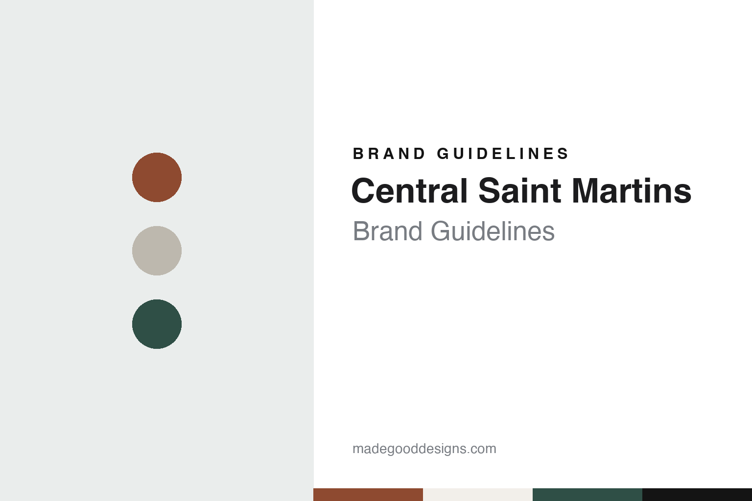
Central Saint Martins Brand Guidelines
Two schools, one granary.
Aa
Two constants: a granary brick, canal green and concrete palette and a Humanist sans register. Abstract homage — not a Central Saint Martins asset or mark; no logo, typeface or wordmark is reproduced.
Saint Martin’s and the Central School
A church school of 1854 and a council school of 1896.
Central Saint Martins carries the names of two older London schools. The elder, Saint Martin’s School of Art, was established in 1854 by Henry Mackenzie, vicar of the church of St Martin-in-the-Fields, Wikipedia says, and became independent of the church in 1859. In 1952 the sculptor Frank Martin became head of its sculpture department and brought in young sculptors and recent graduates as teachers, among them Anthony Caro; Wikipedia says the group around Caro came to be known as the New Generation of British sculptors.
The younger school had its roots in a design movement. Wikipedia says the London County Council set up the Central School of Arts and Crafts in 1896, growing directly from the Arts and Crafts movement of William Morris and John Ruskin. Its principal from 1896 until 1911 was the architect William Richard Lethaby, commemorated by a blue plaque erected in 1957. The school began in Morley Hall, rented from the Regent Street Polytechnic, and moved in 1908 to purpose-built premises on Southampton Row in Camden. In the same year it absorbed the Royal Female School of Art, established in 1842. In time it became the Central School of Art and Design.
The two schools were brought together in stages. Wikipedia says that from 1986 both belonged to the London Institute, formed by the Inner London Education Authority to group seven London art, design, fashion and media schools. In 1989 they merged as Central Saint Martins College of Art and Design. The London Institute became a legal entity in 1988, gained university status in 2003 and was renamed University of the Arts London in 2004; its other colleges are Camberwell, Chelsea, the London College of Communication, the London College of Fashion and Wimbledon.
The college took in other schools after the merger. Wikipedia says the Drama Centre London, founded in 1963, joined in 1999 as a school within the college, keeping its own name, and the Byam Shaw School of Art, founded in 1910 by the artists Byam Shaw and Rex Vicat Cole, was merged into Central Saint Martins in 2003. The college’s name changed slightly along the way, from College of Art and Design to College of Arts and Design, before settling as Central Saint Martins.
Colour
A granary, two transit sheds and a canal square.
Wikipedia says the college moved in 2011 to a converted warehouse complex on Granary Square at King’s Cross, where the greater part of the college is now housed, while it also uses the former Byam Shaw building on Elthorne Road in Archway and premises in Richbell Place, Holborn.
Dezeen reported the new campus on 18 October 2011, in an article by Amy Frearson. It said the architects Stanton Williams had completed the campus in and around a Victorian granary and two former transit sheds. Two new studio blocks sit between the two sheds, one of which now houses workshops. Cycle stores occupy historic horse stables below the eastern shed, and shops and bars the ground floor of the western one. Four-storey-high concrete walls frame the main entrance, which leads into an internal street crossed by bridges under an arched, clear plastic roof. A performing arts centre at the end of the street contains a theatre for student performances.
The Granary Building itself is the college’s front door. Dezeen said the refurbished granary now houses the library and faces a public square, then still under construction. In a statement published with the article, Stanton Williams said the building was designed in 1851 to receive grain from the wheat fields of Lincolnshire, which was unloaded there from railway wagons onto canal boats for the city’s bakeries. The architects said the granary had been restored as the main front of the college, facing a new square that steps down to the Regent’s Canal.
The architects also tied their plan to the site’s working past. Their statement said the design treated the movement of students and materials through the building as a flow diagram running north to south, east to west and up and down, in many ways like the way grain had once been moved around the site using wagons and turntables. Dezeen credited the photographs of the finished building to Hufton + Crow.
Typography
Crests, typefaces and buildings.
An art school’s identity rarely starts with a logo. It usually starts with a name, and that name is often a person’s: a founder who opened the first studio, a teacher whose classes drew the first students, or a benefactor whose gift paid for a building. Over decades those names get shortened, merged, abbreviated into initials or folded into a parent institution, and each change leaves a trace on letterheads, signs and diplomas.
Buildings carry as much of the identity as any mark. A converted warehouse, a purpose-built studio block or a hillside campus becomes the image people picture when they hear the name, and architects’ choices of glass, steel, brick or concrete end up doing the work a brand book would do elsewhere.
Then there are the everyday surfaces: lettering painted on studio doors, signage on stairwells, and above all the posters, catalogues and websites made each year for graduate shows. These are often designed by students or staff rather than agencies, so the look shifts from year to year while the name stays fixed. For a designer, the useful lesson is how a short wordmark has to sit comfortably beside work that changes every season.
Aa
A humanist sans — after a typeface that mixes a face drawn from Edward Johnston’s archive work with a contemporary sans. (Specimen set in Work Sans, a sans STAND-IN; NOT the Central Saint Martins logo or the CSM Shifts typeface.)
Central Saint Martins
A typeface that shifts.
The college’s current identity rests on a typeface rather than a fixed logo. Design Week reported on 26 September 2019 that Central Saint Martins had unveiled a new visual identity for its communications, part of a project led since 2018 by the design studio Boyle & Perks. The magazine said the aim was to define the college as its own entity while it remained under the University of the Arts London umbrella, and that the latest stage brought a bespoke dynamic typeface and a bolder colour palette.
The typeface is called CSM Shifts, and Design Week said it was designed in collaboration with Colophon Foundry. It combines three styles, one drawing on history, one contemporary and one looking to the future, which change according to a coded algorithm. Elaine Perks, a cofounder of Boyle & Perks and a graduate of the college, told the magazine that the team had not set out to make a font, but came to see it as the right answer for a college with nine course programmes, spanning disciplines including graphic, product and textile design. “The whole point is about leaving space for experimentation,” she said.
The designers drew on the college’s own archives. Design Week said the ‘past’ style was based on archived work by Edward Johnston, the designer and teacher at the college in the early twentieth century. A sans serif was chosen for the ‘present’, and the ‘future’ became an updated version of the ‘past’ style. The magazine said the identity was soft-launched at the start of the academic year and would then be rolled out across all of the college’s communications.
For a design guide, Central Saint Martins shows how a merged college can draw a single identity out of its predecessors’ archives and buildings. Compare the Royal College of Art, another London school with its own typeface, and Parsons School of Design. For this guide we use granary brick, canal green and concrete with a sans, an unofficial interpretation; no product or logo is reproduced.
Explore & save
Keep Central Saint Martins’s identity on hand — save it to a board in the Made Good inspiration library.
Central Saint Martins identity set
Pin the Central Saint Martins granary brick, canal green and concrete palette and the Humanist sans register to your own board.