Design Miami Brand Guidelines
A design fair written with a slash.
Aa
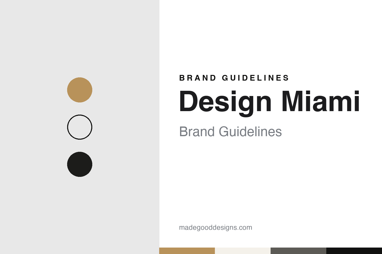
Two constants: a black, grey, gold and linen palette and a Grotesque sans register. Abstract homage — not a Design Miami asset or mark; no logo, slash device or wordmark is reproduced.
Born in the Design District
A developer, a director and a fair beside Art Basel.
Design Miami grew out of a property project. Wikipedia says the fair was founded in 2005 by Craig Robins, a real estate developer and art and design collector, who from 2000 had been working to turn the run-down Miami Design District into a centre for design, architecture, fashion, food and art. Wikipedia says the renewal of the district inspired the creation of the Design Miami company and its annual fair, followed shortly afterwards by an edition in Basel, Switzerland. The fair’s own website describes Robins as the chief executive and president of Dacra, the company through which he develops what it calls creative communities that combine art, design and architecture.
Robins did not build the fair alone. Dezeen, in a report by Marcus Fairs dated 27 April 2010, described Ambra Medda as the director who had co-founded the limited-edition design fair five years earlier. The same report quoted the fair’s announcement that it was marking its fifth anniversary with its tenth show overall, and said the event was presented twice a year, in step with Art Basel in Switzerland and Art Basel Miami Beach in Florida. In the fair’s own words, the launch of 2005 had been an experiment in whether limited-edition design could be shown alongside art as collectible material.
The link to the art fair went beyond the calendar. Dezeen quoted The Art Newspaper describing Robins as the Miami collector who owned Design Miami “in partnership with Art Basel parent company MCH Group”. In the same 2010 report, Dezeen said Medda would step down after the Design Miami/Basel fair that June, five years after the launch, and would stay on as a creative consultant and serve on the fair’s selection committees while a search for a new director got under way.
The name itself was written in a particular way from the start. In that 2010 report the fair appears as Design Miami/, with a forward slash after the city, and its Swiss edition as Design Miami/ Basel. Medda, quoted by Dezeen, said the aim had been a global platform for the design community, a forum for cultural experiences and commercial opportunities. Robins, in the same announcement, said the show had begun with a belief that it was tapping into a growing interest in collecting design.
Colour
A chief executive, a Paris debut and a new owner.
A new generation of management followed. The fair’s website says Jen Roberts joined Design Miami as chief executive in 2015 and has since introduced new parts of the business, including the Design Miami Curatorial Lab, which it describes as a strategic consultancy, as well as event formats called Podium and In Situ. The company says Roberts also launched the Paris edition. The website lists Basel, Milan, Los Angeles, Aspen, Shanghai and Seoul among the places the fair has appeared, and gives its two main fairs as Miami Beach each December and Paris each October.
The Paris debut came with news about ownership. The Art Newspaper, in a report by Sophia Herring dated 6 December 2023, said that on the opening day of the VIP preview of the fair’s Paris debut in October, Design Miami announced it would be acquired by the digital marketplace Basic.Space. The paper said the two companies had long been connected, because Robins, the fair’s co-founder and chairman, had been an early investor in Basic.Space. It quoted Roberts, the fair’s chief executive, saying the deal would get the fair “to where we’ve always wanted to be—just faster”, and quoted Jesse Lee, chief executive of Basic.Space, on the shared perspective that led to talks.
Wikipedia dates the acquisition to 18 October 2023 and describes it as an all-stock transaction. It says Lee became chairman of the Design Miami board and Roberts remained chief executive; the fair’s website gives the same arrangement. The fair’s own magazine said, in an interview dated 3 October 2023, that the Paris edition was due to open on 17 October, at a venue it named as L’hôtel de Maison.
The map kept changing after the sale. Wikipedia says a Los Angeles edition, Design Miami.LA, followed in May 2024. Miami Living magazine, in a piece dated 28 April 2024 carrying the fair’s announcement, said the LA show would run from 16 to 20 May 2024 at a private Holmby Hills estate designed by the architect Paul R. Williams, with a programme by curatorial director Ashlee Harrison. Wikipedia says the In Situ series, which the fair presents as regional exhibitions, began in Aspen, Colorado, on 31 July 2025 and moved to Seoul in September 2025.
Typography
A slash, a line and a yearly rethink.
Design and art events carry their identity in places a consumer brand rarely reaches. A recurring exhibition or festival often puts a year, an edition number or a season into its name, so the wordmark has to work as a stable root that accepts a changing suffix. The same name then has to hold together across a catalogue, a poster series, a website and a printed guide that is replaced every edition.
Host-city signage is a second surface. Banners on lamp posts, flags on venues and wayfinding panels in streets, stations and pavilions have to be read at walking pace and at a distance, often in more than one language. Typography chosen for these jobs tends toward clear letterforms, generous spacing and strong contrast against the street.
Catalogues and posters are the third surface, and the most collected. They outlast the event itself, and many organisers commission a different designer or studio for each edition, so continuity comes from the name, a grid or a colour habit rather than from a fixed logo. For a design guide, the useful question is which elements stay fixed from edition to edition and which are allowed to change.
Aa
A grotesque sans — after the clean, modernist type of the fair’s posters and invitations. (Specimen set in Archivo, a grotesque STAND-IN; NOT the Design Miami logo, slash device or any Design Miami typeface.)
Design Miami
One oblique line, redrawn for every fair.
The fair’s identity rests on a single stroke. In an interview published by Design Miami on 3 October 2023, the company said the London agency Made Thought originated “the defining element of our brand, the 60° forward slash” in 2006, and had gone on to create a new identity for every event since, including graphic themes, formal vocabularies and colour palettes for invitations, signage and T-shirts. Made Thought tells the story from its own side on its website, where it says Design Miami was “merely an idea” in 2005 and that the agency began with “a single 30° oblique” line that could divide perspectives and connect locations. The agency says the line was clean and modernist in year one and was later distorted, cut, extended and woven into cityscapes for each edition.
The slash recurs from edition to edition. In the 2023 interview, Made Thought creative director Alistair Webb said the forward slash is always a key part of any fair identity. For the Paris debut he said the agency put the slash at the centre of the communications and let it disrupt bold typographic arrangements, and that the ornate interiors of the Paris venue appeared as reflections inside a gold forward slash. For Miami, he said, recognition in the home city allowed the team to push the brand’s core codes further.
A broader overhaul came in 2024. Miami Living reported on 28 April 2024 that Design Miami had announced a global rebrand designed by Henrik Purienne, named as the fair’s global creative director for 2024. It said the rebrand was built on the idea of “Living with Design”, shown through photographs of creative people in their own homes, and paired with a clean new graphic identity meant to unify the fairs in Los Angeles, Basel, Paris and Miami Beach. The opening campaign, the magazine said, featured the Los Angeles artist Peter Shire. Roberts, quoted in the same piece, said the new visual identity was designed to reflect the past, present and future of the fair.
The name has shifted in print as well. Reports from 2010 and 2023 write Design Miami/ with a trailing slash, while the fair’s current website writes plain Design Miami, with a full stop in edition names such as Design Miami.Basel and Design Miami.Paris.
For a design guide, Design Miami shows how one oblique line can carry a brand across cities while each edition gets its own colours and type. Compare Art Basel, the art fair whose Basel and Miami Beach editions Design Miami was presented alongside, and Salone del Mobile, the Milan furniture fair. For this guide we use black, grey, gold and linen with a sans, an unofficial interpretation; no product or logo is reproduced.
Explore & save
Keep Design Miami’s identity on hand — save it to a board in the Made Good inspiration library.
Design Miami identity set
Pin the Design Miami black, grey, gold and linen palette and the Grotesque sans register to your own board.