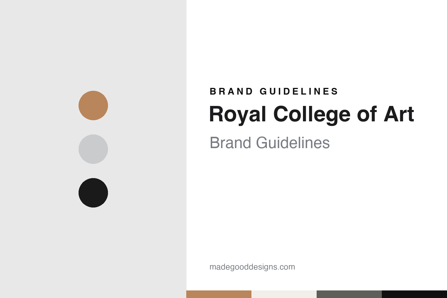
Royal College of Art Brand Guidelines
A school of design, renamed a college of art.
Aa
Two constants: a black, grey, buff brick and aluminium palette and a Slab serif register. Abstract homage — not a Royal College of Art asset or mark; no crest, logo or wordmark is reproduced.
From the School of Design
Somerset House, 1837, to Kensington Gore.
The Royal College of Art did not start under that name. Wikipedia says it was founded at Somerset House in London in 1837 as the Government School of Design, also called the Metropolitan School of Design. Wikipedia, quoting a report of 1848, says many of its early pupils were the sons of tradesmen and skilled artisans. Richard Burchett became head of the school in 1852.
A government body soon took charge. Wikipedia says the Science and Art Department, set up in 1853 to promote education in art, science, technology and design, took over the school. It moved to Marlborough House and then to South Kensington, on the same site as the South Kensington Museum; Wikipedia gives the date of that second move as 1853 or 1857. The name changed with the role. The school became the Normal Training School of Art in 1857 and the National Art Training School in 1863, and for much of the later nineteenth century it trained art teachers. Wikipedia names the painter George Clausen, the designer Christopher Dresser, the illustrator Kate Greenaway and the garden designer Gertrude Jekyll among its pupils in that period.
The present name arrived in September 1896, when, Wikipedia says, the school became the Royal College of Art and the emphasis of its teaching moved to the practice of art and design. From 1896 until 1967 it was based in the Henry Cole Building, now part of the Victoria and Albert Museum. Graphic, industrial and product design were taught from the middle of the twentieth century, and in 1967 the college received a royal charter, amended in 2021, that let it grant its own degrees.
The college’s own building on Kensington Gore is the Darwin Building. Wikipedia says it was built between 1960 and 1963 to designs by three members of RCA staff, H. T. Cadbury-Brown, Hugh Casson and Robert Goodden, and has been a Grade II listed building since 2001. It is named after the painter Robin Darwin, the rector when it was commissioned. In 2012 the college marked its 175th year with an exhibition there, The Perfect Place To Grow: 175 Years of the Royal College of Art, which Dezeen listed on 25 November 2012.
Colour
Battersea, White City and two architects’ campuses.
The Kensington Gore site is tightly bounded, and Wikipedia says that meant further growth had to happen elsewhere in London. In 1991 the sculpture department moved to a converted factory in Battersea. A Sculpture Building redeveloped by the architects Wright & Wright opened there in January 2009.
The college then commissioned a masterplan for Battersea from Haworth Tompkins. Wikipedia says the opening phase was a building for the painting department, opened on 19 November 2009 and called the Painting Building since 2022. The Dyson Building, named in honour of the industrial designer James Dyson, opened on 24 September 2012 to house printmaking and photography, with an innovation wing for start-up designers. The Woo Building opened on 30 September 2015 for ceramics and glass and for jewellery and metal; Wikipedia says its anodised aluminium gates were designed by the RCA graduate Max Lamb. In 2017 a third campus opened at White City, beside the BBC Media Village, in buildings designed by Allies and Morrison.
The newest Battersea buildings are by Herzog & de Meuron. Wikipedia says the college was granted planning permission in 2018 to redevelop the Sculpture Building to the Basel practice’s design. Architecture Today reported on 24 May 2022, after a press tour, that the project comprised two buildings. The Rausing Research and Innovation Building rises behind fins of recycled, variegated aluminium that shade its façade, and houses research spaces including an Intelligent Mobility Design Centre, an incubator for new businesses and visualisation labs. The Studio Building rises to a saw-tooth roof that, the magazine said, echoes the Haworth Tompkins Woo Building next door.
At street level the Studio Building opens onto Battersea Bridge Road and Howie Street. Architecture Today described a double-height space called the Hangar, with tall folding doors at its north and south ends; the north door on Howie Street serves as the main visitor entrance and lets large works be brought in. The magazine quoted Jacques Herzog contrasting the building with the practice’s other London projects: “Here, there is a more a flavour of tradition and even maybe modesty.” It quoted the vice-chancellor, Paul Thompson, describing the aim of a “porous” relationship with passers-by.
Typography
Crests, typefaces and buildings.
An art school’s identity rarely starts with a logo. It usually starts with a name, and that name is often a person’s: a founder who opened the first studio, a teacher whose classes drew the first students, or a benefactor whose gift paid for a building. Over decades those names get shortened, merged, abbreviated into initials or folded into a parent institution, and each change leaves a trace on letterheads, signs and diplomas.
Buildings carry as much of the identity as any mark. A converted warehouse, a purpose-built studio block or a hillside campus becomes the image people picture when they hear the name, and architects’ choices of glass, steel, brick or concrete end up doing the work a brand book would do elsewhere.
Then there are the everyday surfaces: lettering painted on studio doors, signage on stairwells, and above all the posters, catalogues and websites made each year for graduate shows. These are often designed by students or staff rather than agencies, so the look shifts from year to year while the name stays fixed. For a designer, the useful lesson is how a short wordmark has to sit comfortably beside work that changes every season.
Aa
A slab serif — after the Calvert house face and its 2012 remix, Calvert Brody. (Specimen set in Zilla Slab, a slab-serif STAND-IN; NOT the Royal College of Art logo, crest or any RCA typeface.)
Royal College of Art
A crest, a house font and its remix.
The college’s visual identity is built around type. Design Week, in a report dated 11 January 2013, said the RCA was rolling out a new identity created by Neville Brody, then dean of the School of Communication, and his consultancy Research Studios. The new lock-up for the RCA logo kept the royal crest and the Calvert font, which the magazine said had been the college’s house font since the 1990s. The college said it wanted greater coherence for a brand that had grown into a number of variations, used in different ways by different parts of the college.
The centrepiece was a headline typeface. Dezeen reported on 25 November 2012 that Brody and Research Studios had worked with Henrik Kubel, an RCA graduate of 2000, to produce Calvert Brody, a “remixed” version of the house font. Calvert is the work of Margaret Calvert, the graphic designer known for the UK road-sign system of the 1960s and a former course director in graphic design at the college. Design Week named Kubel’s studio as A2-Type and said Calvert herself worked on the new face. Brody told Dezeen he had tried to make it “more classical” through exaggerated thick and thin strokes, and at the same time “more industrial and contemporary” with redrawn pieces and a stencil.
Dezeen said Calvert Brody would be used across the college’s buildings, sprayed directly onto walls or laser-cut into metal, as well as in print and on screen; Design Week said it had already appeared at the Dyson Building. Octavia Reeve, the RCA’s senior publishing manager, who led the rebrand with the designers, told Dezeen that three generations of RCA graphic designers had worked on the face. The rest of the Research Studios identity was due to launch on 1 January 2013. Brody Associates says on its website that it later refreshed the identity it developed in 2012 and unified the design system with new guidelines, keeping Calvert Brody for high-impact uses such as building signage.
For a design guide, the Royal College of Art shows how a school can carry its history in a crest and a house typeface while letting its buildings change around them. Compare Central Saint Martins, another London art school with its own typeface, and the Bauhaus. For this guide we use black, grey, buff brick and aluminium with a slab serif, an unofficial interpretation; no product or logo is reproduced.
Explore & save
Keep Royal College of Art’s identity on hand — save it to a board in the Made Good inspiration library.
Royal College of Art identity set
Pin the Royal College of Art black, grey, buff brick and aluminium palette and the Slab serif register to your own board.