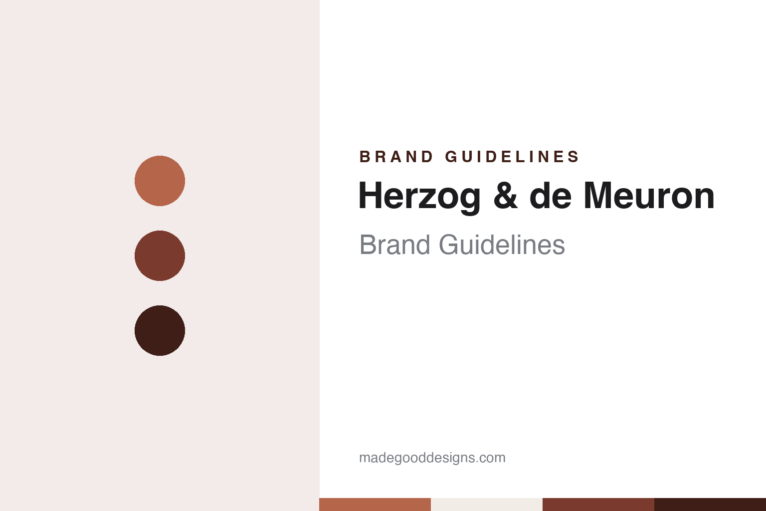
Herzog & de Meuron Brand Guidelines
Two surnames and an ampersand, kept since 1978.
Aa
Two constants: a brick, kiln and umber palette and a plain grotesque register. Abstract homage — not a Herzog & de Meuron asset or mark; no logo, icon or wordmark is reproduced.
Two architects from Basel
Basel, 1978.
Herzog & de Meuron is named after its two founders, and the name has not changed. The Swiss news service swissinfo.ch reported on 8 May 2001 that Jacques Herzog and Pierre de Meuron were both from Basel, had attended the same schools, and set up their practice, Herzog and de Meuron, in 1978. Wikipedia says both had graduated from the Swiss Federal Institute of Technology, ETH Zurich, in 1977, and that the practice was founded in Basel the following year.
The two names, joined by an ampersand, describe a partnership of equals rather than a lead designer with a studio behind him. In the swissinfo.ch report, de Meuron explained how the pair divided their work: “Jacques’ strengths are my weaknesses, and his weaknesses are my strengths.” The company’s formal name, according to Wikipedia, is Herzog & de Meuron Basel Ltd., and Basel has remained its headquarters.
The early work was in and around the city and in the Basel region. Wikipedia lists the Blue House in Oberwil, from 1980, and the Ricola Storage Building in Laufen, from 1987, among the practice’s early projects. Tate’s own account of the Tate Modern competition, on its website, lists further work completed before that commission: the Goetz Gallery in Munich (1991–92), the Ricola Europe factory building (1993), an apartment building on Schützenmattstrasse in Basel (1993) and the railway signal box Auf dem Wolf in Basel.
The practice also worked in the United States in the 1990s. swissinfo.ch named the Dominus winery in California’s Napa Valley and the Institute for Clinical Pharmacy in Basel among the pair’s projects, and reported that a new football stadium the practice designed in Basel had opened earlier in 2001. By then, the two founders also taught: Wikipedia says they were professors at ETH Zurich from 1999 to 2018, where they co-founded ETH Studio Basel.
Colour
A power station on the Thames.
The commission that took the name to London came through a competition. Tate says on its website that its trustees announced in December 1992 their intention to create a separate gallery for international modern and contemporary art, and chose the redundant Bankside Power Station, designed by Sir Giles Gilbert Scott, as the site. Tate organised an international competition, and the winners were the Swiss firm Herzog & de Meuron.
Tate describes the work in stages. The transformation of the power station began in 1995 with the removal of the machinery and a number of outbuildings, leaving a brick shell supported by a steel skeleton. Construction on site began in October 1997, when the concrete foundation was laid. A steel framework was then built inside the existing walls to carry the new gallery floors and to support the brick façade. In January 2000 the building was handed over to Tate, and Tate Modern opened to the public on 12 May 2000.
At Bankside, then, the existing industrial building was kept as a shell, with the new gallery made inside it. The museum opened under the Tate name, with the practice credited as its architect.
Wikipedia says the Beijing National Stadium, completed in 2008 for the Summer Olympics, was designed in collaboration with the artist Ai Weiwei, and lists the Allianz Arena in Munich (2005) and the Prada Aoyama store in Tokyo (2003) among the projects of the same decade. The Vitra-Haus in Weil am Rhein followed in 2010, according to Wikipedia. Each of these buildings is known by its own name or its client’s name.
Typography
Surnames, partners and conversions.
An architecture practice’s identity usually begins with a name, and that name is often a list of founders’ surnames joined by commas and ampersands. Over time those lists tend to compress into initials or a single surname, and the shortened form becomes the working mark on letterheads, drawing sheets and websites. Other studios choose a single word or the name of one designer, which shifts the identity from a partnership to a studio.
Much of a practice’s visual identity lives on working documents rather than in advertising. Title blocks on drawings, the lettering on presentation boards, competition panels and the hoardings that wrap a construction site all carry the practice name, and each sets a typeface, a weight and a placement rule that repeats across projects. Monographs, exhibition catalogues and project books extend the same typography into print.
Physical spaces act as brand surfaces too. A studio’s own office, its reception and the model shop where physical models are built and photographed shape how clients and visitors meet the firm. For a design guide, the useful lesson is restraint: a short name, one typeface used with discipline, and a consistent way of presenting drawings, models and photographs.
Aa
A plain grotesque — after a practice name set as two surnames and an ampersand. (Specimen set in Libre Franklin, a sans STAND-IN; NOT the Herzog & de Meuron logo or any Herzog & de Meuron typeface.)
Herzog & de Meuron
A warehouse in Hamburg and a growing partnership.
The conversion approach reached Hamburg in 2017. The London creative site It’s Nice That reported on 11 January 2017 that the Elbphilharmonie, designed by Herzog & de Meuron, would host its inaugural concert that evening. The concert hall, on the banks of the Elbe, had been scheduled to open in 2010. It’s Nice That said the building is a converted brick warehouse with a new glass structure placed on top, and that the windows had lit up with the word “Fertig”, German for completed, in November 2016. Visitors reach a public plaza by a long curved escalator; inside are a main auditorium whose layout draws on terraced vineyards, a recital hall, a hotel and apartments.
The practice behind these buildings has grown into a wider partnership while keeping the founders’ two names. Wikipedia says the partner Harry Gugger joined in 1991 and left in 2009, and that Christine Binswanger became a partner in 1994. Robert Hösl and Ascan Mergenthaler followed in 2004, Stefan Marbach in 2006, Andreas Fries in 2011, and Jason Frantzen and Wim Walschap in 2014. Wikipedia says Adrian Keller joined as chief executive in 2017.
Wikipedia lists offices in Berlin, Hong Kong, London, Munich, New York City, Paris and San Francisco in addition to Basel. It also lists later projects including 56 Leonard Street in New York (2017), M+ in Hong Kong (2021) and the Roche pRED Innovation Center in Basel (2023). The name on the door in each city is the same two surnames joined by an ampersand.
For a design guide, Herzog & de Meuron shows how a partnership name can stay fixed for decades while new partners join beneath it, and how a practice’s identity can sit quietly behind the names of the institutions it builds for. Compare Tate, whose Tate Modern opened in the converted Bankside Power Station in 2000, and Ricola, the Laufen herb-drop maker whose buildings the practice designed. For this guide we use brick, kiln and umber with a sans, an unofficial interpretation; no product or logo is reproduced.
Explore & save
Keep Herzog & de Meuron’s identity on hand — save it to a board in the Made Good inspiration library.
Herzog & de Meuron identity set
Pin the Herzog & de Meuron brick, kiln and umber palette and the plain grotesque register to your own board.