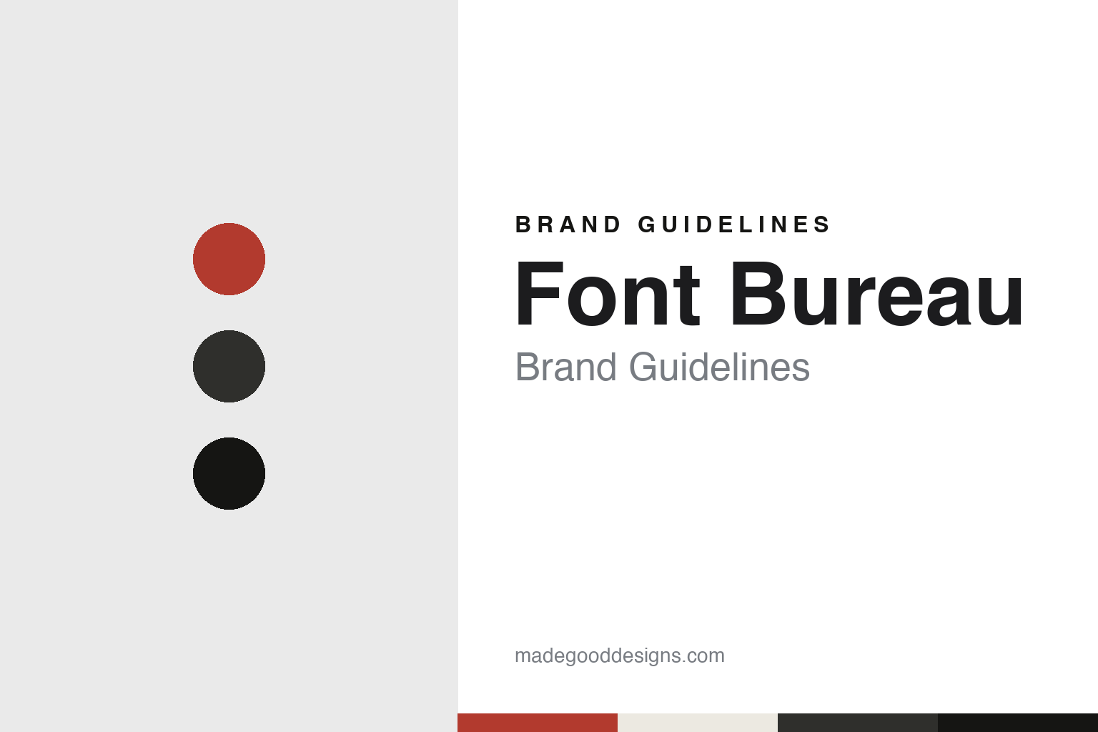
Font Bureau Brand Guidelines
Type for the newsroom, drawn in Boston.
Aa
Two constants: a press red, newsprint grey and ink black palette and a Gothic sans register. Abstract homage — not a Font Bureau asset or mark; no logo, icon or wordmark is reproduced.
A designer and a type designer
Boston, 1989.
Font Bureau was set up in Boston in 1989 by Roger Black and David Berlow. The Boston Globe, in a profile of Berlow by Cindy Atoji Keene published on 25 May 2008, said Berlow started the company in 1989, and quoted him remembering the pre-digital days when letters were drawn on paper. Wikipedia describes Black as an established publication designer and consultant before the foundry was formed, and Berlow as a type designer; it credits Black as co-founder and consultant and Berlow as co-founder and designer. The company’s full name is The Font Bureau, Inc.
The two founders came from different sides of publishing. Wikipedia says Black joined Rolling Stone as an associate art director in May 1975, became its art director in 1976 and led a complete redesign in 1977. It says he was art director of The New York Times Magazine from 1982 to 1984, then director of editorial art for The New York Times, and art director of Newsweek from 1985. Those titles would later appear on Font Bureau’s client list.
Berlow’s path ran through older type companies. Monotype, announcing on 4 May 2023 that it had bought part of the Font Bureau library, said Berlow entered the type industry in 1978 as a letter designer for the Mergenthaler, Linotype, Stempel and Haas type foundries, joined the newly formed digital type supplier Bitstream in 1982, and left Bitstream in 1989 to set up Font Bureau with Black.
The name describes an office, but Berlow’s own account in the Globe describes a dispersed team. He told the paper in 2008 that the foundry’s designers worked from home in places ranging from Oakland, California, to Delft in the Netherlands, and that he had never been to the office: he said he had seen it on screen, in the documentary Helvetica, which filmed there. He described making a typeface as solving a problem with words, sometimes a single word such as a logo and sometimes a special edition, starting with commonly used letters such as R, S, T, A and E before building out the full character set and a range of weights from thin to extra black.
Colour
Newspapers, magazines and narrow columns.
Editorial type was the foundry’s core work. Wikipedia lists The New York Times Magazine, Newsweek, Esquire, Rolling Stone and The Wall Street Journal among its clients, and Monotype’s 2023 release names the same publishers along with the technology companies Apple, Google and Microsoft. The Boston Globe profile said the paper’s own text face had been custom designed by Font Bureau, which was involved in the Globe’s redesign in 2000. Berlow also told the paper that the foundry developed two fonts for Playboy, because the magazine was printed by both offset and gravure and the same type looks darker or lighter depending on the process; matching the two meant drawing two versions.
Several retail families came out of this editorial work. Monotype says Belizio, a digital revival of Aldo Novarese’s Egizio, helped establish the visual identity of Rolling Stone. It dates Bureau Grot, a grotesque sans, to 1989, the year the foundry opened, and says the Poynter series, including Poynter Gothic and Poynter Oldstyle, was designed by Tobias Frere-Jones and published through Font Bureau in 1997 for newsprint at small sizes and in narrow columns, where more characters per line are needed.
Wikipedia dates Benton Sans, by Frere-Jones, to 1995 and Berlow’s Charcoal to 1994–1997, and lists Agency FB, Interstate, Miller and Tasse among the foundry’s families. Several names carry the initials FB, among them Agency FB, Bodoni FB and Garamond FB, all of which appeared on Type Network’s 2024 list of Font Bureau typefaces.
The roster of designers widened over the years. Wikipedia names Frere-Jones, who later worked at Hoefler & Frere-Jones and then Frere-Jones Type, and Cyrus Highsmith, later of Occupant Fonts and Morisawa, among designers at the foundry, and says Matthew Carter collaborated with it often. Type Network’s notice records later homes for some of the work: Antenna with Occupant, Interstate with Frere-Jones Type, Forma with DJR, Agenda with Greg Thompson and Farnham with Orange Italic.
Typography
A foundry name, a client list and a library.
A type foundry’s identity lives in places a consumer brand rarely has to think about. The first is the specimen: a printed or on-screen sheet that sets a typeface at many sizes and in running text so a designer can judge it. For a foundry, the specimen is both a sales tool and a statement of taste, and its layout, paper and paragraph choices often say as much about the house as any logo.
The second surface is the catalogue or house publication. Foundries have long issued booklets, newsletters and magazines that show their faces in use, and some of these publications became better known than the businesses behind them.
Third, the type names themselves work as brand names. A family name has to be distinct, easy to say, and able to sit in a licence agreement, a menu in a design app and a credit line.
Finally, the digital storefront carries the identity day to day: licensing pages, type testers and downloadable trial fonts are where most people now meet a foundry, so their typography, tone and terms form part of the brand.
Aa
A gothic sans — after a foundry whose library grew out of newspaper and magazine work. (Specimen set in Libre Franklin, a sans STAND-IN; NOT the Font Bureau logo or any Font Bureau typeface.)
Font Bureau
From Type Network to Monotype.
From the mid-2010s the business changed shape. Wikipedia says that after the launch of Type Network in 2016, Font Bureau focused mainly on type design and custom services, while font licensing, font development and its retail shop moved to Type Network. It says that on 6 July 2016 the company announced its retail typefaces would be sold exclusively through Type Network, withdrawing them from Fonts.com, MyFonts and FontShop, and that the foundry withdrew its fonts from the Adobe Fonts library on 15 June 2020.
The library was then divided. Monotype announced on 4 May 2023 that it had acquired a group of Font Bureau type families, including Belizio, Bureau Grot and Poynter, many of them designed by Berlow; Monotype has owned those families since then. The release quoted Berlow saying that Monotype was the natural home for these typefaces and that they would sit alongside his earlier work from Linotype and Bitstream, which Monotype already held.
Type Network’s notice “Farewell, Font Bureau” said that from 1 July 2024 it would no longer offer the Font Bureau typefaces that had been sold, because the new owner had decided not to renew the distribution agreement. It said that before the sale Font Bureau had transferred the rights to part of its library to the original designers, which is how families such as Antenna and Interstate stayed on Type Network under other foundry names.
For a design guide, Font Bureau shows how a type foundry can take its identity from the publications it serves, with a plain office-like name and a library shaped by newsprint, narrow columns and two printing processes. Compare Emigre and Dalton Maag, two other type foundries in this collection. For this guide we use press red, newsprint grey and ink black with a gothic sans, an unofficial interpretation; no product or logo is reproduced.
Explore & save
Keep Font Bureau’s identity on hand — save it to a board in the Made Good inspiration library.
Font Bureau identity set
Pin the Font Bureau press red, newsprint grey and ink black palette and the Gothic sans register to your own board.