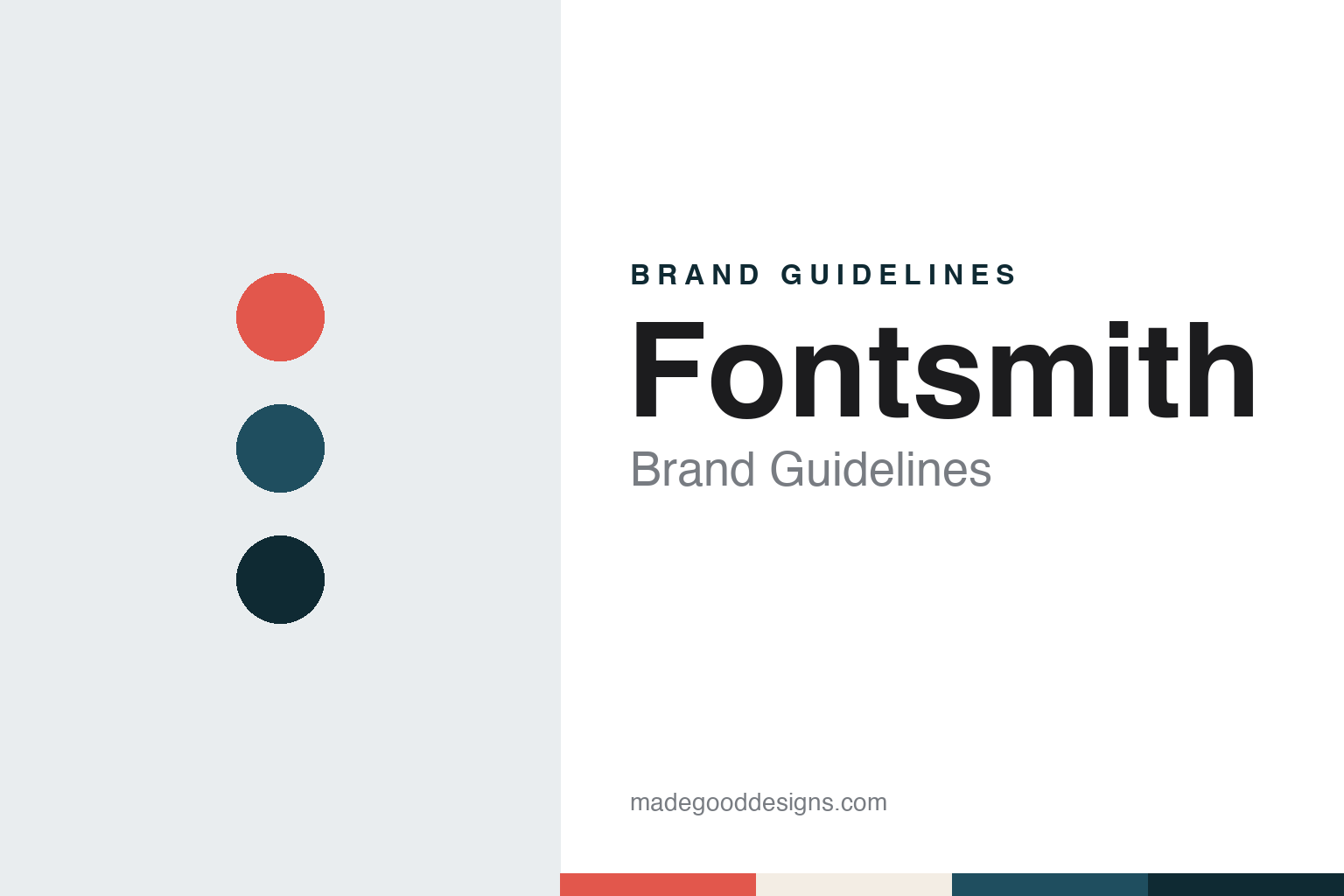
Fontsmith Brand Guidelines
Custom type, made in London.
Aa
Two constants: a coral, petrol and deep teal palette and a humanist sans register. Abstract homage — not a Fontsmith asset or mark; no logo, typeface or wordmark is reproduced.
A foundry named after its founder
London, 1997.
Fontsmith is a London type foundry founded by Jason Smith. It’s Nice That, reporting on 28 January 2020, says the foundry was founded in 1997, and that Smith began his typographic career as an intern at Monotype. Smith described the arc in the same report as “a full circle story”: his earliest type design experience at Monotype, he said, inspired him to strike out on his own, and the company he left later bought the foundry he built.
Transform magazine, covering the same news in 2020, quoted Smith looking back on the years he had spent building Fontsmith since its founding. Monotype’s own announcement, dated 27 January 2020, calls Fontsmith a boutique font foundry in London and names Jason Smith as its founder.
The foundry’s naming system is a large part of its identity. The families named in the 2020 coverage all carry the prefix FS ahead of a single word: It’s Nice That lists FS Albert, FS Brabo, FS Koopman and FS Meridian among them.
The press coverage describes two kinds of work: retail families that designers can license, and bespoke or modified typefaces made for a single organisation. It’s Nice That names the BBC, British Gas, Colgate, ING and Lloyds Bank among the brands it had made such typefaces for by 2020.
That process is unusually well documented for one project, a typeface for the learning-disability charity Mencap. The magazine’s account shows how the foundry described its method, and the face later joined its retail catalogue.
Colour
FS Me and the Mencap consultation.
Creative Review reported the project on 31 May 2008, in a piece by Gavin Lucas. Mencap had unveiled a new identity created by Rare Corporate Design, and the rebrand included a new corporate typeface called Me, crafted by Fontsmith in consultation with members of the charity. Mencap’s creative manager Nina Clarke, who managed the rebrand, told the magazine that the charity wanted more personality in its identity, and that picking a standard font off the shelf did not seem right. She credited Lee Smith at Rare with suggesting a bespoke typeface.
Fontsmith then worked with Clarke, Mencap’s design team, its accessibility unit and a consultation group of Clarke and other Mencap employees who represented a range of mild learning disabilities. Jason Smith described the method to Creative Review. In the first session the foundry set test words and sentences in many kinds of type, from serif and sans serif to script and rounded faces, in different weights, to learn what the group preferred to look at and what it found easier to read.
The findings shaped the letters. Smith said sans serif faces were easier to read, but the group felt that more informal shapes had more personality, so the team looked at rounded forms with movement in them. Faces with very rounded terminals were seen as childlike and patronising, and the foundry noted that and avoided it, aiming for something grown-up and engaging.
A second round of documents looked at key characters such as a, g, i, j and k. Smith told the magazine he had wanted a two-storey lower-case a and had expected it to be easier to read, but the research group preferred the other form, and the group’s view prevailed. He was careful about how this should be described: “It wasn’t design-by-committee,” he said; the foundry shaped the typeface by reacting to the feedback and making its own design judgements.
The face entered Fontsmith’s retail catalogue as FS Me. Wikipedia credits Jason Smith as its designer, dates it to 2008, and says the TV platform YouView commissioned a digital version that year as part of its accessibility specification. For a foundry, the Mencap story did double duty: it was client work, and it was a published account of how Fontsmith works with the people who will read its type.
Typography
Specimens, catalogues and names.
A type foundry’s identity lives in places a consumer brand rarely has to think about. The first is the specimen: a printed or on-screen sheet that sets a typeface at many sizes and in running text so a designer can judge it. For a foundry, the specimen is both a sales tool and a statement of taste, and its layout, paper and paragraph choices often say as much about the house as any logo.
The second surface is the catalogue or house publication. Foundries have long issued booklets, newsletters and magazines that show their faces in use, and some of these publications became better known than the businesses behind them.
Third, the type names themselves work as brand names. A family name has to be distinct, easy to say, and able to sit in a licence agreement, a menu in a design app and a credit line.
Finally, the digital storefront carries the identity day to day: licensing pages, type testers and downloadable trial fonts are where most people now meet a foundry, so their typography, tone and terms form part of the brand.
Aa
A humanist sans — after the open, legibility-led sans families in the Fontsmith catalogue. (Specimen set in Figtree, a sans STAND-IN; NOT the Fontsmith logo or any Fontsmith typeface.)
Fontsmith
Variable fonts and a return to Monotype.
In the years before the sale, Fontsmith put variable fonts at the front of its story. It’s Nice That reported in January 2020 that the foundry had created a variable-font logo for WPP’s new campus in Amsterdam, designed with the Dutch branding agency VBAT, and that in 2019 it had launched a collection of variable fonts. Monotype’s announcement dates that collection to the October before the deal.
Monotype’s own ownership had changed shortly before. Wikipedia says Monotype passed to the private equity firm HGGC in October 2019, and that on 27 January 2020 the company added Fontsmith to its catalogue. Monotype’s announcement of that date says Fontsmith’s families would join the Monotype Library, and that its designers would add to the Monotype Studio. It’s Nice That reported that the designs would remain on sale through Monotype, through MyFonts and still through Fontsmith’s own website. Monotype has owned Fontsmith since 2020.
The families named in the 2020 coverage kept their FS names under the new owner. In the same announcement Monotype also listed FS Millbank and FS Split among the incoming families, and said the designs would be offered through its Monotype Fonts service as well as on MyFonts and Fontsmith’s own website.
For a design guide, Fontsmith shows how a foundry can turn its founder’s name into a short prefix that labels every product, and how a documented design process can become part of the brand. Compare Monotype, the group that has owned it since 2020, and Colophon Foundry, another London foundry in this collection. For this guide we use coral, petrol and deep teal with a humanist sans, an unofficial interpretation; no product or logo is reproduced.
Explore & save
Keep Fontsmith’s identity on hand — save it to a board in the Made Good inspiration library.
Fontsmith identity set
Pin the Fontsmith coral, petrol and deep teal palette and the humanist sans register to your own board.