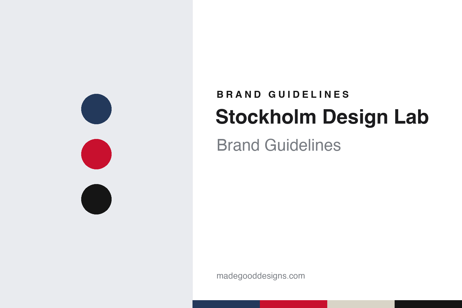
Stockholm Design Lab Brand Guidelines
Every touchpoint designed, from livery to wet wipe.
Aa
Two constants: a navy, red, linen and black palette and a humanist sans register. Abstract homage — not a Stockholm Design Lab asset or mark; no logo, icon or wordmark is reproduced.
A lab in Stockholm
Björn Kusoffsky, Thomas Erikson and a reaction against the usual agency.
Stockholm Design Lab, often shortened to SDL, is a design studio in the Swedish capital. The Japanese culture magazine SHIFT, in a feature written by Yurie Hatano and published in its archive for January 2006, named Björn Kusoffsky and Thomas Erikson as the founders and creative directors of the multidisciplinary company. In that interview the founders said the studio was established in 1998 as a reaction against ordinary design companies that worked mainly with packaging and corporate identity. Dezeen, reporting on 17 March 2022, also dates the studio’s founding to 1998.
The name joins the name of the studio’s city to the words “Design Lab”, with no founder’s surname. The short form SDL, used by SHIFT in 2006 and by Dezeen in 2022, turns the name into a compact set of initials.
Kusoffsky has described his route into the work. In an interview with People of Print published on 21 April 2026, where he is introduced as Founder and Executive Creative Director, he said he studied at Beckmans College of Design in Stockholm, worked early on as art director of a music and lifestyle magazine and then spent about five years at an advertising agency before starting Stockholm Design Lab. He named Tom Hedqvist, his teacher at school and later a colleague at the agency, as a mentor, and listed Charles and Ray Eames, Alvar Aalto, Achille Castiglioni, Paul Rand and Peter Saville among the figures he looked up to. SHIFT reported in 2006 that Kusoffsky had worked on title sequences since 1989 and that moving graphics were a natural part of the studio’s graphic design.
The founders summed up their approach to SHIFT in one line: to work with design as a tool to make a change. They also said that many of the studio’s clients came from the partners’ own interests in music, art, architecture, sports and fashion, and that the work combined graphic design, strategy, architecture and interiors, moving graphics and packaging, with architecture and interior work carried out together with the practice TEARK.
Colour
SAS first, then IKEA, museums and a store chain.
The studio’s opening commission set the pattern for its identity. The founders told SHIFT in 2006 that their opening assignment, for SAS Scandinavian Airlines, helped them explore the idea of working on all parts of a total identity, from aircraft livery and wet wipes to lounges and uniforms, with every item designed individually. People of Print returned to the same project in 2026, describing the SAS work as extending from aircraft exteriors down to the smallest in-flight details, and summarising the studio’s view that a wet wipe, a poster, a book or a digital interface all carry equal weight in shaping a brand.
The client list in SHIFT in 2006 already reached beyond aviation: it named SAS, IKEA, the fashion label Filippa K, the bed maker Hästens, the Japanese office-supplies company Askul, the Museum of Modern Art, Universal Music and Astoria Cinemas. The founders said Japan inspired them and that the Japanese clients they worked with had a natural appreciation of the studio’s way of thinking. The same feature noted that Stockholm Design Lab had designed that month’s SHIFT cover.
Much of the studio’s documented work is visible in Swedish public space. Dezeen reported on 17 March 2022 that the architecture museum ArkDes in Stockholm had opened an exhibition about the studio, titled Smoothies, Museums and Airports, in the Boxen gallery designed by Dehlin Brattgård Arkitekter, and that it would run until 1 May. The magazine said the show looked at how the studio’s designs had become a common sight in many Swedish towns, on shop signs, adverts and store windows. Examples on display included work for the airport operator Swedavia and wayfinding for Arlanda Airport, the identity for the art museum Moderna Museet, the logo for the department store Åhléns and packaging for IKEA food, including crispbread. Dezeen also said the studio’s work included IKEA typefaces, the visual identity for the Nobel Prize and the redesigned Ericsson logo.
Kusoffsky told Dezeen that all design is about a clear strategy and goal and a connection to the product or service, and that work which will be on display in a very visible place needs more thought. Sometimes, he said, a design is driven by function, as at Arlanda, while for Polestar it is more discreet and pulls back; often, he added, it is about making the design visible from a distance.
Typography
A city name, a lab and a client list.
A European design studio’s identity is assembled from a small number of decisions that sit close to the people who run it. The first is the name. Many studios carry the surnames of their founders, joined into a pair or a longer chain; others choose a single short word, a city or a plain noun, so that the name reads as a label rather than a signature. Each route sets a different tone before any work is seen.
The second is publishing. A studio may run its own imprint, edit a journal or produce books about its field, and those printed objects carry its typographic voice into libraries and bookshops. Studio publications often say more about how a practice thinks than its client case studies do.
The third is type. When a studio draws a typeface for a client, the letters can outlast the commission and become the most visible trace of the studio’s hand. Some practices also release fonts under their own name.
Finally, the studio website works as a brand surface in its own right: the grid, the type and the ordering of projects show the house manner directly, with no client brief in between.
Aa
A humanist sans — after a studio whose identities run from airport signs to food packs and car parts. (Specimen set in Work Sans, a sans STAND-IN; NOT the Stockholm Design Lab logo, any client typeface or any studio typeface.)
Stockholm Design Lab
Polestar, Sigma and print in a digital decade.
Car and camera clients have shaped the studio’s recent work. Dezeen reported in March 2022 that the ArkDes show included the studio’s work for the electric car brand Polestar, covering its symbol, wordmark and typography, some of it used on internal car parts that ordinary drivers do not see. The magazine said the studio was then continuing to work on Polestar’s global launch and was designing for the Chinese smartphone maker OPPO. In People of Print in 2026, Kusoffsky said that each Polestar car also comes with a printed book, and that for Sigma, the Japanese lens manufacturer, printed materials and packaging remain important. He described a poster campaign in New York for a Sigma pop-up shop, saying the physical posters had a strong effect and were then shared online anyway.
The studio has also talked openly about how its tools have changed. Kusoffsky told Dezeen in 2022 that screen resolution on phones and computers is now good enough to use an antique typeface, so the design process had become closer to how it was twenty years earlier. In People of Print he called the arrival of the iPhone a major shift, said the conceptual process had not changed while the tools had become faster, and said that clients now have stronger internal teams, so the studio needs higher quality and stronger ideas. Asked about AI, he said such tools can help generate and visualise ideas quickly, but that a strong idea can still start as a simple sketch.
People of Print described Stockholm Design Lab as a multidisciplinary practice combining strategy, graphic design and architecture, and Kusoffsky said the company had always worked across 2D and 3D, physical and digital. He said that after the pandemic years the studio brings prints, objects and prototypes to in-person client meetings, because a physical meeting should be an experience.
For a design guide, Stockholm Design Lab shows how a studio can define itself by the reach of its systems, treating an airline’s wet wipes, a museum sign and a car’s hidden parts as parts of one identity. Compare IKEA, a long-running client, and Norm, another studio in this collection. For this guide we use navy, red, linen and black with a humanist sans, an unofficial interpretation; no product or logo is reproduced.
Explore & save
Keep Stockholm Design Lab’s identity on hand — save it to a board in the Made Good inspiration library.
Stockholm Design Lab identity set
Pin the Stockholm Design Lab navy, red, linen and black palette and the humanist sans register to your own board.