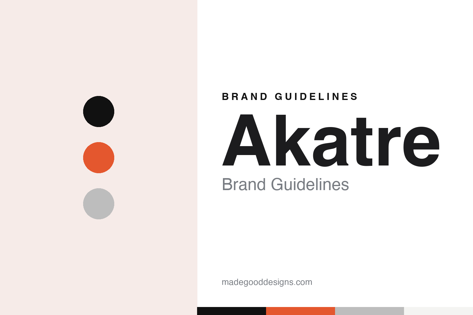
Akatre Brand Guidelines
A sheet of A4, a homemade alphabet and a camera.
Aa
Two constants: a black, orange and grey palette and a heavy grotesque sans register. Abstract homage — not an Akatre asset or mark; no logo, typeface or wordmark is reproduced.
Three graduates and an A4 sheet
A Paris studio founded in 2007.
Akatre is a multidisciplinary studio in Paris. It’s Nice That said on 11 August 2015, and again on 29 June 2017, that it was founded in 2007 by Valentin Abad, Julien Dhivert and Sébastien Riveron. In an interview with Metal magazine by Erwan Filidori, published on 25 July 2017, the three said that they had studied graphic design together in Paris, in the same year group, and that the wish to set up a structure of their own came while they were still students.
They did not start straight away. The founders told Metal that after graduating they gave themselves a year to learn the profession inside studios that worked on visual identities for the cultural sector, and only then created their own studio. In the same interview they said that Akatre would be ten years old that September.
The name is a piece of studio shorthand. The trio told Metal that Akatre came from the A4 paper format, the sheet they used as a letter to communicate, and that the abstract name stayed with them even though there are three of them in the studio.
Lettering came before everything else. Metal described the studio as focused at the start on the conception of new typefaces, before it moved into graphic design, video, artistic installations, photography and music production. The founders said they drew a typeface for each of their projects, as a way of bringing a personal touch and a deeper involvement to the work. They explained that at the beginning they could not afford to buy typefaces, so they made them, and that they were often frustrated with the typefaces they had; drawing their own, they said, was a real constraint but above all a freedom they kept using. They added that they were drawn to the world of publishing, to the making of books and to the drawing of letters.
Colour
Books, supermarket objects and music videos.
The founders told Metal in 2017 that on their early visual identities they produced hundreds of images, close to the installations and stagings they wanted to make. They said the DIY store and the supermarket had long been their favourite shops, because everyday objects found there could be turned to graphic use in photographs, in installations and in the choice of papers for printed work, and that the bodies of their models soon became a playground for transformation with different materials.
Print stayed central. It’s Nice That wrote on 11 August 2015 about 924P, a 924-page book designed by the studio with a plain black cover and pages it described as mostly monochrome without being minimal. The same article said that the studio’s expressive typography for the Anglo-Japanese magazine Mother had partly drawn the publication to the studio.
Music became a large share of the work. In the 2017 Metal interview the trio said the band Yalta Club had come to them for a cover and a music video after seeing their earlier music work with Benjamin Clementine, AaRON and Quadrupède. The band wanted to talk about boundaries, money and duality within civilisations, and the studio chose to build the project around a face that could serve as the group’s emblem across two clips. The founders said that handling every medium on a project, from the conception of the cover to the vinyl layout and the video shoot, was what they preferred.
It’s Nice That reported on 29 June 2017 on the studio’s video for Grand Yellow’s track “On My Way”. The trio said the band had contacted them because of their work for the University Theatre of Nantes (TU-Nantes), Benjamin Clementine, AaRON and Yalta Club. They had planned real wooden modular sets, then miniatures, before settling on 3D, a project made possible by their former producer Céline Lopez and the post-production company St-Louis. They imagined about a hundred painted scenes, and used a photographic capture to reproduce the two band members in 3D so they could be placed in surreal landscapes, crossing without ever meeting.
Typography
Three founders, one studio name.
Independent design studios abroad tend to treat their own name as the first commission. A duo name joined by an ampersand, a slash or a plain space is a small piece of typography in itself: the connecting mark sets the tone, and the order of the names is fixed once and repeated on every credit line, colophon and exhibition label. Some studios set that name in a typeface they drew; others keep it in a neutral grotesque so it sits quietly beside a client’s mark.
Many studios also draw alphabets for clients, and those letterforms often travel further than any studio logo, turning up on museum walls, posters and catalogues for years. For a guide like this, that client lettering is described as client work, not as the studio’s own identity.
A third surface is the studio exhibition and the studio book. When a practice shows its posters in a gallery or publishes a monograph of its work, the selection, the sequencing and the cover become a public statement of how the studio wants to be seen. Read together, the name, the client lettering and the books give a fuller picture than a logo alone.
Aa
A heavy grotesque sans — after a studio that began by drawing its own letters for every project. (Specimen set in Archivo Black, a sans STAND-IN; NOT the Akatre logo or any Akatre typeface.)
Akatre
An album, fashion films and a changed line-up.
The studio also makes its own music. The founders told Metal in July 2017 that they had released an album, Blck Rck, gathering the soundtrack they had composed for their artistic work, on limited-edition vinyl and on streaming platforms, together with a black-and-white clip, Somewhere, showing an astronaut drifting in deep darkness. They said the clip had been shown at the Short Film Corner of the Cannes festival, and that they would like to make music for cinema or modern dance. In the same interview they mentioned a video for Hermès that was about to be released, and It’s Nice That said in June 2017 that video projects for Miu Miu and Hermès were next for the studio.
Asked in 2017 what they hoped to do next, the founders told Metal that they wanted to work more with international fashion brands on long-term creative direction, proposing shoots, publishing and videos, and to work with magazines again. They said that alternating between disciplines kept the work fresh for all three of them, and that they enjoyed designing an art book as much as photographing for an artist or a brand or making a music video.
The line-up has since changed. In an interview with Cercle magazine by Stella Ammar, published on 14 April 2021, Valentin Abad said that he had left Akatre, the studio he co-founded and developed through photography for more than ten years, and that the departure marked the start of his own practice, Studio Valentin Abad, which focuses on photography for luxury brands. The magazine credited earlier pictures made for Debeaulieu to “Valentin Abad w/Akatre”.
For a design guide, Akatre shows how a studio identity can start from a sheet of paper and a homemade alphabet, and then carry the same hand into photography, film and sound. Compare M/M (Paris) and Helmo, two other studios in this collection. For this guide we use black, orange and grey with a heavy grotesque sans, an unofficial interpretation; no product or logo is reproduced.
Explore & save
Keep Akatre’s identity on hand — save it to a board in the Made Good inspiration library.
Akatre identity set
Pin the Akatre black, orange and grey palette and the heavy grotesque sans register to your own board.