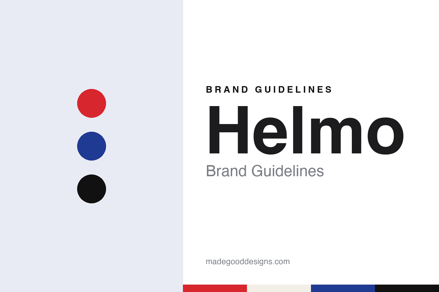
Helmo Brand Guidelines
Two designers, one poster at a time.
Aa
Two constants: a red, blue and black palette and a heavy grotesque register. Abstract homage — not a Helmo asset or mark; no poster, logo or wordmark is reproduced.
Montreuil, 2007
Two graphic designers and a studio name.
Helmo is a French graphic design studio run by two designers, Thomas Couderc and Clément Vauchez. The clearest account of how it began comes from the Université Paris-Saclay, which presented the studio’s work in an exhibition titled Stratigraphie from 22 September to 7 December 2023. The university’s event page says the two met in 1997 in Besançon, in Franche-Comté, while they were students, and then followed different paths.
They came back together in 2003. The same page says that in that year they set up a studio called La bonne merveille with a third designer, Thomas Dimetto, and that it ran for four years. In 2007, it says, Couderc and Vauchez founded the studio Helmo in Montreuil, in the Seine-Saint-Denis département. The university describes both men as independent graphic designers working in the broad field of graphic design: images, posters, signage, typography and editorial design.
The studio’s own website calls Helmo an atelier de graphisme, a graphic design workshop, and arranges its work by year. Its archive runs back to 2002, five years before the Helmo name. It’s Nice That called it a Paris-based studio in an article published on 2 March 2020.
The main clients, according to the Université Paris-Saclay, are cultural institutions such as SIANA and festivals in France. In the 2020 It’s Nice That article Vauchez described a wider range: improvised music, basketball culture, art, contemporary cuisine, charities and the luxury industry, each of which, he said, invites a different form of imagination.
Colour
A poster for every edition, and a typeface in 2015.
The studio’s longest relationship is with Jazzdor, the improvised-music festival in Strasbourg. The publisher Éditions B42 says that the duo has designed the festival’s image since 2002. The Centre Pompidou holds Helmo posters in its design collection, including a poster for the 17th Jazzdor festival dated 2002, a poster for the 27th edition dated 2012, and further Jazzdor posters dated 2011, 2013, 2014 and 2015.
In the 2020 It’s Nice That article, which said the studio had then worked with the festival for many years and designed a poster for each edition, Couderc explained the brief. The festival mixes contemporary music, free jazz, chamber music, classic jazz, slam, New Orleans jazz and noise, so the posters could not be tied to one genre; the task, he said, was to invent images of what jazz means in its wider contemporary sense. The article said that in 2015 Helmo created a typeface based on the festival’s identity, used from then on.
A new format followed in 2020. It’s Nice That reported that the studio had begun designing a poster for each concert rather than only for the festival as a whole, and described the series as type-led, in a uniform colourway of red, blue and black. Vauchez said designing for one musician or band let the studio work close to graphic translation, sometimes using documents, text excerpts, photographs or drawings that resonate with the music.
Those concert posters became a book. Éditions B42 published Look at Jazz in September 2025, an 80-page bilingual volume, produced with the support of the screen printer Lézard Graphique, that presents concert posters designed between 2019 and 2024, with interviews with Couderc, Vauchez and the Jazzdor director Philippe Ochem. The studio says on its website that a retrospective titled Jazzdorama, shown in November 2025 at La Chaufferie, the gallery of the HEAR art school in Strasbourg, during the Format(s) festival, marked the end of 24 years of collaboration with Jazzdor and Ochem.
Typography
A studio name that stands for a working pair.
Independent design studios abroad tend to treat their own name as the first commission. A duo name joined by an ampersand, a slash or a plain space is a small piece of typography in itself: the connecting mark sets the tone, and the order of the names is fixed once and repeated on every credit line, colophon and exhibition label. Some studios set that name in a typeface they drew; others keep it in a neutral grotesque so it sits quietly beside a client’s mark.
Many studios also draw alphabets for clients, and those letterforms often travel further than any studio logo, turning up on museum walls, posters and catalogues for years. For a guide like this, that client lettering is described as client work, not as the studio’s own identity.
A third surface is the studio exhibition and the studio book. When a practice shows its posters in a gallery or publishes a monograph of its work, the selection, the sequencing and the cover become a public statement of how the studio wants to be seen. Read together, the name, the client lettering and the books give a fuller picture than a logo alone.
Aa
A heavy grotesque — after a studio known for type-led posters. (Specimen set in Archivo Black, a sans STAND-IN; NOT the Helmo logo, the Jazzdor typeface or any studio typeface.)
Helmo
Screen prints, a magazine and dated commissions.
Alongside commissioned posters the studio runs a long research series. The Université Paris-Saclay says Helmo develops Stratigraphie by covering its commissioned posters with new shapes, new patterns and new layers of ink, and describes the series as research into screen printing and mechanical image reproduction carried out since 2012 with the workshop Lézard Graphique. The 2023 exhibition put the posters Helmo designed for the SIANA biennale between 2009 and 2022, at its centre, because they were the starting point for many Stratigraphie pieces. Earlier, on 26 November 2012, It’s Nice That reported that the duo had shown experimental Stratigraphie posters at the My Monkey design gallery, reworking and distorting existing pieces into oversized prints.
The Centre Pompidou dates another commission: the poster Good design, good business, made in 2010 for Le Lieu du Design with screen printing by Lézard Graphique, which entered the collection as a gift in 2017.
Editorial design is the third strand. It’s Nice That reported on 5 December 2017 that the photographer and photo editor Benjamin Schmuck, the editor-in-chief Stéphane Peaucelle-Laurens and Helmo had made Entorse, a French magazine about basketball culture, with a launch planned in Paris on 7 December. The name is French for a sprain, and the idiom faire une entorse also means breaking a rule. The article said the magazine used a custom typeface inspired by the lines of a playground, measured 12 by 15 inches so that an open spread matched the proportion of a court, and had an orange hard cover with an embossed black title and varnished dots. In 2020 Vauchez told It’s Nice That that the magazine’s identity was “a logo, three fonts, permanent margins” and little else.
Couderc told the same magazine that a style or graphic signature was not something the studio looked for, and that it tried consciously not to repeat itself; he added that people still point to primary colours, arrangements, variations and series as clues. For a design guide, Helmo shows how a studio’s identity can live in a long run of posters rather than in a logo. Compare it with M/M (Paris) and Akatre. For this guide we use poster red, print blue and press black with a heavy grotesque sans, an unofficial interpretation; no product or logo is reproduced.
Explore & save
Keep Helmo’s identity on hand — save it to a board in the Made Good inspiration library.
Helmo identity set
Pin the Helmo red, blue and black palette and the heavy grotesque register to your own board.