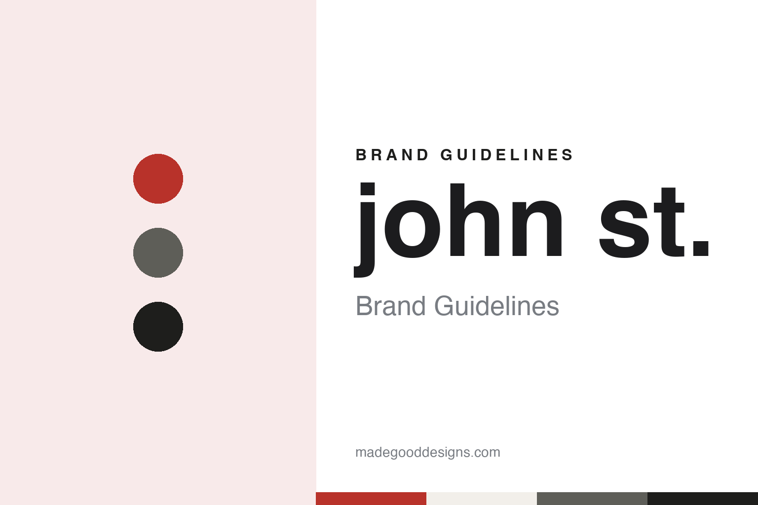
john st. Brand Guidelines
A street name, in lower case, with a full stop.
Aa
Two constants: a signal red, kerb grey and asphalt palette and a Lower-case grotesque register. Abstract homage — not a john st. asset or mark; no logo, icon or wordmark is reproduced.
Two creative directors, three partners and a street
Toronto, 2001.
john st. is a Toronto advertising agency, written in lower case with a full stop in its own usage and in the Ogilvy announcement of November 2024, which calls it “john st. advertising”. The trade press has usually printed it as John St. The agency opened in 2001.
The British production magazine Shots told the founding story in a profile published on 7 November 2013. It said Angus Tucker and Stephen Jurisic had been creative directors at Ammirati Puris Toronto and left in 2001 to start their own agency. Jurisic told the magazine that being promoted had turned the two of them from people who made things into managers, and that the work had stopped being fun. He recalled Tucker asking him across a desk whether he was having fun, and answering no.
According to Shots, the pair founded john st. with Arthur Fleischmann as president, Jane Tucker as managing director and Emily Bain as director of strategic planning. Tucker told the magazine the new agency was a chance to do things their way, run it with their own philosophy and be a little more nimble.
The name is an address. Shots said the agency was named after its location in central Toronto, a name that records where the partners set up rather than who they were. In the same article, the writer closed by asking whether the agency would keep its name if it ever outgrew its office.
Marketing magazine, the Canadian trade title, profiled the agency on 26 November 2008, when it was seven years old. It described the four founding partners as Fleischmann, Tucker, Bain and Jurisic, and listed Jane Tucker as director of client services and Peter Bolt as director of business strategy. The magazine said the partners had been selective about new clients and new hires, and quoted Jurisic saying the agency just wanted to do good work and did not read its own press.
Colour
From independent to WPP and Ogilvy Canada.
Until 2013, john st. was independent. Marketing reported on 4 March 2013 that the agency had joined the WPP network. The article quoted Fleischmann, then president, saying in a release that the agency would keep doing the kind of work that had made its clients unignorable, and would now be able to offer services clients were asking for, including media, direct marketing and public relations. Financial details were not disclosed.
Fleischmann told the magazine the deal had started coming together about six months earlier, when WPP approached him, and that john st. had not been looking for a buyer. He said that for media planning and buying, public relations and direct response, it had not been feasible to build those specialties in-house, and that the agency had worked with partners such as the media house Wills&Co. for that work. He also said a larger parent offered options in Quebec, where the agency had struggled to set up a Montreal office. According to the agency, no structural or management changes were planned. Marketing noted that WPP already owned JWT, Ogilvy, Grey and Y&R in Canada.
The Ogilvy connection came next. Ogilvy said in a press release dated 4 November 2024 that john st. advertising, which Fleischmann co-founded in 2001, joined the Ogilvy network in 2013, and that Fleischmann had managed WPP’s operations in Canada since January 2021 in addition to serving as chief executive of Ogilvy Canada.
The arrangement was set out in 2022. Adweek reported on 3 May 2022 that Ogilvy had brought its offices in Quebec City, Montreal and Toronto together under one banner, Ogilvy Canada, with a single national executive team led by its president, Marie-Lise Campeau, who reported to Fleischmann as group chief executive of Ogilvy Canada and country manager for WPP. The same report said john st. would remain a distinct agency brand and entity under the leadership of Stephanie Hurst.
Leadership changed again in 2024. In the November 2024 release, Ogilvy said Christopher Andrews, previously at BBDO Canada, had been named chief executive of Ogilvy Canada, and that Fleischmann would step away from his Ogilvy Canada and WPP Canada roles at the end of that year. Fleischmann said in the release that building john st. and then helping to lead Ogilvy Canada had been an amazing journey.
Typography
A street name and a running joke about advertising.
For an advertising or design agency, the name is the one piece of branding it has to live with on every pitch, credit and door plate. Canadian agencies have taken very different routes. Some keep the founder’s name. Bruce Mau Design was named after the designer who started it in Toronto in 1985, and it kept that name after Mau moved to Chicago and Hunter Tura took over as chief executive in 2010; the studio still uses it, usually shortened to BMD. Others turn the founder into something less literal. Zulu Alpha Kilo, which Zak Mroueh started in Toronto after leaving Taxi in 2007, takes its name from the NATO phonetic spelling of his name, and for a time its website introduced three fictional founders played by actors rather than the real one.
The rest of the identity tends to be built from what an agency shows rather than a logo alone: the work it puts on its site, the way it describes its offices, the projects it chooses to name, and how it carries one name across studios in Toronto and cities such as New York, Vancouver, Chicago and Los Angeles. When reading these identities, look at how much the name explains about the people behind it, how the agency’s own website and spaces are staged, and which client projects it puts forward as evidence of how it thinks.
Aa
A lower-case grotesque — after a name written small, with a full stop. (Specimen set in Work Sans, a sans STAND-IN; NOT the john st. logo or any john st. typeface.)
john st.
Self-parody films and client work, as dated facts.
Much of the agency’s public image comes from films it made about itself. The Globe and Mail reported on 6 November 2012 that the Toronto agency had made a name for itself by making fun of its own industry. The paper said “Pink Ponies” mocked the dramatic tone of the case-study videos agencies make to argue for their own campaigns, using soaring music, high production values and statistical measures of success to describe a campaign for a child’s birthday party.
The Los Angeles Times reported on 5 November 2012 that in November 2011 the agency had posted a video called “Catvertising”, in which it said it would focus entirely on making cat videos. The Globe described it as a fictional promotion poking fun at agencies’ claims to know where the future is headed. Both papers covered the next film, “Buyral”, a fake promotion for a service that sold clicks to make a video go viral, complete with an outreach programme for retirement homes and a plan to harvest clicks from elevator buttons and whack-a-mole games. The Globe said that at global shows and conferences, Fleischmann had said, john st. was often recognised as the “Catvertising” firm. Tucker told Shots in 2013 that the self-promotion films had started almost by accident, and that the agency kept making them because they were fun and let it comment on the industry.
The client record runs alongside. Marketing wrote in November 2008 about the agency’s work on Kruger’s Cashmere bathroom tissue, “The Wiserhood” campaign for Wiser’s whisky, a spokesperson called Mama for Michelina’s frozen meals, and “Camp Okutta” for War Child, which broke in the summer of 2007. The same article described Amoeba as the agency’s wholly owned design partner. Shots in 2013 described a Cashmere campaign in which fashion designers made dresses from the product, “Your Man Reminder” for Rethink Breast Cancer in 2011, and a Maple Leaf Foods campaign called “Change Your Life With Bacon”. Tucker told the magazine the agency’s credo was to be unignorable, by avoiding the clichés each category repeats.
For a design guide, john st. shows how an agency name can be nothing more than an address, and how a running joke about advertising can become a recognisable part of an agency’s brand. Compare Leo Burnett and Rethink, two other agencies in this collection. For this guide we use signal red, kerb grey and asphalt with a sans, an unofficial interpretation; no product or logo is reproduced.
Explore & save
Keep john st.’s identity on hand — save it to a board in the Made Good inspiration library.
john st. identity set
Pin the john st. signal red, kerb grey and asphalt palette and the Lower-case grotesque register to your own board.