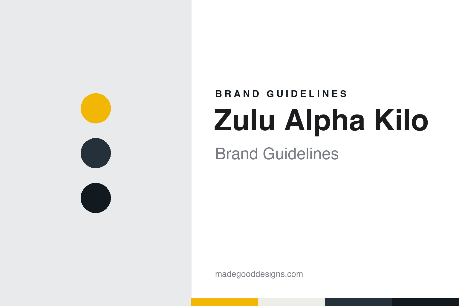
Zulu Alpha Kilo Brand Guidelines
Three code words for three letters.
Aa
Two constants: a signal yellow, radio slate and ink palette and a Heavy grotesque register. Abstract homage — not a Zulu Alpha Kilo asset or mark; no logo, icon or wordmark is reproduced.
A founder’s name, spelled out for radio
Toronto, 2008.
Zulu Alpha Kilo is a creative agency in Toronto that also writes its name as Z·A·K. Its name is a piece of spelling. On its own website the agency says it was founded in 2008, and that the name is the NATO phonetic spelling of its founder’s name, Zak. In that alphabet, Zulu, Alpha and Kilo stand for the letters Z, A and K.
The founder is Zak Mroueh. A biography published by the Canadian Marketing Association in 2023 says he started in the mailroom at Saatchi & Saatchi and worked his way up to creative director at Taxi, the Toronto agency, where he oversaw work for brands including MINI, Canadian Tire and Nike, before founding Zulu Alpha Kilo.
Communication Arts, the American design and advertising magazine, published a long feature on the agency on 14 April 2016, written by Chris Daniels. It said Mroueh had spent nine years at Taxi, latterly as chief creative officer and a partner, and that he quit in 2007. He was not unhappy there, the magazine said, but had decided that if he was going to open his own agency, it was now or never.
The magazine was frank about the name. It called it a tongue-twisting moniker that hardly rolls off the tongue, taken from the NATO phonetic alphabet, and suggested Mroueh positioned the agency almost as a challenge to clients, as if asking whether they had the nerve to walk into a boardroom and propose hiring a firm called Zulu Alpha Kilo. The agency’s own site takes a lighter tone, adding in brackets that the name is “not a frat.”
The name also gave the agency a vocabulary to build on. Its staff are known as Zuligans, a word Communication Arts used in 2016. Its media and production arms are called Zulumatic and Zulubot, the agency says on its website, and its mascot, described by the magazine, is a dog named Romeo Echo X-ray, or Rex, a second name spelled out in the same phonetic alphabet.
Colour
Fictional founders, a dog and a kitchen.
Zulu Alpha Kilo’s own presentation has been built around not saying the expected thing. Communication Arts described a website, new in 2016, that replaced a single page carrying a few contact addresses and a short explanation of the name. The new site made no mention of Mroueh or his years at Taxi. Instead it introduced three fictitious founders, a chief executive called Frank Zulu, a creative director called Marcus Alpha and a client-services vice-president called Katherine Kilo, each with a deliberately outrageous biography. On the contact page, the magazine said, the three admitted they were actors, and laughed at the idea that the content would anchor a real website for a real agency.
Mroueh explained the thinking to the magazine. Every agency website, he said, says the same thing, just skinned a different way, and he did not want to give people the same information; the agency wanted clients to discover it rather than the other way round. The agency’s current site still refers back to that period, saying its original website took some playful jabs at the industry, and now organises its message around a single line: “We fight sameness.”
The offices are part of the presentation too. Communication Arts described the Toronto office on the east side of downtown, in a low-rise brick-and-beam building, with white walls lined with posters of Mroueh’s influences from the 1970s, among them Harper Lee’s To Kill a Mockingbird, Stanley Kubrick’s 2001: A Space Odyssey, work by Jackson Pollock and a photograph of the Sex Pistols. One breakout room was styled as a homage to the television drama Mad Men, with wood panels, shag carpet, a typewriter and a bottle of scotch; another was an all-white room whose table was originally so low that people sat on pillows, an idea Mroueh admitted had gone too far.
A third room hosted what the agency calls kitchen sessions, held with clients midway through creative development. Mroueh told the magazine the point was to let clients share the journey to a recommended idea, and that he enjoyed tearing ideas off the wall once they had been put up.
The magazine also described a policy that shapes how the agency sells itself: it refuses to take part in pitches that require unpaid creative spec work. Mroueh made that decision, the magazine said, after the agency lost an account on a technicality it felt should have been disclosed at the start. Mike Sutton, promoted to president so Mroueh could concentrate on creative work, recalled the early phone calls turning down pitches. Today the agency lists offices in Toronto, New York and Vancouver on its website.
Typography
A founder’s name, spelled in code.
For an advertising or design agency, the name is the one piece of branding it has to live with on every pitch, credit and door plate. Canadian agencies have taken very different routes. Some keep the founder’s name. Bruce Mau Design was named after the designer who started it in Toronto in 1985, and it kept that name after Mau moved to Chicago and Hunter Tura took over as chief executive in 2010; the studio still uses it, usually shortened to BMD. Others turn the founder into something less literal. Zulu Alpha Kilo, which Zak Mroueh started in Toronto after leaving Taxi in 2007, takes its name from the NATO phonetic spelling of his name, and for a time its website introduced three fictional founders played by actors rather than the real one.
The rest of the identity tends to be built from what an agency shows rather than a logo alone: the work it puts on its site, the way it describes its offices, the projects it chooses to name, and how it carries one name across studios in Toronto and cities such as New York, Vancouver, Chicago and Los Angeles. When reading these identities, look at how much the name explains about the people behind it, how the agency’s own website and spaces are staged, and which client projects it puts forward as evidence of how it thinks.
Aa
A heavy grotesque — after a name built from three blunt code words. (Specimen set in Archivo Black, a sans STAND-IN; NOT the Zulu Alpha Kilo logo or any Z·A·K typeface.)
Zulu Alpha Kilo
Clients and campaigns, as dated facts.
The agency had a client before it had formally opened. Communication Arts reported in 2016 that Bell Canada hired Zulu Alpha Kilo for a creative rebranding before Mroueh had officially launched the agency. Others followed, the magazine said, including Audi Canada, the restaurant chain Jack Astor’s and Coca-Cola, and later Canada Dry Mott’s and the physical-activity organisation ParticipACTION.
The Coca-Cola relationship is dated in the same feature. In October 2010, the magazine said, Coca-Cola consolidated the creative work for its brands in English Canada and chose Zulu Alpha Kilo. In 2013 the agency built an outdoor display for the brand with sculptures of a polar bear and her cub on real ice, which people kept from melting by pledging to cut their carbon footprint by video, text or tweet. In September 2014, Zulu Alpha Kilo resigned the Coca-Cola account.
Identity work also appears in the record. The payment network Interac, the magazine said, was invited into the agency’s kitchen to collaborate on its 2014 rebranding campaign. For ParticipACTION, the agency made broadcast spots in which footage of children playing outside shrank to a sliver of black screen, ending on the line “Don’t visit our website”; ParticipACTION’s marketing director told the magazine the two sides argued over whether that line could stand alone, and that Mroueh made the case for keeping it.
On its current website the agency shows newer campaigns, including work for Dove on #ChangeTheCompliment and for The New York Times, both credited to its New York office, and for Destination BC from Vancouver. In 2021, the agency says, it announced the 20Doors Scholarship Fund to cover tuition for BIPOC candidates on a year-long postgraduate programme in copywriting or art direction, with mentoring from its creative leaders.
For a design guide, Zulu Alpha Kilo shows how an agency can turn a founder’s name into a system: three code words, a dog with a call sign of its own, and arms named Zulumatic and Zulubot, all held together by a habit of not saying what an agency website usually says. Compare Rethink and john st., two other Canadian agencies in this collection. For this guide we use signal yellow, radio slate and ink with a sans, an unofficial interpretation; no product or logo is reproduced.
Explore & save
Keep Zulu Alpha Kilo’s identity on hand — save it to a board in the Made Good inspiration library.
Zulu Alpha Kilo identity set
Pin the Zulu Alpha Kilo signal yellow, radio slate and ink palette and the Heavy grotesque register to your own board.