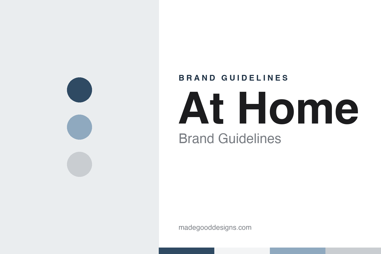
At Home Brand Guidelines
A Texas pottery warehouse that became a décor superstore with a house in its name.
Aa
Two constants: a slate blue, soft blue and dove gray palette and a rounded store sans register. Abstract homage — not an At Home product or mark; no store sign, bag or logo is reproduced.
Garden Ridge Pottery and World Imports
A Texas pottery store with a long name.
At Home started under a different and much longer name. English Wikipedia says that in 1979 Eric White opened a store called Garden Ridge Pottery and World Imports in Schertz, Texas. A second location followed in 1985 near Yukon, Oklahoma, which The Oklahoman reported in July of that year as a pottery outlet opening. Wikipedia, citing the Dallas Morning News, says White sold Garden Ridge to a group of investors in 1988, and the business was later known simply as Garden Ridge.
The chain changed hands several times before it changed its name. Wikipedia says Garden Ridge held an initial public offering in the mid-1990s, citing The New York Times, and that the investment firm Three Cities Research took it private again in 1999; the Times ran the news on 23 November 1999 under the headline that Garden Ridge Corp. would be taken private. Wikipedia says the company filed for Chapter 11 bankruptcy protection in February 2004 and emerged in 2005, citing The Journal Record and the Houston Chronicle.
The merchandise moved indoors. Wikipedia, citing Home Textiles Today in July 2004, says Garden Ridge set out to focus more on interior decorating, including seasonal items, greenery, pottery, framed art and mirrors. That mix — decorative goods across a very large floor, with a strong seasonal calendar — is the same mix the business would later carry under its new name. Wikipedia says the investment firm AEA Investors acquired Garden Ridge in October 2011, citing The Deal, and that Lee Bird became chief executive in 2012.
Colour
In 2014 the orange went and a house appeared.
The new name came in 2014. English Wikipedia, citing the Dallas Morning News of June 2014, says Garden Ridge converted all of its stores to the At Home brand and floorplan that year. The visual change is unusually well recorded for a retailer: Wikipedia says the company replaced its orange branding with soft gray and blue and added a house symbol for the “o” in At Home. A two-word name, a cool palette and a small building tucked into a letter made the identity read as a place to furnish a home rather than a warehouse of pots and garden goods.
Headquarters moved with the rebrand. Wikipedia says Bird moved the corporate offices from Houston to Plano, Texas, where the company’s distribution centre was located; At Home’s own releases now give its headquarters as Dallas, Texas. The chain then spread well beyond its southern base. Wikipedia records new states including Wisconsin in 2014, Kansas and Utah in 2015, Massachusetts and New Jersey in 2017 and Connecticut in 2018, and stores on the West Coast in Puyallup, Washington and Lake Forest, California in 2019. In April 2021, Wikipedia says, At Home opened in Rego Park, Queens, in New York City.
The renamed company went public and then private again. Wikipedia says At Home filed for an initial public offering on 4 September 2015 and listed in August 2016 on the New York Stock Exchange under the ticker HOME. A joint release dated 23 July 2021 announced that funds affiliated with Hellman & Friedman had completed their acquisition of At Home, which it described as a home décor superstore, and that its stock had ceased trading and was no longer listed on the New York Stock Exchange. Under the new owner, Wikipedia says, At Home introduced the Honeybloom, Providence and Found & Fable private labels, released a mobile app and added same-day delivery through DoorDash and Roadie.
Typography
Design and documentation.
The brands in this group are American home-goods store chains: retailers that fill their shelves with decorative objects, furniture, linens, kitchenware and seasonal pieces, sometimes made to their own specification and sometimes bought from other makers. Some sell at full price under a house name; others buy surplus stock and resell it at a discount, so the goods change from week to week. Between those two models sit chains that mix their own lines with branded stock.
For a chain like this, the visual identity sits mostly outside the products. It lives in the sign above the entrance, the printed circular or catalogue, the price tickets and shopping bags, and the way aisles and displays are arranged. Because such chains are regularly sold, merged, restructured or closed, the history behind each sign deserves a plain account: who founded the business and where, which companies have owned it since, and what became of its stores.
Each guide keeps what independent, dated sources record apart from what a company says about itself, follows its ownership and store history over time, and says clearly where a claim rests only on the company’s own account.
Aa
A rounded, friendly sans for a store-sign and shelf-label register. (Specimen set in Nunito Sans, a sans STAND-IN; NOT the At Home logo.)
At Home
Chapter 11 in 2025 and new owners.
The company went through a second reorganisation in 2025. Retail Insight Network reported on 17 June 2025 that At Home Group and certain of its subsidiaries had filed voluntary petitions for Chapter 11 protection in the U.S. Bankruptcy Court for the District of Delaware, and quoted chief executive Brad Weston pointing to an “increasingly dynamic and rapidly evolving trade environment”. English Wikipedia dates the filing to 16 June 2025 and says the company kept operating through the proceedings while closing a number of underperforming stores.
The company left Chapter 11 in October 2025. In a release headed “At Home Successfully Completes Financial Restructuring”, datelined Dallas, At Home said it had completed its financial restructuring and emerged from Chapter 11, and that ownership had transferred to a group of its lenders, including funds affiliated with Redwood Capital Management, Farallon Capital Management and Anchorage Capital Advisors. The same release named Brad Weston as chief executive and gave the company’s headquarters as Dallas, Texas. Wikipedia says the reorganisation plan was approved by the Delaware bankruptcy court in October 2025. Hellman & Friedman owned At Home from 2021 to 2025; the lender group has owned it since 2025.
For a design guide, At Home shows what a rename can do for a large-format store: the long Garden Ridge Pottery and World Imports name, and later its orange signage, gave way to two short words, soft gray and blue, and a house hidden in the letter “o”. Compare the American home retailers in our Bed Bath & Beyond brand guidelines and our TJ Maxx brand guidelines. For this guide we use slate blue, soft blue and dove gray with a sans, an unofficial interpretation; no product or logo is reproduced.
Explore & save
Keep At Home’s identity on hand — save it to a board in the Made Good inspiration library.
At Home identity set
Pin the At Home slate blue, soft blue and dove gray palette and the store sans register to your own board.


