Bed Bath & Beyond Brand Guidelines
A big blue coupon, ceiling-high aisles and a dramatic fall — the home-goods icon reborn as an online brand.
Aa
Two constants: a deep blue palette and a clean sans. Abstract homage — not the Bed Bath & Beyond wordmark.
The big blue coupon
Bed Bath & Beyond was defined by a coupon.
Bed Bath & Beyond is a lesson in the power — and the peril — of a single brand mechanic. It was founded in 1971 by Warren Eisenberg and Leonard Feinstein, opening as “Bed ’n Bath,” small linen and bath specialty shops in the New York–New Jersey suburbs; the name “Bed Bath & Beyond” was adopted in 1987 to signal a superstore-scale range (the “Beyond” meaning more than bed and bath). But the thing that truly defined the brand was its oversized blue-and-white “20% OFF” mailer coupon — nicknamed “Big Blue,” hoarded by shoppers, and famous for (unofficially) seeming to never expire. (Honest caveats: no official brand hex or wordmark typeface is published, so the colours and type here are approximate.)
That coupon was a genuine pop-culture icon and a huge traffic driver — but it was also a double-edged sword. Analysts widely credit the endless discounts with eroding margins and training customers never to pay full price, a real contributor to the company’s later troubles. The stores themselves were an experience of “cluttered abundance” — sprawling big-boxes piled to the ceiling with towels, bedding, kitchenware and gadgets. For decades, that combination made Bed Bath & Beyond a home-goods giant.
Then came a dramatic collapse. A private-label-heavy rebrand under CEO Mark Tritton alienated core shoppers; the stock became a 2022 meme-stock episode (activist Ryan Cohen bought in and then exited); and in April 2023 the company filed for Chapter 11 bankruptcy and liquidated all its stores. The brand didn’t vanish, though: Overstock.com bought the intellectual property (name, domains, trademarks and loyalty data) for about $21.5 million and relaunched Bed Bath & Beyond as an online-only brand — then renamed itself “Beyond, Inc.” (NYSE: BYON). A physical icon, reborn online.
Colour
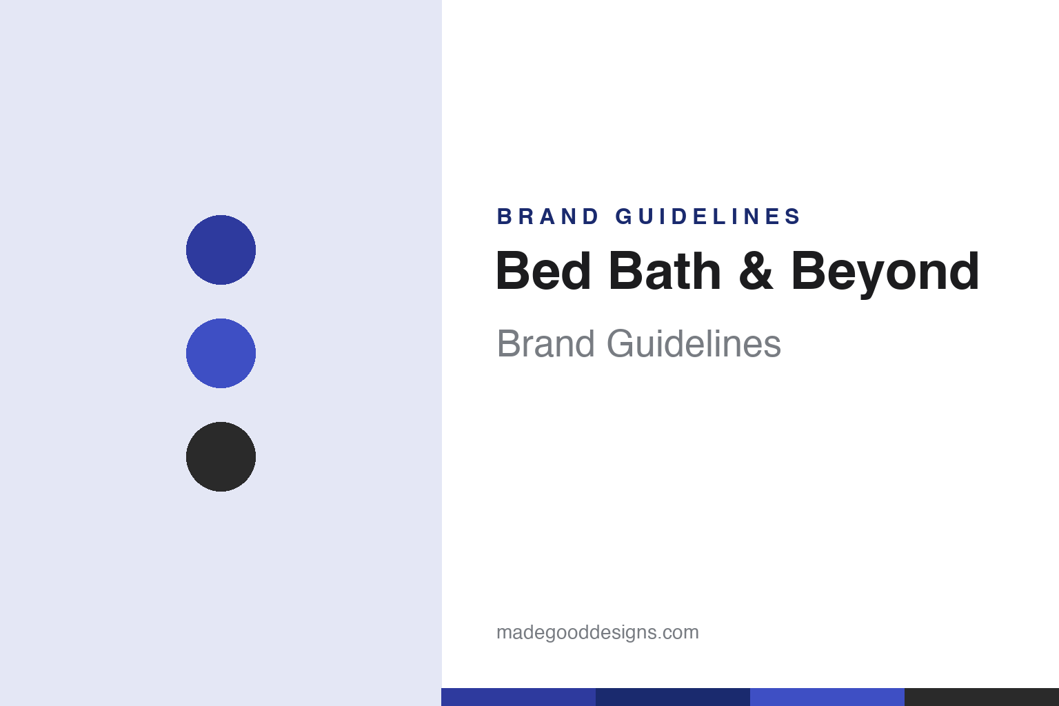
Bed Bath & Beyond lives in deep blue. Click a swatch to copy the hex.
Bed Bath & Beyond’s palette is defined by a deep, distinctive blue (a navy-violet range) with white — the colours of both the wordmark and the legendary “Big Blue” coupon. The blue reads as dependable, familiar and value-signalling, and it’s so tied to the coupon that the colour itself evokes “20% off” for a generation of shoppers. It’s a strong, recognisable, homey scheme that made the brand instantly identifiable in mailboxes and on storefronts. The honest caveat: no official public brand hex is published — the deep blue here is an observed approximation, not a confirmed spec.
The lesson is a colour bonded to a mechanic. Bed Bath & Beyond’s blue is inseparable from its coupon — the colour is the discount in shoppers’ minds. For designers, it’s a reminder that a colour tied to a strong, repeated mechanic becomes deeply ownable. The takeaways: bond a signature colour to a memorable brand mechanic (the blue coupon); use it consistently across mailers, stores and wordmark; and treat specific hexes as approximate when no official spec is published.
Typography
The wordmark is a clean, all-caps sans — familiar and homey.
Bed Bath & Beyond’s clean, all-caps blue wordmark is familiar and homey — straightforward, geometric letters (often described as a customised Futura-style face) that read as dependable, everyday and value-friendly, matching a mass-market home-goods retailer. There’s nothing flashy about it; the type is legible and reassuring, the visual equivalent of a reliable place to buy towels and kitchenware. Paired with the deep blue, it’s the mark that sat atop the famous coupon and the ceiling-high aisles for decades. (Because the exact face is undocumented officially, the honest description is “a clean, all-caps sans,” not a confirmed font.) The type behaves like the brand: familiar, homey and dependable.
Aa
A clean, all-caps sans — familiar and homey. (Specimen set in Manrope, a clean sans in the spirit of the Bed Bath & Beyond wordmark; the real face is undocumented.)
A mechanic that giveth and taketh
Bed Bath & Beyond shows a mechanic’s double edge.
Bed Bath & Beyond is a lesson in how a single brand mechanic can both build and break a brand. The Big Blue coupon drove enormous traffic and cult affection — it was the brand’s most beloved and recognisable asset. But that same relentless discounting eroded margins and conditioned shoppers never to pay full price, becoming a factor in the company’s collapse. It’s a cautionary tale: a powerful mechanic can define a brand and also trap it, and a discount that’s brilliant for traffic can be corrosive for the business. The brand’s online revival under Beyond, Inc. is now a second act built on that famous name.
For designers and brand-builders, Bed Bath & Beyond offers a clear takeaway: a powerful brand mechanic is an asset and a liability — manage it carefully. The lessons: a beloved, ownable mechanic (the blue coupon) can build enormous recognition and loyalty; but a mechanic that trains customers to expect discounts can undermine the business; and a strong brand name can outlive the company that built it (the Beyond, Inc. online revival). It’s also a reminder to keep the facts precise — Bed Bath & Beyond was founded in 1971 as “Bed ’n Bath” (renamed 1987), was defined by its blue 20%-off coupon, ran ceiling-high “cluttered abundance” stores, filed for Chapter 11 in 2023 and liquidated its stores, and had its name bought by Overstock, which relaunched it online and renamed itself Beyond, Inc. Bed Bath & Beyond shows a mechanic’s double edge — proof that a powerful brand device must be managed, not just celebrated.
Explore & save
Keep Bed Bath & Beyond’s identity on hand — save it to a board in the Made Good inspiration library.
Bed Bath & Beyond identity set
Pin the deep-blue palette and the clean-sans spirit to your own board.