Tractor Supply Brand Guidelines
A red slab wordmark and ‘Life Out Here’ — the biggest rural-lifestyle store that famously doesn’t sell tractors.
Aa
Two constants: a red palette and a heavy slab serif. Abstract homage — not the Tractor Supply wordmark.
Everything except tractors
Tractor Supply serves rural life — without tractors.
Tractor Supply is a lesson in a name that outgrew its meaning. It was founded in 1938 by Charles E. Schmidt Sr. — a self-described Chicago “city boy” — as a mail-order tractor-parts business (the Tractor Supply Co. Blue Book catalog), with its first retail store opening in 1940 in Minot, North Dakota. But here’s the fun, defining fact: despite the name, Tractor Supply does not sell tractors. It markets itself as selling “everything except tractors,” and it has grown into the largest rural-lifestyle retailer in the US (2,400+ stores). (Honest caveats: no official brand hex or wordmark typeface is published, so the colours and type here are approximate.)
The positioning is rural lifestyle, broadly defined. Tractor Supply serves recreational farmers, ranchers, homesteaders, horse and pet owners, gardeners and rural/suburban customers with animal feed, farm supplies, pet products, workwear (including Carhartt), tools, fencing and chicken supplies. It’s become a fast-growing fixture of small-town and exurban America — a one-stop shop for “life out here.” That tagline, “Life Out Here,” is central to the brand and its strategy. It also runs Petsense (a small-format pet banner) and a beloved seasonal ritual, Chick Days (selling live baby chicks each spring).
The identity is a bold red logo (with black and white), rugged and functional to match its practical, hardworking customers. On ownership, Tractor Supply is publicly traded (NASDAQ: TSCO), headquartered in Brentwood, Tennessee. (One recent, widely reported note: in 2024, after a conservative-led pressure campaign, Tractor Supply announced it would roll back certain diversity and climate commitments — a decision covered extensively in the press.) A brand that turned a literal name into a whole rural-lifestyle category.
Colour
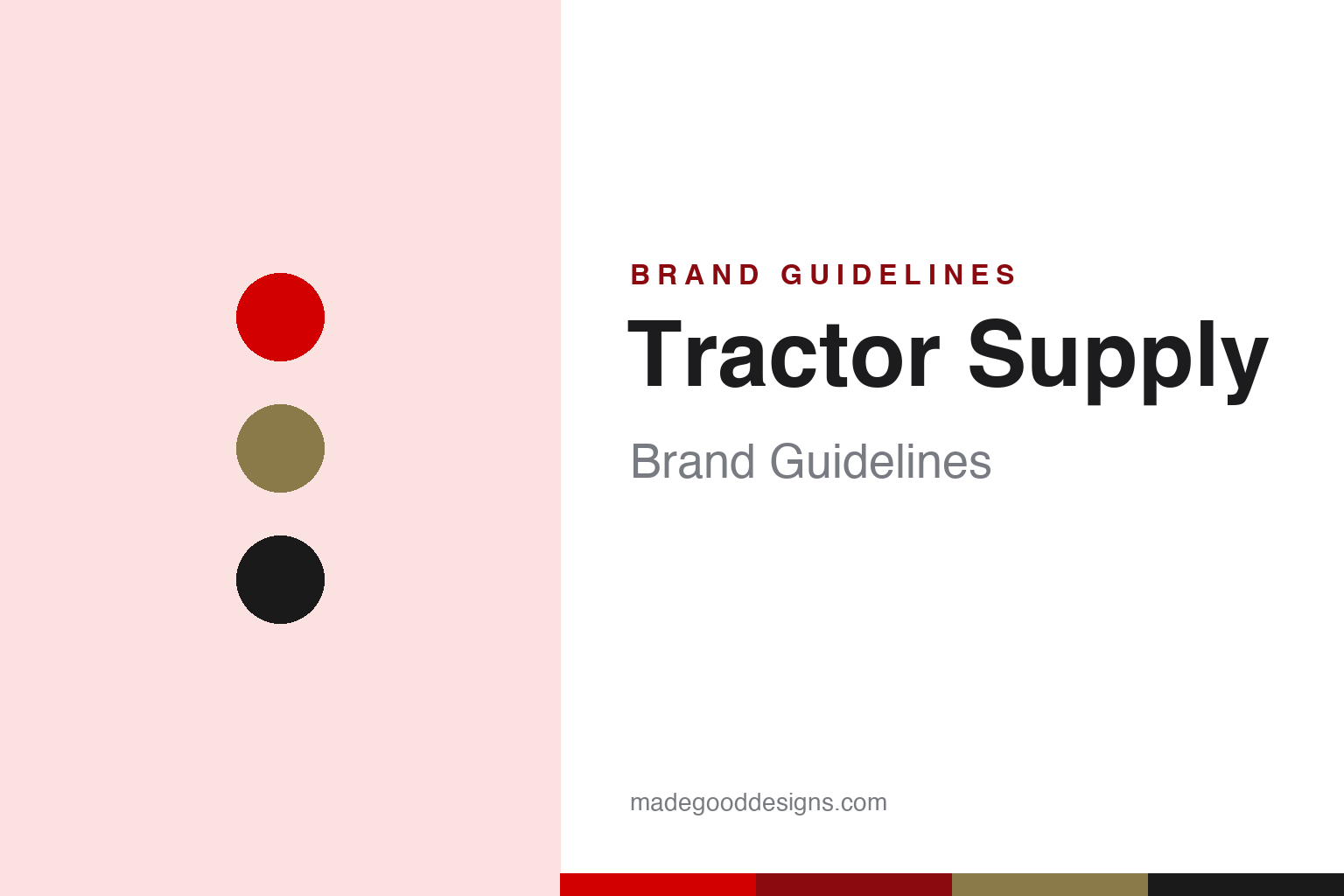
Tractor Supply lives in red. Click a swatch to copy the hex.
Tractor Supply’s palette is anchored by a bold red — energetic, confident and easy to spot from a rural highway — with black, white and warm khaki/earth tones. The red reads as strong, hardworking and dependable (fitting for a store built for farmers and doers), while the earthy accents nod to the rural, outdoor, work-a-day world it serves. It’s a practical, high-visibility, no-nonsense scheme that matches the brand’s rugged, get-it-done personality and its “Life Out Here” positioning. The honest caveat: Tractor Supply publishes no official public brand hex — the red here is an observed approximation (third-party sites cite a red near #D20000), not a confirmed spec.
The lesson is bold, hardworking colour for a practical brand. Tractor Supply’s red signals strength, energy and dependability — the right register for a rural-lifestyle store. For designers, it’s a reminder that a bold, practical palette can match a hardworking, functional brand. The takeaways: use a bold, high-visibility primary for a practical retail brand (the red); ground it with earthy, rural tones; and treat specific hexes as approximate when no official spec is published.
Typography
The wordmark is a heavy slab serif — rugged and dependable.
Tractor Supply’s heavy slab-serif wordmark is rugged and dependable — bold, sturdy, block-like letters that read as hardworking, honest and no-nonsense, matching a rural-lifestyle store built for farmers, ranchers and doers. The slab weight signals strength and durability rather than modern minimalism, and it pairs naturally with the bold red and earthy tones. It looks like it belongs on a feed sack or a farm-supply sign — exactly the practical, get-it-done character the brand owns. (Because the exact face is undocumented officially — often likened to heavy slab faces — the honest description is “a heavy slab serif,” not a confirmed font.) The type behaves like the brand: rugged, dependable and hardworking.
Aa
A heavy slab serif — rugged and dependable. (Specimen set in Roboto Slab, a slab serif in the spirit of the Tractor Supply wordmark; the real face is undocumented.)
Owning a lifestyle
Tractor Supply built a brand on rural life.
Tractor Supply is a lesson in owning a lifestyle, not just a product category. Rather than limit itself to farm equipment, it expanded the idea of who it serves — anyone living the rural or exurban “life out here” — and became the one-stop shop for that whole way of living, from chicken feed to Carhartt. That broad, clearly-owned lifestyle positioning (captured perfectly by the tagline) turned a literal-sounding name into a fast-growing national brand. The rugged red-and-slab identity reinforces the practical, hardworking values of its customers. It’s proof that defining and owning a lifestyle can be more powerful than owning a single product.
For designers and brand-builders, Tractor Supply offers a clear takeaway: owning a lifestyle can outperform owning a product category. The lessons: expand the brand around a way of life, not just goods (“Life Out Here” rural lifestyle); use rugged, practical design that reflects your customers’ values (bold red, a heavy slab wordmark); and build beloved rituals and sub-brands (Chick Days, Petsense). It’s also a reminder to keep the facts precise — Tractor Supply was founded in 1938 as a mail-order tractor-parts business (Charles Schmidt), is the largest US rural-lifestyle retailer that famously does not sell tractors (“everything except tractors”), uses the “Life Out Here” tagline, and is publicly traded (NASDAQ: TSCO); in 2024 it drew wide coverage for rolling back certain DEI and climate commitments. Tractor Supply owned a lifestyle — proof that a way of life can be a bigger idea than a product.
Explore & save
Keep Tractor Supply’s identity on hand — save it to a board in the Made Good inspiration library.
Tractor Supply identity set
Pin the red palette and the heavy-slab spirit to your own board.


