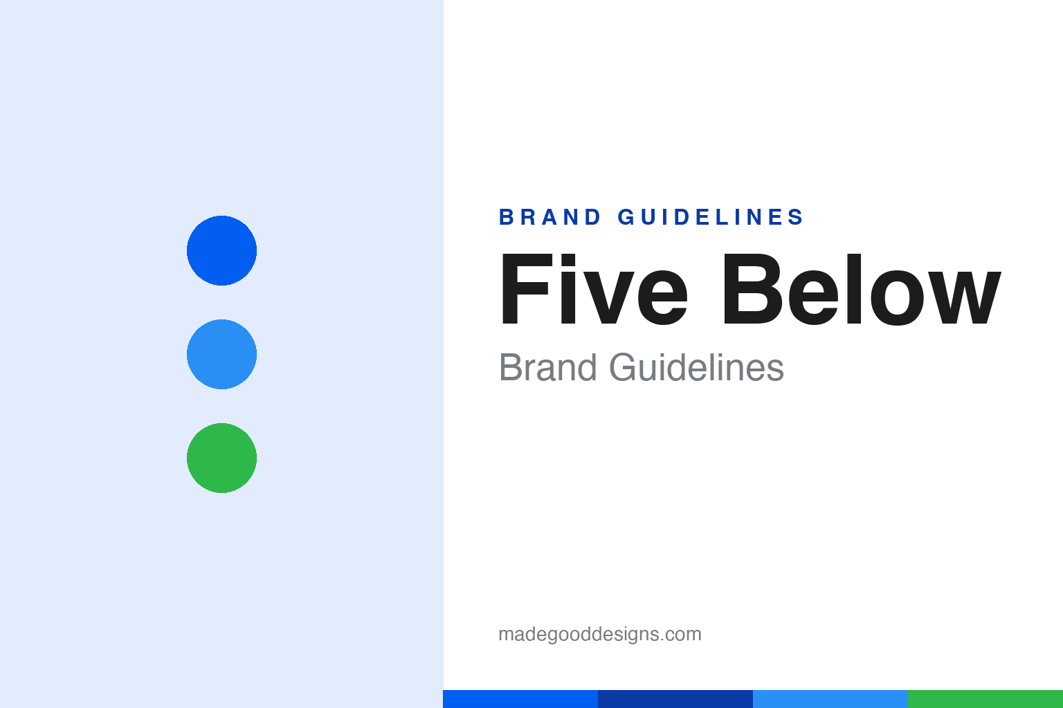
Five Below Brand Guidelines
A bright blue teen-treasure-hunt store where (almost) everything was $5 — until ‘Five Beyond’ broke the ceiling.
Aa
Two constants: a bright blue palette and a bold sans (with a degree-symbol ‘o’). Abstract homage — not the Five Below wordmark.
A store for teens and tweens
Five Below built value shopping for a young crowd.
Five Below is a lesson in designing a value store around a specific audience. It was founded on October 4, 2002, by David Schlessinger and Tom Vellios in the Philadelphia area (both had previously led kids’ retailer Zany Brainy, and each had preteen sons). The concept was sharp: a fun, trend-driven, treasure-hunt store aimed at teens and tweens — a place where that age group could spend their allowance — where (originally) everything was priced at $5 and below. That clear price point and youthful focus set it apart from generic discount stores. (Honest caveats: no official brand hex or wordmark typeface is published, so the colours and type here are approximate.)
The defining evolution is the price point. Five Below began strictly at $5-and-under, but it has since broken that ceiling with a “Five Beyond” section carrying items priced above $5 (rolled out broadly around 2019–2023, with upper prices reported anywhere from about $25 up to the mid-$30s depending on the year). It’s an important nuance: the strict $5 cap is history, and Five Below now spans a wider range while keeping its value, trend-forward identity. (A myth to avoid: it’s not a dollar store — it’s a specialty value retailer, and not everything is $5 anymore.)
The positioning is bright, energetic and treasure-hunt: colourful stores (around 8,000 square feet) packed with tech and phone accessories, toys and games, candy, room décor, stationery, fashion accessories, novelty items and seasonal goods — all aimed at a young, value-conscious shopper. The identity matches the vibe: the wordmark reads “fiVe BEL°W,” with a small “o” cleverly doubling as a degree symbol, in a primary blue. On ownership, Five Below is publicly traded (NASDAQ: FIVE), headquartered in Philadelphia. A value store built for a young, trend-hungry crowd.
Colour
Five Below lives in bright blue. Click a swatch to copy the hex.
Five Below’s palette centres on a bright, energetic blue — youthful, fun and confident — with white, and bursts of other bright colours (including green in some signage) that suit its playful, teen-focused vibe. The blue reads as energetic and trustworthy, the perfect base for a colourful, treasure-hunt value store aimed at a young crowd, and it keeps the brand feeling upbeat and modern. It’s a lively, high-energy scheme that matches the fun, discovery-driven shopping experience. The honest caveat: Five Below publishes no official public brand hex — the blue (community-cited near #015EF0) and accents here are observed approximations, not confirmed values.
The lesson is bright, youthful colour for a young audience. Five Below’s energetic blue and colourful accents signal fun and value to teens and tweens. For designers, it’s a reminder that colour can be tuned to an audience’s energy. The takeaways: use bright, energetic colour to match a young, fun audience (the blue and colourful accents); keep the identity playful and modern; and treat specific hexes as approximate when no official spec is published.
Typography
The wordmark is a bold sans — playful and clever.
Five Below’s bold sans wordmark — “fiVe BEL°W,” with its mixed caps and the small “o” doubling as a degree symbol — is playful and clever. The strong, energetic letters read as fun, youthful and value-forward, matching a treasure-hunt store aimed at teens and tweens, and the degree-symbol detail is a smart, ownable piece of wordplay (“below”). In bright blue, the type feels upbeat and modern rather than corporate. It’s energetic and a little cheeky — exactly the fun, come-hunt-for-deals personality Five Below wants. (Because the exact face is custom and undocumented, the honest description is “a bold sans,” not a named font.) The type behaves like the brand: playful, clever and energetic.
Aa
A bold sans — playful and clever. (Specimen set in Poppins, a geometric sans in the spirit of the Five Below wordmark; the real lettering (with the degree-symbol “o”) is custom.)
Knowing your audience
Five Below won by designing for teens.
Five Below is a lesson in designing a whole brand around a specific audience. Rather than be a generic discounter, it built everything — the assortment, the bright treasure-hunt stores, the energetic blue identity, the clever wordmark — around teens and tweens spending their own money. That sharp audience focus made it distinctive and beloved, and it grew into a major value retailer. The “Five Beyond” evolution shows the brand adapting (raising prices) while keeping its youthful, fun DNA. It’s proof that knowing exactly who you’re for — and designing the entire experience around them — is a powerful way to stand out.
For designers and brand-builders, Five Below offers a clear takeaway: a sharp audience focus, expressed through the whole experience, builds a distinctive brand. The lessons: design the assortment, environment and identity around a specific audience (teens/tweens); use a clever, ownable wordmark and bright colour to match their energy (the degree-symbol “o,” the blue); and evolve carefully while keeping the core DNA (the “Five Beyond” expansion). It’s also a reminder to keep the facts precise — Five Below was founded in 2002 by Schlessinger and Vellios in Philadelphia as a teen/tween store where everything was $5-and-below, has since added “Five Beyond” items above $5 (so it’s no longer strictly $5, and it’s not a dollar store), uses the blue “fiVe BEL°W” wordmark, and is publicly traded (NASDAQ: FIVE). Five Below knew its audience — proof that designing for a specific crowd builds a distinctive brand.
Explore & save
Keep Five Below’s identity on hand — save it to a board in the Made Good inspiration library.
Five Below identity set
Pin the bright-blue palette and the bold-sans spirit to your own board.