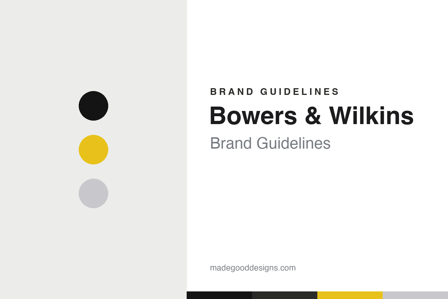
Bowers & Wilkins Brand Guidelines
British loudspeaker royalty — the Nautilus shell, yellow Kevlar cones, and the sound of Abbey Road.
Aa
Two constants: a black-and-silver base with a Kevlar-yellow accent and a geometric sans. Abstract homage — not the Bowers & Wilkins wordmark.
British loudspeaker royalty
Bowers & Wilkins defines high-end hi-fi.
Bowers & Wilkins is a lesson in engineering excellence as a luxury brand. It was founded in 1966 in Worthing, England, by John Bowers and Roy Wilkins, who had met in the Royal Corps of Signals and run a radio shop together — Bowers the driving force behind speaker design. It became a legendary British high-end loudspeaker maker, revered by audiophiles worldwide. (Honest caveats: no official brand hex was found, so the colours below are observed; the Kevlar yellow is a brand-associated accent rather than a documented swatch; and the wordmark typeface is undocumented.)
Its icons are genuine design landmarks. The Nautilus (1993) is a radical, snail/shell-shaped, tapered-tube flagship speaker — still hand-built to order — that looks like sculpture and is instantly recognisable. The 800 Series (now 800 Series Diamond) are the studio-reference flagships. And B&W’s signature woven yellow Kevlar mid-range cones (developed in-house from 1974) became a visual and sonic trademark — though note that top-tier models later moved to “Continuum” material, so not every current model uses yellow Kevlar.
The ultimate credibility marker: B&W speakers (especially the 800 Series) have been the reference monitors at Abbey Road Studios since 1980 — the sound of countless famous recordings was checked on B&W. The brand also makes the Px-series headphones and the distinctive blimp-shaped Zeppelin speaker (2007), and is now owned by Masimo (via Sound United). The identity is premium, minimalist British luxury: a clean “Bowers & Wilkins” wordmark, a black/white/silver palette, and the signature Kevlar yellow as an accent. Engineering, elevated to luxury.
Colour
Bowers & Wilkins lives in black, silver and Kevlar yellow. Click a swatch to copy the hex.
Bowers & Wilkins’s palette is premium and restrained: black, white and silver-grey, with the signature Kevlar yellow as a distinctive accent. The black-and-silver base reads as luxurious, serious and high-end — the colours of premium audio and fine engineering — while the Kevlar yellow is a genuinely ownable brand signature, instantly recognisable to audiophiles as “that yellow cone.” It’s an elegant, sophisticated scheme that positions B&W as luxury hi-fi, with the yellow providing a warm, engineering-proud spark of identity. The restraint signals quality and confidence. The honest caveat: B&W publishes no official brand hex — the black, silver and Kevlar-yellow tones here are observed approximations, not first-party values.
The lesson is a restrained luxury palette with one iconic accent. B&W’s black-and-silver reads as premium, while the Kevlar yellow is an ownable signature. For designers, it’s a reminder that a single, distinctive accent (rooted in the actual product) can become a brand’s calling card. The takeaways: use a restrained, premium base for luxury (black and silver); let a real product feature become an ownable accent (the Kevlar yellow); and treat specific hexes as approximate when no official spec is published.
Typography
The wordmark is a clean geometric sans — premium and understated.
Bowers & Wilkins’s clean geometric sans wordmark — the full “Bowers & Wilkins,” minimal and evenly spaced — is premium and understated. The neutral, refined letterforms read as luxurious, confident and timeless, matching a high-end British hi-fi brand whose products (the Nautilus, the 800 Series) speak for themselves, and the restraint signals that no ornament is needed. Set against black and silver with the Kevlar-yellow accent, the type feels sophisticated and architectural — exactly the understated luxury personality B&W cultivates. It lets the sculptural products, not the logo, be the show. (Because the exact face is undocumented, the honest description is “a clean geometric sans,” not a named font.) The type behaves like the brand: premium, understated and timeless.
Aa
A clean geometric sans — premium and understated. (Specimen set in Jost, a geometric sans in the spirit of the Bowers & Wilkins wordmark; the real face is undocumented.)
Letting the product be the brand
B&W’s engineering does the talking.
Bowers & Wilkins is a lesson in letting extraordinary products carry the brand. Rather than shout, B&W keeps its identity understated — a plain premium wordmark, a restrained black-and-silver palette — and lets the work speak: the sculptural Nautilus, the studio-reference 800 Series, the unmistakable yellow Kevlar cones, and the ultimate endorsement of being the sound of Abbey Road. That confidence is itself the branding: when your speakers are used to master famous records and displayed like art, you don’t need a loud logo. The Kevlar yellow gives just enough of an ownable signature. It’s proof that, for a genuine quality leader, the products and their reputation can be the most powerful brand asset of all.
For designers and brand-builders, Bowers & Wilkins offers a clear takeaway: a genuine quality leader can let its products and reputation do the branding, with an understated identity and one iconic signature. The lessons: keep the identity restrained when the products are the stars (the plain wordmark, black-and-silver); own a distinctive, product-rooted signature (the Kevlar yellow); and let credibility markers carry weight (Abbey Road, the Nautilus). It’s also a reminder to keep the facts precise — Bowers & Wilkins was founded in 1966 in Worthing by John Bowers and Roy Wilkins, made the iconic Nautilus (1993) and 800 Series, pioneered yellow Kevlar cones (from 1974), has been Abbey Road’s reference monitor since 1980, makes the Zeppelin and Px headphones, and is now owned by Masimo. B&W lets the product be the brand — proof that quality and reputation can be the strongest identity of all.
Explore & save
Keep Bowers & Wilkins’s identity on hand — save it to a board in the Made Good inspiration library.
Bowers & Wilkins identity set
Pin the black-and-yellow palette and the geometric-sans spirit to your own board.