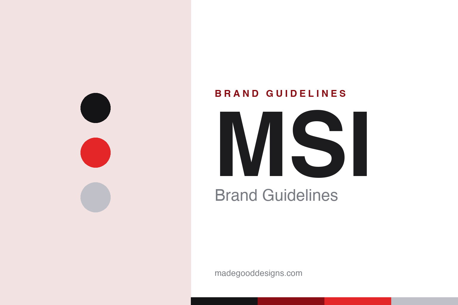
MSI Brand Guidelines
A dragon in a shield and ‘True Gaming’ — the motherboard maker that became a gaming powerhouse.
Aa
Two constants: a black-and-red palette (with silver) and a gaming sans. Abstract homage — not the MSI dragon-shield logo.
The dragon in the shield
MSI grew from boards to a gaming powerhouse.
MSI is a lesson in growing from components into a gaming brand. Micro-Star International was founded in 1986 in Taiwan by five engineers with backgrounds at Sony, and it began by designing and making motherboards and add-on cards for the emerging PC market. From that foundation it expanded into graphics cards, gaming laptops, desktops, monitors and peripherals — becoming one of the world’s major PC-gaming hardware brands, alongside ASUS and Gigabyte. (Honest caveats: no authoritative official brand hex is published, so the red below is approximate — and it is a crimson, not pure #FF0000; and the wordmark typeface is undocumented.)
MSI is especially strong in gaming laptops (the GS, GE, Stealth, Raider and Titan families) and graphics cards, and its whole gaming identity centres on the dragon. The logo is a stylised dragon encased in a shield (the “MSI GAMING Shield”), and the brand’s official mascot is “Lucky the Dragon.” The slogan is “TRUE GAMING.”
MSI has even codified what its colours mean: per the company, in the shield, red stands for gamers’ passion, black for innovative technology and silver for continuous profit. The everyday brand palette is red and black — aggressive, high-energy, unmistakably gaming. From a motherboard maker to a dragon-emblazoned gaming powerhouse, MSI built an identity as bold as its hardware.
Colour
MSI lives in red and black. Click a swatch to copy the hex.
MSI’s palette is a bold red and black, with silver. Per MSI’s own materials, the red signals gamers’ passion, the black innovative technology and the silver continuous profit — a rare case of a brand publishing the meaning behind its colours. The red-and-black reads as aggressive, powerful and high-energy — the default visual language of PC gaming — while the silver adds a premium, metallic edge fitting for high-performance hardware. It’s a strong, ownable scheme that stands with the reds and blacks of its gaming rivals while the dragon gives MSI its distinct icon. The honest caveat: no authoritative official brand hex is published — MSI red is commonly cited near #E52629 (a crimson), explicitly not pure #FF0000.
The lesson is red-and-black for gaming energy. MSI’s palette signals passion and power, the expected language of gaming hardware. For designers, it’s a reminder that a category has visual conventions — and a distinct icon (the dragon) is how you stand out within them. The takeaways: use an energetic palette that fits the category (red-and-black for gaming); differentiate with an ownable icon (the dragon shield); and treat specific hexes as approximate when no official spec is published (and MSI red isn’t #FF0000).
Typography
The wordmark is a gaming sans — aggressive and technical.
MSI’s identity pairs a gaming sans wordmark with its dragon-shield emblem. The angular, tech-styled letterforms read as aggressive, powerful and performance-minded, matching a brand built for gamers who chase every frame, while the dragon in the shield gives it a fierce, ownable icon (with “Lucky the Dragon” as the mascot). Set in red-and-black with silver, the type feels intense and high-tech — exactly the “True Gaming” personality MSI wants. It’s bold and technical rather than restrained, standing shoulder-to-shoulder with the aggressive aesthetics of gaming hardware. (Because the exact face is undocumented, the honest description is “a gaming sans,” not a named font.) The type behaves like the brand: aggressive, technical and performance-minded.
Aa
A gaming sans — aggressive and technical. (Specimen set in Chakra Petch, a techy sans in the spirit of the MSI wordmark; the real face is undocumented.)
An icon that stands out in a crowd
MSI’s dragon differentiates it.
MSI is a lesson in using a distinctive icon to stand out within a category’s conventions. Gaming hardware is a red-and-black, aggressive-aesthetics world — everyone plays in that visual space — so MSI’s challenge was to be recognisable within it. Its answer is the dragon: a fierce, memorable, ownable creature that gives MSI a symbol no rival has, turning generic gaming energy into a specific MSI identity. Codifying the colour meanings (red/black/silver) and naming the mascot (“Lucky”) further cements a coherent brand world. It’s a smart move: embrace the category’s visual language for instant belonging, but own a distinct icon so customers remember you. In a crowded, look-alike category, a strong symbol is the differentiator.
For designers and brand-builders, MSI offers a clear takeaway: embrace a category’s visual conventions for belonging, but own a distinctive icon to stand out. The lessons: use the expected palette to signal you belong (red-and-black gaming); differentiate with an ownable symbol and mascot (the dragon, “Lucky”); and build a coherent brand world (codified colour meanings, “True Gaming”). It’s also a reminder to keep the facts precise — MSI (Micro-Star International) was founded in 1986 in Taiwan making motherboards, grew into a major gaming-hardware brand (laptops, GPUs), uses the dragon-shield logo with the “True Gaming” slogan, and a red-and-black palette. MSI’s dragon stands out in a crowd — proof that a distinct icon differentiates within a category’s conventions.
Explore & save
Keep MSI’s identity on hand — save it to a board in the Made Good inspiration library.
MSI identity set
Pin the red-and-black palette and the gaming-sans spirit to your own board.