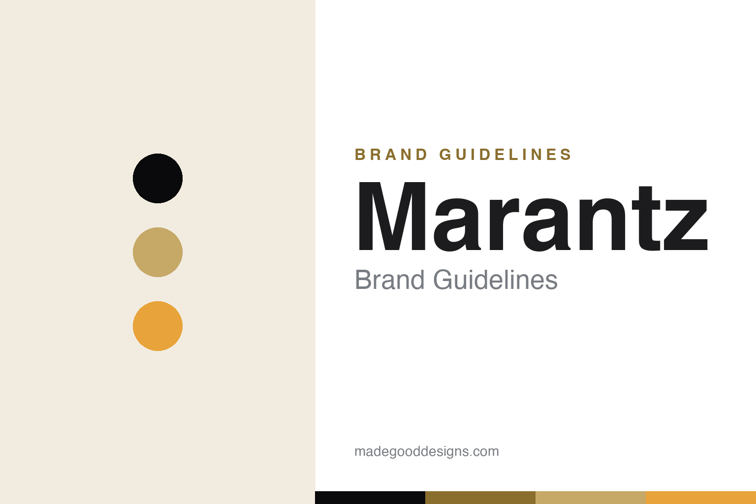
Marantz Brand Guidelines
An illuminated porthole glowing amber in a dark room — audiophile luxury since 1953, from a designer’s bench.
Aa
Two constants: a black-and-champagne-gold palette (with amber) and an elegant sans. Abstract homage — not the Marantz wordmark or porthole.
From a designer’s bench
Marantz built audiophile legend.
Marantz is a lesson in a designer’s eye applied to audio luxury. It was founded by Saul Marantz — an audiophile who was a graphic designer by trade — who built the “Audio Consolette” preamplifier in his home in Kew Gardens, Queens (around 1951–52). When the first hand-built units sold out with a backlog, he formally established the Marantz Company in 1953 in New York. (A myth to avoid: Marantz is American-founded, not Japanese — Japanese ownership and manufacturing came later.) (Honest caveats: no official brand hex is published, so the gold below is observed, and the wordmark typeface is a custom, undocumented mark.)
The late-1950s–early-1960s vacuum-tube electronics are audiophile legend: the Model 7 stereo preamplifier (1958) and the Model 8B/Model 9 power amplifiers (1961), designed with chief engineer Sid Smith. Marantz later became a major force in AV receivers, CD/SACD players and hi-fi separates, and remains positioned as a premium/luxury audio brand.
Its most identifiable design signature is the illuminated “porthole” — a circular window in the centre of its premium components, flanked by knobs, that glows amber in a dark room (originally framing a meter or tuning display; today a porthole-style OLED). It emerged around 1960 and became the brand’s defining visual cue. On ownership, Marantz (paired with sister brand Denon) passed through Superscope, Philips, D&M Holdings and Sound United, and — after Masimo — is now owned by Harman (Samsung) following a 2025 deal. The identity is elegant and near-unchanged: the lowercase, slightly italic “marantz” wordmark, in a black and champagne/gold aesthetic. Luxury sound with a designer’s signature.
Colour
Marantz lives in black and champagne gold. Click a swatch to copy the hex.
Marantz’s palette is luxurious and warm: black with a champagne/gold metallic (and the amber glow of the porthole). The black reads as premium, serious and sophisticated — the colour of high-end audio — while the champagne gold adds richness, heritage and a jewellery-like preciousness that positions Marantz components as objects of desire. The warm amber of the illuminated porthole is a signature detail, giving Marantz gear a distinctive, inviting glow in a dark listening room. It’s an elegant, high-end scheme that signals audiophile luxury and craftsmanship. The honest caveat: Marantz publishes no official brand hex — the champagne gold, black and amber here are observed approximations (collectors even distinguish “champagne” from “gold” finishes), not first-party values.
The lesson is black-and-gold plus a signature glow for audio luxury. Marantz’s warm palette — and the amber porthole — read as premium and inviting. For designers, it’s a reminder that a signature illuminated detail can become a brand’s most ownable cue. The takeaways: use black plus a warm metallic for luxury (champagne gold); make a signature detail ownable (the glowing porthole); and treat specific hexes as approximate when no official spec is published.
Typography
The wordmark is an elegant sans — refined and timeless.
Marantz’s elegant lowercase sans wordmark — the slightly italic “marantz,” with its extended “M” stroke and bar-less “A”s — is refined and timeless. Fittingly for a brand founded by a graphic designer, the wordmark has stayed stylistically near-unchanged for 70+ years, a mark of confidence and consistency. The refined, gently italicised letterforms read as luxurious, sophisticated and enduring, matching premium audio components meant to be treasured, and the restraint signals quality without shouting. Set against black with champagne gold, the type feels architectural and quietly opulent — exactly the audiophile-luxury personality Marantz cultivates. (Because the exact face is a custom, undocumented mark, the honest description is “an elegant sans,” not a named font.) The type behaves like the brand: refined, timeless and luxurious.
Aa
An elegant sans — refined and timeless. (Specimen set in Josefin Sans, an elegant geometric sans in the spirit of the marantz wordmark; the real mark is custom and undocumented.)
A signature detail as a brand
Marantz’s porthole is instantly its own.
Marantz is a lesson in a single signature design detail becoming a brand’s identity. Across decades of changing products, ownership and technology, the illuminated porthole has remained instantly, unmistakably Marantz — a warm amber circle you recognise across a room, more memorable than any logo. That kind of ownable, distinctive design cue is enormously valuable: it makes every product recognisable, carries the brand’s heritage forward, and gives audiophiles an emotional touchpoint. Founded by a graphic designer, Marantz has always understood that how a product looks and glows is part of how it’s loved. It’s proof that a well-chosen, consistently-applied signature detail can be as powerful a brand asset as a name — sometimes more.
For designers and brand-builders, Marantz offers a clear takeaway: a distinctive, consistently-applied signature design detail can become a brand’s most ownable asset. The lessons: find a memorable, ownable cue and keep it (the illuminated porthole); maintain a refined, near-unchanged identity for heritage and trust (the 70-year wordmark); and let design and emotion carry a premium brand. It’s also a reminder to keep the facts precise — Marantz was founded in 1953 in New York by graphic-designer-audiophile Saul Marantz, is legendary for its tube-era electronics (the Model 7), is known for the signature illuminated porthole, is the sister brand to Denon, and is now owned by Harman/Samsung. Marantz’s porthole is instantly its own — proof that a signature detail can be a brand’s deepest identity.
Explore & save
Keep Marantz’s identity on hand — save it to a board in the Made Good inspiration library.
Marantz identity set
Pin the black-and-gold palette and the elegant-sans spirit to your own board.