AKG Brand Guidelines
Studio microphones on countless records — a Vienna audio house since 1947, in disciplined black-and-white.
Aa
Two constants: a black-and-white palette (with a heritage blue) and a clean grotesque. Abstract homage — not the AKG wordmark.
A Vienna audio house
AKG has shaped recorded sound since 1947.
AKG is a lesson in engineering heritage in professional audio. It was founded in 1947 in Vienna, Austria by physicist Dr. Rudolf Görike and engineer Ernst Pless, and its name stands for “Akustische und Kino-Geräte” (“Acoustic and Cinema Equipment”). It began, as the name says, in cinema equipment — with only a handful of workers — before pivoting within months to the microphones that made it legendary. (Honest caveats: AKG publishes no official brand hex — the tones below are observed, with historical logos using a blue — and the wordmark typeface is undocumented.)
AKG became a studio institution. Its microphones are on countless records: the C12 (1953) tube condenser, the multi-pattern C414 — a studio “Swiss-army-knife” condenser — and the D112 “egg” prized on kick drum and bass (distinct from the earlier D12 dynamic). Its headphones are equally revered: the semi-open K240, the open-back reference K701/K702, and the Quincy Jones Q701.
On ownership — with two myths worth correcting — Harman acquired AKG in 1993–94 (not 2012), and Harman itself became a Samsung subsidiary (announced 2016, completed 2017), so AKG is now Samsung-owned via Harman, a sibling to JBL and Harman Kardon. In a genuinely controversial move, AKG’s Vienna operations closed in 2017 — after which former AKG engineers founded Austrian Audio in Vienna, keeping the city’s microphone DNA alive. The identity is disciplined: a bold, monochrome “AKG” wordmark in black-and-white. Seven-plus decades of shaping recorded sound.
Colour
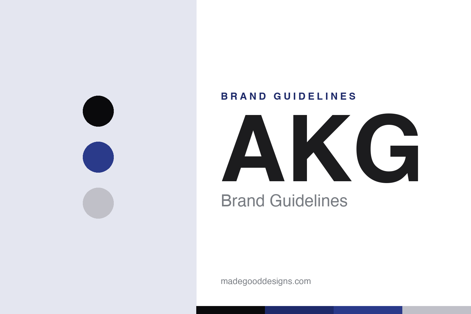
AKG lives in black and white. Click a swatch to copy the hex.
AKG’s modern identity is disciplined and pro-grade: essentially black and white, with a heritage blue that appeared in earlier logos and a hint of studio silver. The black-and-white reads as serious, precise and professional — the understated look of studio equipment where the sound, not the branding, is the point — while a heritage blue nods to AKG’s long history and a silver edge suits precision microphones. It’s a spare, credible scheme fitting for gear engineers trust on record after record, letting the instrument lead. The honest caveat: AKG publishes no official brand hex — the near-black, blue and silver here are observed approximations, not first-party values.
The lesson is discipline reads as studio-grade trust. AKG’s black-and-white says “professional tool,” and a heritage blue quietly carries the history. For designers, it’s a reminder that a pro-audio brand can be deliberately spare. The takeaways: keep the palette disciplined and professional for pro tools (black-and-white); let a heritage colour carry history sparingly (the blue); and treat specific colours as approximate when no official spec is published.
Typography
The wordmark is a clean grotesque — bold and professional.
AKG’s bold, clean grotesque wordmark — the three capitals “AKG” — is professional and confident. The even, minimal letterforms read as precise, serious and modern, matching a pro-audio house whose reputation rests on microphones used on countless recordings, and the all-caps monochrome treatment feels calm and authoritative rather than showy. Set in black-and-white with a heritage-blue nod, the type is quiet and trustworthy — appropriate for studio gear where getting out of the way is the job. It’s minimal and precise rather than decorative, exactly the understated, engineering-first personality AKG carries. Because the exact face is undocumented, the honest description is “a clean grotesque,” not a named font. The type behaves like the brand: bold, professional and precise.
Aa
A clean grotesque — bold and professional. (Specimen set in Familjen Grotesk, a clean grotesque in the spirit of the AKG wordmark; the real face is undocumented.)
Heritage as the brand
AKG’s records are its résumé.
AKG is a lesson in a heritage of genuine tools as brand equity. Over seven-plus decades, AKG microphones — the C12, the C414, the D112 — became studio standards heard on countless records, and that track record is the brand: engineers and producers trust AKG because the gear has proven itself for generations. An understated black-and-white identity works precisely because the heritage is real; the branding can be spare when the résumé is that deep. Even the controversial 2017 Vienna closure underlines the point — the city’s AKG DNA was strong enough that former staff founded Austrian Audio to carry it on. In pro audio, a long, verifiable history of tools people rely on is a durable, hard-to-copy asset. The records are the résumé.
For designers and brand-builders, AKG offers a clear takeaway: a deep, verifiable heritage of genuine tools lets a brand stay understated and still command trust. The lessons: build on real, proven products and history (the C-series mics, since 1947); keep the identity disciplined so the heritage leads (black-and-white, a heritage blue); and get the facts right to stay credible. It’s also a reminder to keep the facts precise — AKG was founded in 1947 in Vienna by Görike and Pless, is legendary for the C12, C414 and D112 mics and K-series headphones, was acquired by Harman in 1993–94 (now Samsung-owned, a sibling to JBL and Harman Kardon), and closed its Vienna operations in 2017. AKG’s records are its résumé — proof that a real heritage of tools is a lasting brand asset.
Explore & save
Keep AKG’s identity on hand — save it to a board in the Made Good inspiration library.
AKG identity set
Pin the black-and-white palette and the grotesque spirit to your own board.