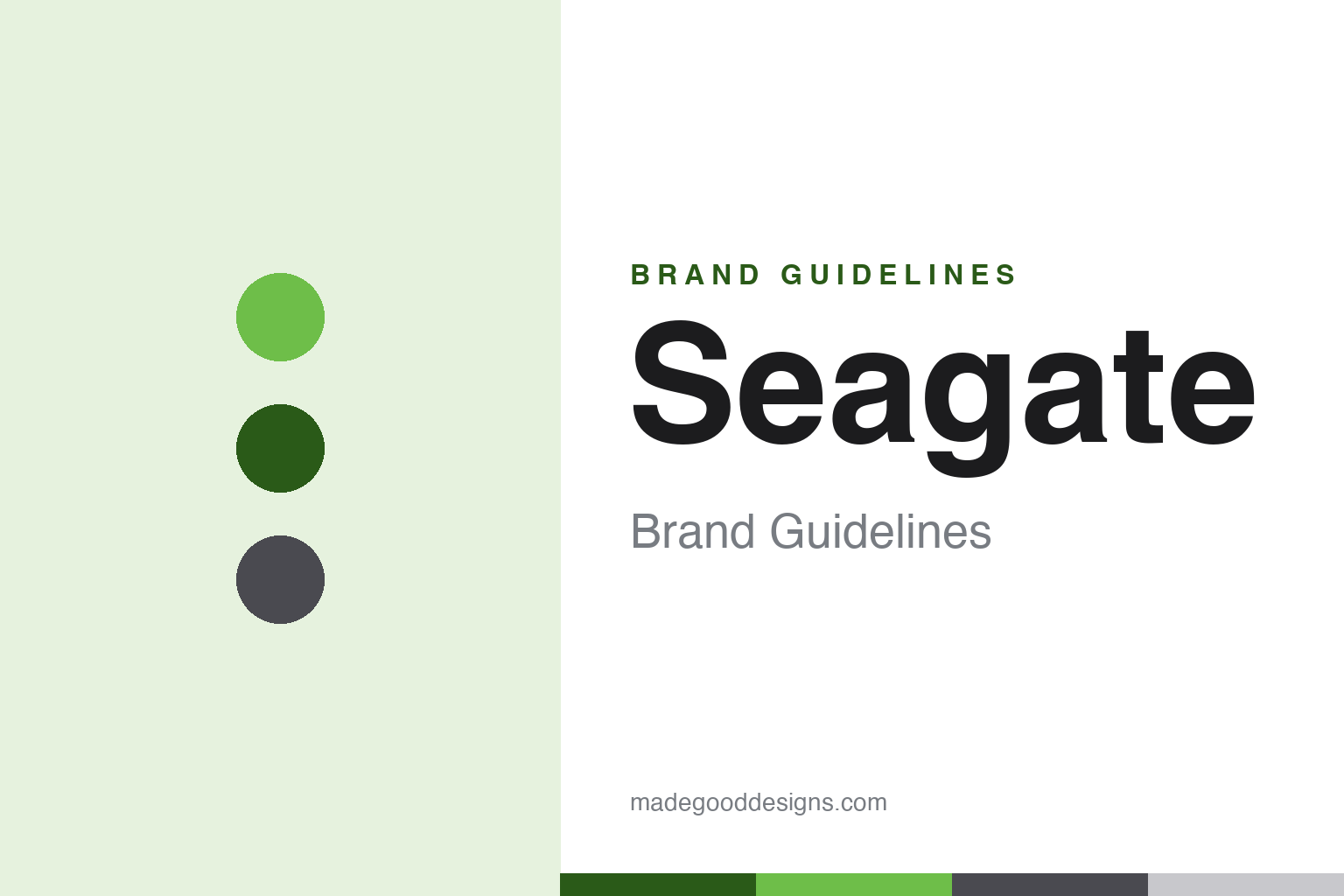
Seagate Brand Guidelines
The company that fit five megabytes into a 5.25-inch bay — data storage, in an unmistakable green.
Aa
Two constants: a green palette (with greys) and a clean neo-grotesque. Abstract homage — not the Seagate wordmark.
Five megabytes, one bay
Seagate built the modern hard drive business.
Seagate is a lesson in a name and identity rooted in a real first. It was founded in 1978–79 in Scotts Valley, California by Al Shugart, Finis Conner and others, originally as Shugart Technology. It was renamed Seagate Technology — a coined word that kept the letters S, G, T from “Shugart” — to avoid a trademark conflict with Shugart Associates, Al Shugart’s earlier (by then Xerox-owned) company. Its landmark first product was the ST-506 (1980), the first hard disk drive in the 5.25-inch form factor, holding 5 MB — small by today’s standards, but it helped set an early PC storage standard. (An important honest note: Seagate did not invent the hard drive — that’s IBM, 1956 — it made the first 5.25-inch HDD. Caveat: brand colours below follow Seagate’s Pantone-anchored guide.)
From that drive, Seagate became one of the two dominant hard-drive makers in the world (alongside Western Digital), and a core supplier of enterprise and data-centre storage. Its product lines are well known: Barracuda (desktop), IronWolf (NAS), Exos (enterprise), SkyHawk (surveillance) and FireCuda (gaming). It also owns the premium external-storage brand LaCie.
The identity is clean and corporate: the “seagate” wordmark set in Helvetica Neue (per its own brand guide), paired with a curved “S”-like mark also read as an infinity sign — evoking the continuity of data. The signature colour is Seagate green (Pantone 360, commonly rendered near #6EBE49), with greys and black. Notably, Seagate’s brand guide states it uses no tagline. Today Seagate is public (NASDAQ: STX, Seagate Technology Holdings plc). Five megabytes in one bay, four decades ago.
Colour
Seagate lives in green. Click a swatch to copy the hex.
Seagate’s identity is anchored by Seagate green — a fresh, confident green (Pantone 360, commonly rendered near #6EBE49) — supported by light and dark greys, black and white. The green reads as reliable, forward and distinct — an unusual, ownable choice in a tech category dominated by blues — signalling stability and trust for a company whose whole business is keeping your data safe. The greys keep it corporate and serious, fitting enterprise and data-centre customers. It’s a clean, dependable scheme where a single differentiated colour does the identifying work. The honest note here is a happy one: Seagate anchors its colour to Pantone 360 in its own brand guide, so the green is documented (the exact hex is derived from that Pantone, so treat #6EBE49 as the common rendering).
The lesson is own a differentiated colour in a blue category. Seagate’s green stands out precisely because storage and tech default to blue. For designers, it’s a reminder that choosing against the category convention can be the ownable move. The takeaways: pick a distinct, differentiated colour (green in a blue field); anchor it to a real reference so it stays consistent (Pantone 360); and keep the supporting palette corporate and calm (greys and black).
Typography
The wordmark is a clean neo-grotesque — corporate and legible.
Seagate’s wordmark, set in Helvetica Neue (per its brand guide), is corporate and legible — a clean neo-grotesque paired with a curved “S”/infinity mark that suggests the endless continuity of stored data. The even, neutral letterforms read as trustworthy, established and professional, matching a company entrusted with the world’s data, and Helvetica’s familiarity signals reliability rather than flash. Set in Seagate green with greys, the type feels dependable and enterprise-ready — exactly the stable, trustworthy personality Seagate cultivates. It’s neutral and clear rather than expressive, appropriate for infrastructure that must simply work. Honestly noted: the documented brand face is Helvetica Neue; whether Seagate has since moved to a bespoke face isn’t publicly confirmed. The type behaves like the brand: corporate, legible and dependable.
Aa
A clean neo-grotesque — corporate and legible. (Specimen set in Arimo, a Helvetica-metric-compatible grotesque echoing Seagate’s documented Helvetica Neue.)
A name that carries its history
Seagate hides Shugart in plain sight.
Seagate is a lesson in encoding heritage into a name. Forced to rename to avoid a trademark clash, the founders coined “Seagate” while preserving the letters S, G and T from “Shugart” — hiding the company’s lineage in plain sight. It’s a neat, verifiable piece of brand craft: the name reads as clean and modern (with sea/gate connotations) while quietly carrying the founder’s history for those who know. Combined with a real first (the ST-506) and an ownable colour (Seagate green), it gives the brand a coherent story rooted in genuine engineering heritage — Al Shugart’s thread runs from floppy disks (at Shugart Associates) straight into the hard-drive era. It’s proof that even a forced rename can be turned into an asset when it’s crafted with intent, preserving meaning while solving a legal problem. History, hidden in the letters.
For designers and brand-builders, Seagate offers a clear takeaway: a name can preserve heritage even under constraint, and a differentiated colour makes it ownable. The lessons: turn constraints into craft (coining “Seagate” to keep S-G-T from Shugart); anchor the brand in a genuine first (the ST-506, the first 5.25-inch HDD); and choose a distinct, documented colour (Seagate green, Pantone 360). It’s also a reminder to keep the facts precise — Seagate was founded in 1978–79 by Al Shugart and Finis Conner as Shugart Technology, renamed to keep S-G-T, made the first 5.25-inch hard drive (not the first hard drive), owns LaCie, uses Helvetica and Seagate green, and is public as NASDAQ: STX. Seagate hides Shugart in its letters — proof that a name can carry history by design.
Explore & save
Keep Seagate’s identity on hand — save it to a board in the Made Good inspiration library.
Seagate identity set
Pin the green palette and the neo-grotesque spirit to your own board.