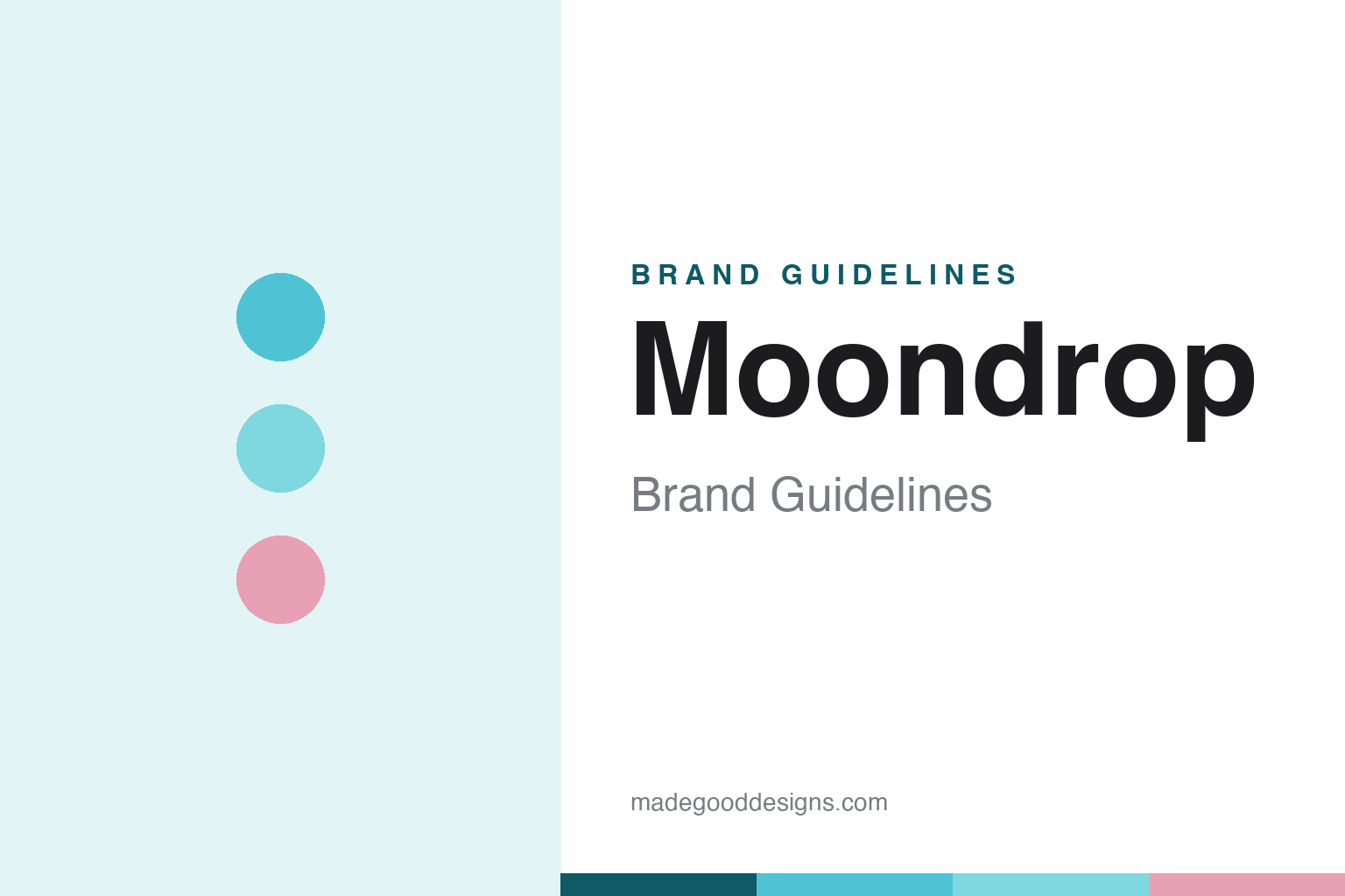
Moondrop Brand Guidelines
Measurement-driven IEMs wrapped in anime art — a poster child of ChiFi, fusing art and reason.
Aa
Two constants: a soft cyan-and-pastel palette and a rounded sans. Abstract homage — not the Moondrop wordmark or character art.
Art and reason
Moondrop fuses measurement and anime.
Moondrop is a lesson in a deliberate contradiction as brand identity. Founded in 2015 in Chengdu, China, its Chinese name is 水月雨 — literally “water, moon, rain,” a poetic, allusive name (the moon reflected on water), of which “Moondrop” is an evocative English adaptation rather than a literal translation. (An honest note: Moondrop does not prominently publicise a named founder, so we don’t assert one — “a privately held Chinese company founded in 2015 in Chengdu” is the safe framing. Caveats: no official brand hex is published — the tones below are observed from packaging — and the wordmark typeface is undocumented.)
Moondrop made its name with well-tuned, value-focused in-ear monitors (IEMs) — single-dynamic models like the Chu, Aria and Starfield; the breakout hybrid Blessing 2 (2020, a “giant-killer”); and the Variations, a tribrid (dynamic + balanced-armature + electrostatic). Its tuning follows its own house target — the VDSF (Virtual Diffuse Sound Field), a diffuse-field-derived, Harman-adjacent target (not literally “the Harman target”). It has since expanded to DAPs, USB DAC/amp dongles, a portable CD player, mechanical keyboards, and even an Android audiophile phone (the MIAD 01).
The most distinctive brand choice is the anime-style character art on its packaging and identity — often a different illustrated character per product (fans call it “waifu” branding; that’s a community term, not Moondrop’s official language). That deliberate contradiction — emotional, artistic anime imagery wrapped around rigorous, measurement-driven acoustic engineering — is the whole point, captured in Moondrop’s stated slogan: “Explore the integration of art and reason.” The look leans on clean white with soft cyan/aqua and pastel character art. A poster child of the ChiFi movement.
Colour
Moondrop lives in cyan and pastel. Click a swatch to copy the hex.
Moondrop’s identity leans on clean white with a soft cyan/aqua-teal accent and pastel character art (with pink/red on some packaging). The cyan and pastels read as soft, dreamy and approachable — an artistic, almost anime aesthetic that matches the illustrated character branding and the poetic “water-moon-rain” name — while the clean white keeps it modern and lets the art and products shine. It’s a distinctive, emotional scheme that stands well apart from the black-and-silver seriousness of most audiophile brands, embodying the “art” half of Moondrop’s art-and-reason philosophy. The palette feels approachable and expressive rather than clinical. The honest caveat: Moondrop publishes no official brand hex — the cyan, aqua and pastel here are observed approximations from packaging, not first-party values.
The lesson is an expressive palette can differentiate a technical brand. Moondrop’s soft cyan-and-pastel — plus anime art — sets it apart in a category of clinical black-and-silver. For designers, it’s a reminder that emotion and art can be a differentiator even for a measurement-driven product. The takeaways: use an expressive, approachable palette to stand out (cyan and pastels); embrace an artistic identity that contrasts with the category norm (the character art); and treat specific hexes as approximate when no official spec is published.
Typography
The wordmark is a soft rounded sans — approachable and artful.
Moondrop’s soft rounded sans wordmark — the all-caps “MOONDROP,” paired with the Chinese 水月雨 — is approachable and artful. The gentle, rounded letterforms read as friendly, dreamy and modern, matching a brand that wraps rigorous acoustic engineering in soft anime aesthetics and a poetic name, and the rounded warmth ties to the pastel, character-led identity. Set in clean white with cyan and pastel accents, the type feels expressive and welcoming — exactly the “art” half of Moondrop’s “art and reason” personality. It’s soft and approachable rather than clinical, the opposite of most audiophile branding — which is the point. Because the exact face is undocumented, the honest description is “a soft rounded sans,” not a named font. The type behaves like the brand: approachable, artful and modern.
Aa
A soft rounded sans — approachable and artful. (Specimen set in Comfortaa, a soft rounded sans in the spirit of the MOONDROP wordmark; the real face is undocumented.)
Emotion plus engineering
Moondrop pairs art with measurement.
Moondrop is a lesson in pairing emotional branding with rigorous engineering. Most audiophile brands lean fully technical — spec sheets, black-and-silver, serious tone. Moondrop deliberately does both: it markets with soft, artistic anime character illustrations (the emotional, aesthetic half) while grounding its products in measurement-driven acoustics and its own VDSF house target (the rational half). That combination — captured in the slogan “Explore the integration of art and reason” — is genuinely distinctive: the art makes the brand approachable and memorable to a young, global audience, while the engineering earns credibility with serious listeners (models like the Blessing 2 became “giant-killers”). It’s a smart, ownable position in the crowded ChiFi space — stand out on art, win trust on measurement. The lesson: emotional branding and technical substance aren’t opposites; fused deliberately, they can make a brand both beloved and respected. Art and reason.
For designers and brand-builders, Moondrop offers a clear takeaway: fusing emotional, artistic branding with rigorous engineering can be a distinctive, ownable position. The lessons: differentiate on art and emotion where rivals are clinical (the anime character identity); back it with real technical substance (measurement-driven tuning, the VDSF target); and make the contradiction the point (“art and reason”). It’s also a reminder to keep the facts precise — Moondrop was founded in 2015 in Chengdu (水月雨), is known for value IEMs like the Chu and Blessing 2 (the Variations a tribrid), tunes to its diffuse-field-derived VDSF target (Harman-adjacent, not literally Harman), and is a ChiFi poster child with anime-style branding. Moondrop pairs emotion with engineering — proof that art and reason together can be a brand.
Explore & save
Keep Moondrop’s identity on hand — save it to a board in the Made Good inspiration library.
Moondrop identity set
Pin the cyan-and-pastel palette and the rounded-sans spirit to your own board.