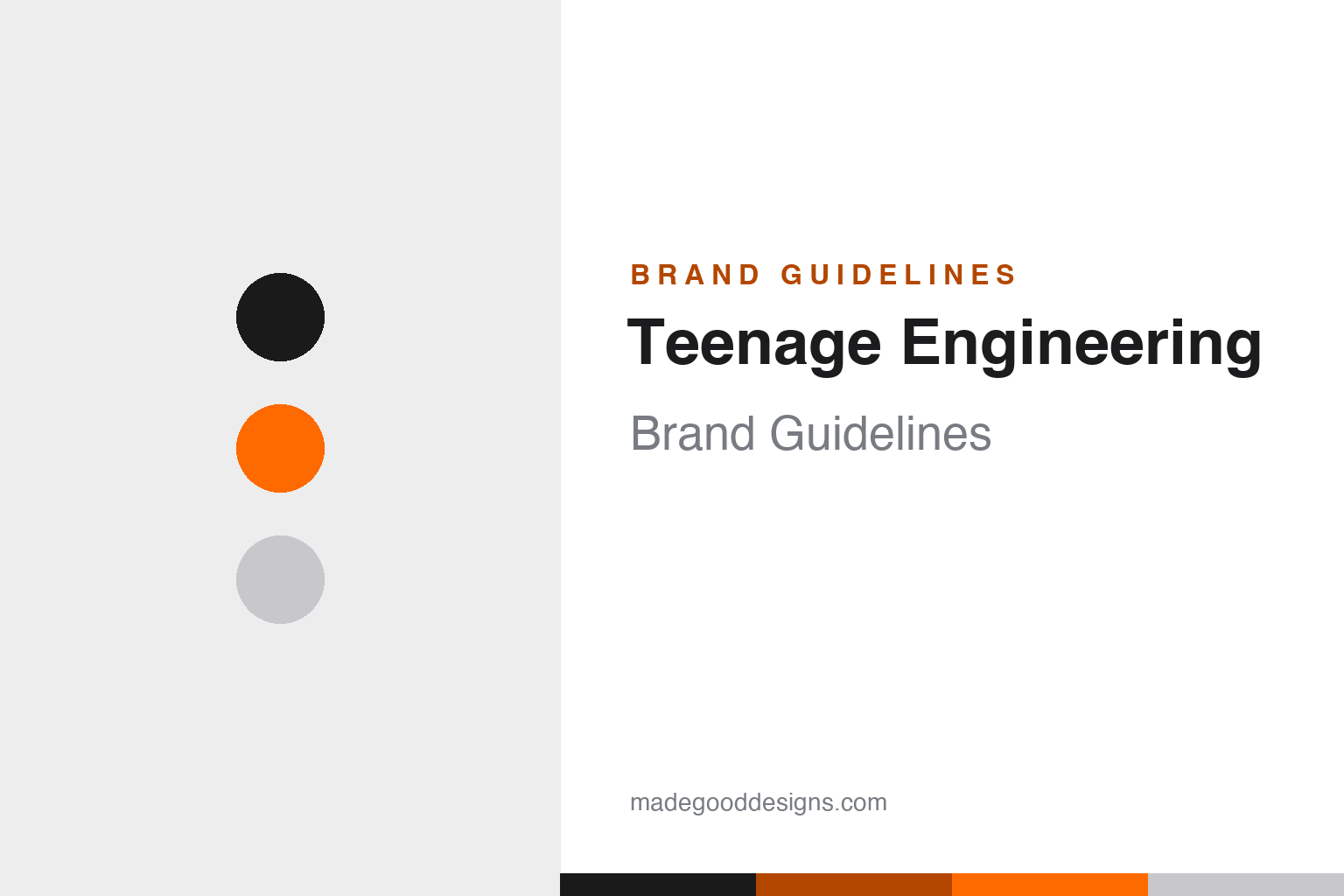
Teenage Engineering Brand Guidelines
Swedish design royalty — the OP-1, the Pocket Operators, and a playful-yet-precise orange-and-black world.
Aa
Two constants: an orange-and-black palette and precise monospace type. Abstract homage — not the Teenage Engineering wordmark.
Sweden’s design cult
Teenage Engineering makes electronics designers adore.
Teenage Engineering is a lesson in design as the entire product. It’s a Swedish consumer-electronics and design company based in Stockholm, founded in the mid-2000s (sources vary between 2005 and 2007) by Jesper Kouthoofd — the CEO and creative force — with co-founders including Jens Rudberg and David Eriksson. Famously, the company bootstrapped for around 15 years, taking outside investment only recently. (Honest caveats: the founding year is genuinely uncertain (2005–2007); no official brand hex is published, so the colours below are observed; and the wordmark typeface is undocumented.)
Its products are design icons. The OP-1 — a portable all-in-one synthesizer, sampler and sequencer that shipped in 2011 — is celebrated as a masterpiece of industrial design (it entered SFMOMA’s collection), and the tiny, affordable Pocket Operators (2015) put a calculator-sized synth in your pocket. The line runs on through the OP-Z, the TX-6 mixer, the EP-133 sampler and more — each one a jewel-like object as admired for its form as its function.
Teenage Engineering is also the design partner behind other icons. It designed IKEA’s FREKVENS audio/light range, shaped the aesthetic of Nothing (Jesper Kouthoofd serves as Nothing’s creative lead), and designed Panic’s Playdate handheld — the little yellow console with a mechanical crank. The identity matches the products: minimalist yet colourful, playful yet precise, with clean geometric forms that recall pocket calculators and vintage electronics, a near-signature orange-and-black palette, monospaced product graphics, and a humble lowercase “teenage engineering” wordmark. A studio beloved by designers.
Colour
Teenage Engineering lives in orange and black. Click a swatch to copy the hex.
Teenage Engineering’s near-signature palette is orange and black, with white and anodised-aluminium tones (and bright accent hues on the Pocket Operators). The orange reads as playful, energetic and creative, while the black keeps it precise, premium and grown-up — together they feel like a piece of high-end lab equipment that’s also fun to use. It’s a bold, ownable, design-forward scheme that stands apart from the sea of grey gadgets, matching the brand’s playful-yet-precise character. The honest caveat: Teenage Engineering publishes no official brand hex — the orange and black here are observed approximations, not first-party values.
The lesson is a playful-yet-precise colour pairing. Teenage Engineering’s orange-and-black balances fun and rigour — creative but serious. For designers, it’s a reminder that a two-colour scheme can carry a whole personality. The takeaways: pick a pairing that captures the brand’s dual character (orange for play, black for precision); use bright accents sparingly for delight (the Pocket Operator hues); and treat specific hexes as approximate when no official spec is published.
Typography
The type is precise monospace — technical and playful.
Teenage Engineering’s type language leans on precise monospaced lettering — the kind you’d find on lab gear, calculators and vintage synths — paired with a humble lowercase “teenage engineering” wordmark. The monospace reads as technical, exact and a little retro-futuristic, signalling engineering rigour, while the lowercase wordmark keeps the brand modest and approachable rather than shouty. Together they capture the studio’s whole personality: serious craft delivered with a wink. The type feels like the products — clean, geometric and precise, but never cold. (Because the exact wordmark face is undocumented, the honest description is “a lowercase wordmark with monospaced product graphics,” not a named font.) The type behaves like the brand: technical, precise and playful.
Aa
Precise monospace — technical and playful. (Specimen set in JetBrains Mono, a monospace in the spirit of Teenage Engineering’s product graphics; the real wordmark is a custom lowercase face.)
Design as the product
Teenage Engineering sells objects, not just specs.
Teenage Engineering is a lesson in treating design as the core value, not a finish. In electronics, most brands compete on specifications; Teenage Engineering competes on desire — its products are objects people covet, display and love as much for their form as their function. That obsessive design focus is why a small Swedish studio became a global design cult, why museums collect its work, and why giants like IKEA, Nothing and Panic hire it to shape their own products. The orange-and-black identity, the precise monospace, the jewel-like objects — everything says “design is the point.” It’s proof that, done with enough conviction, design itself can be the product.
For designers and brand-builders, Teenage Engineering offers a clear takeaway: design can be the primary value proposition, not a coat of paint. The lessons: make objects people desire and display, not just use (the OP-1); build a coherent, ownable identity (orange-and-black, monospace, lowercase); and let craft earn a premium and a cult following. It’s also a reminder to keep the facts precise — Teenage Engineering is a Stockholm design company founded in the mid-2000s by Jesper Kouthoofd and others, made its name with the OP-1 (2011) and Pocket Operators (2015), designed IKEA’s FREKVENS, shaped Nothing’s aesthetic and designed Panic’s Playdate, and is defined by a playful-yet-precise orange-and-black identity. Teenage Engineering made design the product — proof that craft itself can be a brand’s whole value.
Explore & save
Keep Teenage Engineering’s identity on hand — save it to a board in the Made Good inspiration library.
Teenage Engineering identity set
Pin the orange-and-black palette and the monospace spirit to your own board.


