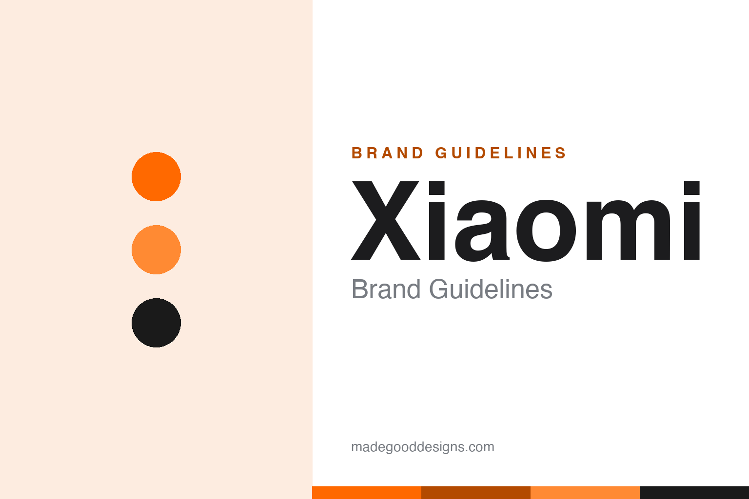
Xiaomi Brand Guidelines
A ‘grain of rice’ that grew into a top-three phone maker — orange, a squircle logo, and a whole ecosystem.
Aa
Two constants: an orange palette and a geometric sans in a soft “squircle”. Abstract homage — not the Xiaomi wordmark or squircle logo.
From a grain of rice
Xiaomi grew into a global tech giant.
Xiaomi is a lesson in scale from humble beginnings and an ecosystem strategy. It was founded in 2010 in Beijing by Lei Jun (a former Kingsoft president) with a founding team of eight. The name 小米 (Xiǎomǐ) literally means “millet” (little rice) — Lei Jun tied it to a Buddhist idea that a single grain of rice can be as great as a mountain, signalling humble, incremental beginnings. (The “MI” wordmark is given as a backronym for “Mobile Internet” and “Mission Impossible” — but that’s company lore; “millet” is the real etymology.) (Honest caveats: no official brand hex is published, so the orange below is approximate, and the wordmark typeface is undocumented.)
Xiaomi rose fast to become a top-three global smartphone maker, frequently sitting behind only Samsung and Apple, on a model of high-spec phones at aggressive prices (originally sold online via flash sales, with thin hardware margins). But phones are only the start: Xiaomi built a vast ecosystem of connected products — smart-home devices, the Mi Band wearable, e-scooters, TVs and appliances — and in 2024 launched an electric car, the Xiaomi SU7. (A myth to avoid: writing Xiaomi off as a mere Apple “copycat” misses its genuinely distinctive low-margin ecosystem strategy.)
The identity centres on a signature orange square with a lowercase “MI.” In 2021, Xiaomi unveiled a redesign by the famed Japanese designer Kenya Hara (art director of Muji) that changed the square to a “squircle” — a rounded-square “superellipse” — after testing many curvature values. Widely (and unfairly) mocked online as “just rounded corners,” it was actually a considered study, and it nudged the branding from “Mi” toward simply Xiaomi. A giant that grew from a grain of rice.
Colour
Xiaomi lives in orange. Click a swatch to copy the hex.
Xiaomi’s palette is anchored by a bright orange, with black and white. The orange reads as energetic, youthful, affordable and friendly — fitting for a brand that made high-spec technology accessible to a huge, young, value-conscious audience — and it stands apart from the cool blues and monochrome of many rivals. It’s a warm, approachable, high-visibility scheme that signals value and accessibility rather than luxury. Consistent across phones, gadgets and stores, the orange is Xiaomi’s recognisable anchor. The honest caveat: Xiaomi publishes no official public brand hex — the orange (commonly cited near #FF6900) is an observed approximation, not a first-party value.
The lesson is a warm, accessible colour for a value brand. Xiaomi’s orange signals affordability and friendliness, matching its accessible-tech mission. For designers, it’s a reminder that colour can position a brand as approachable rather than elite. The takeaways: choose a warm, energetic primary to feel accessible (the orange); keep it consistent across a huge product ecosystem; and treat specific hexes as approximate when no official spec is published.
Typography
The wordmark is a geometric sans in a soft squircle — modern and friendly.
Xiaomi’s identity pairs a clean geometric sans with the soft “squircle” frame from Kenya Hara’s 2021 redesign. The even, modern letterforms read as accessible, tech-forward and friendly, matching a brand that makes high-spec gear affordable, while the squircle — a rounded-square superellipse — gives the mark a soft, contemporary, human feel (the redesign’s theme was literally “Alive”). It’s modern and approachable rather than cold or luxury, exactly the down-to-earth, tech-for-everyone personality Xiaomi wants. (Because the exact face is custom and undocumented, the honest description is “a geometric sans,” not a named font.) The type behaves like the brand: modern, friendly and accessible.
Aa
A geometric sans — modern and friendly. (Specimen set in Manrope, a geometric sans in the spirit of the Xiaomi wordmark; the real face is undocumented, and the “squircle” is a custom Kenya Hara form.)
The ecosystem play
Xiaomi sells a connected universe, not just phones.
Xiaomi is a lesson in building an ecosystem, not just a product. Rather than rely on phone margins, Xiaomi used affordable, high-value phones to win a massive user base, then surrounded those users with a whole connected universe — smart-home devices, wearables, scooters, TVs, appliances and now electric cars. Each product reinforces the others, deepening loyalty and lifetime value, all under one recognisable orange identity. It’s a genuinely distinctive strategy (not an Apple copy): low margins on hardware, scale everywhere, and an ecosystem that keeps customers inside the brand. The 2021 rebrand and the SU7 EV show a company confidently expanding that universe.
For designers and brand-builders, Xiaomi offers a clear takeaway: an ecosystem of products, unified by one identity, can be more powerful than any single device. The lessons: use an accessible hero product to build a base (value phones); surround users with connected products under one brand (the ecosystem); and keep a consistent, friendly identity across all of it (the orange, the squircle). It’s also a reminder to keep the facts precise — Xiaomi was founded in 2010 in Beijing by Lei Jun, its name means “millet,” it’s a top-three global phone maker with a vast ecosystem extending to the 2024 SU7 EV, and its 2021 Kenya Hara “squircle” rebrand nudged it from “Mi” to Xiaomi. Xiaomi played the ecosystem game — proof that a connected universe can beat any single product.
Explore & save
Keep Xiaomi’s identity on hand — save it to a board in the Made Good inspiration library.
Xiaomi identity set
Pin the orange palette and the geometric-sans spirit to your own board.