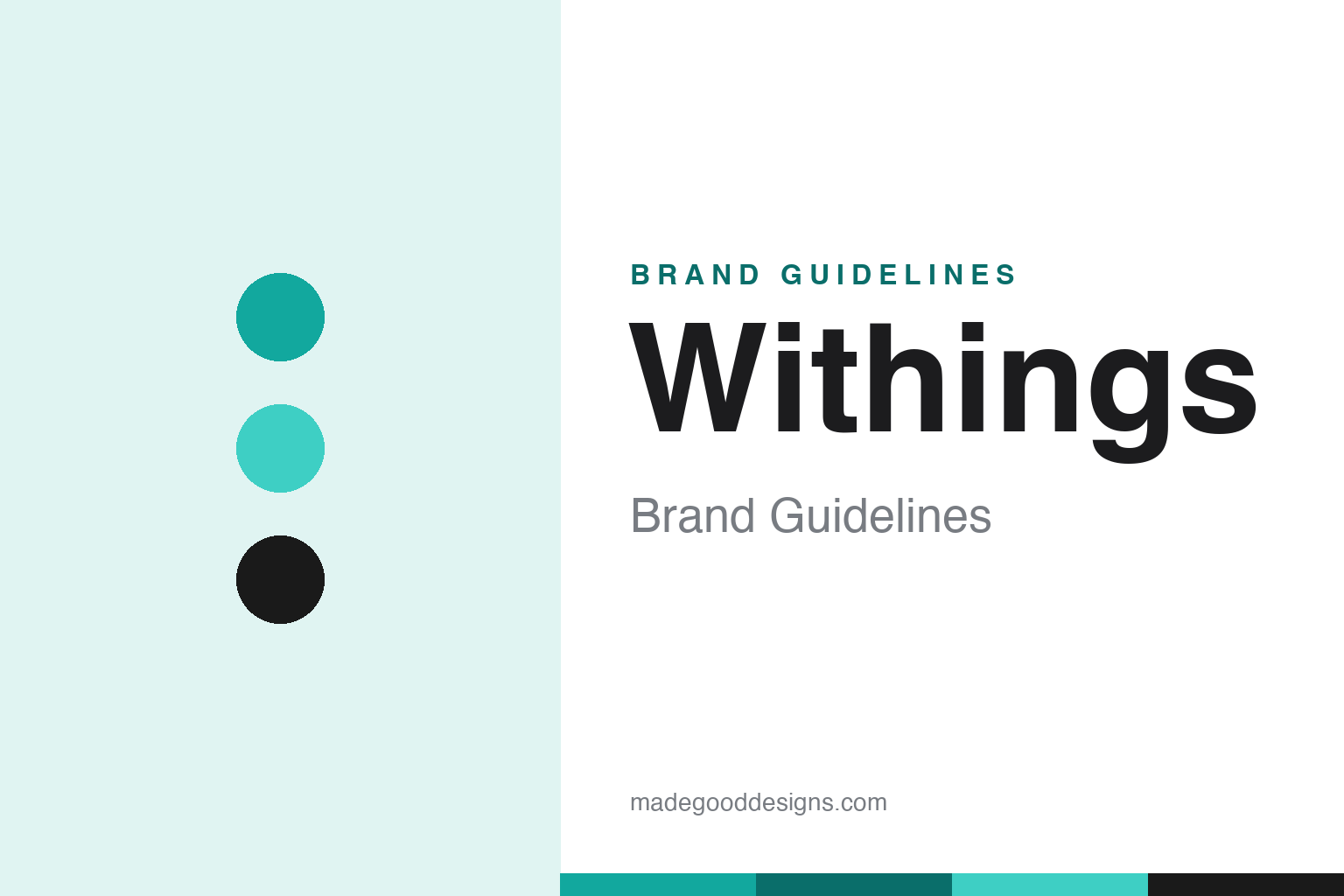
Withings Brand Guidelines
French connected-health design — a watch that hides the tech, and a company bought by Nokia, then bought back.
Aa
Two constants: a teal accent on white and a clean sans. Abstract homage — not the Withings wordmark.
Health tech that hides
Withings makes health devices that don’t look like tech.
Withings is a lesson in design that hides the technology. It was founded in 2008 in France (Issy-les-Moulineaux, near Paris) by Éric Carreel and Cédric Hutchings (with Fred Potter also credited). Its first product was the world’s first Wi-Fi connected smart scale (unveiled at IFA 2009) — one of the first true connected-health devices, quietly syncing your weight to an app. (Honest caveats: no official brand hex is published, so the teal below is approximate, and the wordmark typeface is undocumented.)
Withings makes connected health hardware — smart scales, blood-pressure monitors, sleep-tracking mats and thermometers — but its signature idea is the hybrid analog smartwatch. The Activité (2014) was a Swiss-made watch that looked entirely classic — traditional hands, a real watch face — while quietly tracking fitness behind the scenes; the later ScanWatch added ECG (AFib detection) and SpO2, hiding clinical-grade health tech inside an elegant timepiece. The whole philosophy is “health tech that doesn’t look like tech” — beautiful objects you actually want to wear and keep on your counter, not gadgets.
The notable business chapter is the Nokia saga. Nokia acquired Withings in 2016 for about $191 million, folded it into “Nokia Health” and dropped the Withings name — and it went badly. Then, in 2018, co-founder Éric Carreel bought the business back from Nokia and revived the Withings brand. The name itself explains the mission: “Wi” (wireless) + “Things.” The identity is minimal, elegant and French — a clean “Withings” wordmark, predominantly white with a teal/turquoise accent — quiet and design-forward, exactly like the products.
Colour
Withings lives in teal on white. Click a swatch to copy the hex.
Withings’s palette is clean and elegant: predominantly white with a teal/turquoise-green accent (and black text). The teal reads as calm, healthy, fresh and trustworthy — a wellness-oriented colour that feels medical-adjacent without being clinical or cold — and it pairs with the airy white to signal a premium, minimal, French design sensibility. It’s a restrained, sophisticated scheme that matches Withings’s whole philosophy: understated devices that blend into your life rather than shout for attention. The teal is the calm, health-forward signature. The honest caveat: Withings publishes no official brand hex — the teal here is an observed approximation, not a first-party value.
The lesson is a calm, health-forward accent on lots of white. Withings’s teal-on-white feels wellness-oriented and premium, matching its “hidden tech” ethos. For designers, it’s a reminder that a restrained palette can signal calm, trustworthy health. The takeaways: use a calm, healthy accent for wellness tech (the teal); keep lots of white for a premium, minimal feel; and treat specific hexes as approximate when no official spec is published.
Typography
The wordmark is a clean sans — elegant and minimal.
Withings’s clean sans wordmark — “Withings,” a modern, custom lettermark — is elegant and minimal. The even, refined letterforms read as premium, calm and design-forward, matching a French connected-health brand whose products deliberately look like elegant objects rather than gadgets, and the restraint signals sophistication and quiet confidence. Set predominantly in white with the teal accent, the type feels understated and trustworthy — appropriate for devices about health that you keep on your wrist or counter. It’s clean and human rather than techy or clinical, mirroring the brand’s “hidden tech” philosophy. (Because the exact face is undocumented, the honest description is “a clean sans,” not a named font.) The type behaves like the brand: elegant, minimal and calm.
Aa
A clean sans — elegant and minimal. (Specimen set in Albert Sans, a clean sans in the spirit of the Withings wordmark; the real face is undocumented.)
Design as the difference
Withings competes on elegance.
Withings is a lesson in competing on design and restraint in a category of loud gadgets. Most health wearables shout — big screens, aggressive fitness energy, obvious “tech.” Withings does the opposite: it hides the technology inside beautiful, everyday objects (a classic-looking watch, an elegant scale) so people actually want to use them long-term. That design-first, “doesn’t look like tech” philosophy — very French, very understated — is Withings’s core differentiator, and the calm teal-on-white identity is its visible expression. The Nokia saga even underscores the point: when Nokia stripped away the Withings brand and design ethos, it faltered; when the founder brought them back, the brand revived. Design and identity were the value.
For designers and brand-builders, Withings offers a clear takeaway: design restraint — hiding the technology inside desirable objects — can be a core differentiator, and the brand/identity itself can be the value. The lessons: make the product something people want to wear or keep, not an obvious gadget (the hybrid watch); use a calm, elegant identity to match (teal-on-white); and remember the brand can be the asset (the Nokia buy-back). It’s also a reminder to keep the facts precise — Withings was founded in 2008 in France by Carreel and Hutchings, made the first Wi-Fi scale (2009) and the Activité hybrid watch (2014), was bought by Nokia (2016, ~$191M) and bought back by its co-founder (2018), and uses a minimal teal-accented identity. Withings competes on elegance — proof that design restraint can be the difference.
Explore & save
Keep Withings’s identity on hand — save it to a board in the Made Good inspiration library.
Withings identity set
Pin the teal palette and the clean-sans spirit to your own board.


